 Titanium SDK
 # Titanium.UI.Label
A text label, with an optional background image.
 0.8
0.8 0.8
0.8 9.2.0
9.2.0# Overview
| Android | iOS |
|---|---|
 |
Use the Titanium.UI.createLabel method or <Label> Alloy element to create a label.
# Examples
# Simple Alloy XML Example
Simple label in a Window
<Alloy>
    <Window>
        <Label text="Just a label with text"/>
    </Window>
</Alloy>
# Basic Label
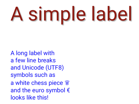
Create a center-aligned label with a text shadow and specified-size font, and another containing forced line breaks and Unicode symbols.
var win = Ti.UI.createWindow({
  backgroundColor: 'white',
  exitOnClose: true,
  fullscreen: false,
  layout: 'vertical',
  title: 'Label Demo'
});

var label1 = Ti.UI.createLabel({
  color: '#900',
  font: { fontSize:48 },
  shadowColor: '#aaa',
  shadowOffset: {x:5, y:5},
  shadowRadius: 3,
  text: 'A simple label',
  textAlign: Ti.UI.TEXT_ALIGNMENT_CENTER,
  top: 30,
  width: Ti.UI.SIZE, height: Ti.UI.SIZE
});

var label2 = Ti.UI.createLabel({
  color:'blue',
  text: 'A long label with\na few line breaks\nand Unicode (UTF8)\nsymbols such as\na white chess piece \u2655\nand the euro symbol \u20ac\nlooks like this!\n',
  textAlign: Ti.UI.TEXT_ALIGNMENT_LEFT,
  top: 30,
  width: 300, height: 200
});

win.add(label1);
win.add(label2);
win.open();
# Alloy XML Markup
Previous example as an Alloy view.
The font and shadowOffset properties need to be defined in the TSS or controller file. These property values are dictionaries, rather than single values, so they cannot be included in the markup.
<Alloy>
    <Window id="win" backgroundColor="white" exitOnClose="true" fullscreen="false" layout="vertical" title="Label Demo">

        <!-- The text property can either be defined as an attribute or as node text. -->
        <Label id="label1" color="#900" shadowColor="#aaa" text="A simple label" textAlign="Ti.UI.TEXT_ALIGNMENT_CENTER"
            top="30" width="Ti.UI.SIZE" height="Ti.UI.SIZE" />
        <Label id="label2" color="blue" textAlign="Ti.UI.TEXT_ALIGNMENT_LEFT" top="30" width="300" height="200">
            A long label with\na few line breaks\nand Unicode (UTF8)\nsymbols such as\na white chess piece \u2655\nand the euro symbol \u20ac\nlooks like this!\n
        </Label>
    </Window>
</Alloy>
# Properties
# accessibilityDisableLongPress CREATION ONLY
12.4.0Boolean value to remove the long press notification for the device's accessibility service.
Will disable the "double tap and hold for long press" message when selecting an item.
Default: true
Whether the view should be "hidden" from (i.e., ignored by) the accessibility service.
On iOS this is a direct analog of the accessibilityElementsHidden property defined in the
UIAccessibility
Protocol.
On Android, setting accessibilityHidden calls the native
View.setImportantForAccessibility
method. The native method is only available in Android 4.1 (API level 16/Jelly Bean) and
later; if this property is specified on earlier versions of Android, it is ignored.
Default: false
# accessibilityHint
3.0.0 3.0.0 9.2.0Briefly describes what performing an action (such as a click) on the view will do.
On iOS this is a direct analog of the accessibilityHint property defined in the
UIAccessibility Protocol.
On Android, it is concatenated together with
accessibilityLabel and accessibilityValue in the order: accessibilityLabel,
accessibilityValue, accessibilityHint. The concatenated value is then passed as the
argument to the native View.setContentDescription method.
Default: null
# accessibilityLabel
3.0.0 3.0.0 9.2.0A succinct label identifying the view for the device's accessibility service.
On iOS this is a direct analog of the accessibilityLabel property defined in the
UIAccessibility Protocol.
On Android, it is concatenated together with
accessibilityValue and accessibilityHint in the order: accessibilityLabel,
accessibilityValue, accessibilityHint. The concatenated value is then passed as the
argument to the native View.setContentDescription method.
Defaults to Title or label of the control.
# accessibilityValue
3.0.0 3.0.0 9.2.0A string describing the value (if any) of the view for the device's accessibility service.
On iOS this is a direct analog of the accessibilityValue property defined in the
UIAccessibility Protocol.
On Android, it is concatenated together with
accessibilityLabel and accessibilityHint in the order: accessibilityLabel,
accessibilityValue, accessibilityHint. The concatenated value is then passed as the
argument to the native View.setContentDescription method.
Defaults to State or value of the control.
# anchorPoint
7.5.0 2.1.0 9.2.0Coordinate of the view about which to pivot an animation.
Used on iOS only. For Android, use anchorPoint.
Anchor point is specified as a fraction of the view's size. For example, {0, 0} is at
the view's top-left corner, {0.5, 0.5} at its center and {1, 1} at its bottom-right
corner.
See the "Using an anchorPoint" example in Titanium.UI.Animation for a demonstration. The default is center of this view.
# animatedCenter READONLY
0.9 9.2.0Current position of the view during an animation.
# apiName READONLY
3.2.0 3.2.0 9.2.0The name of the API that this proxy corresponds to.
The value of this property is the fully qualified name of the API. For example, Titanium.UI.Button
returns Ti.UI.Button.
# attributedString
3.6.0 3.2.0 9.2.0Specify an attributed string for the label.
The underlying attributed string drawn by the label. If set, avoid setting common attributes
in the label, such as color and font, as unexpected behaviors may result.
For Alloy, you can use an <AttributedString>
element inside a <Label> element and set the text property as node text:
<Alloy>
  <Window>
      <Label>
        <AttributedString>
            Alloy is great!
        </AttributedString>
      </Label>
  </Window>
</Alloy>
Then set attributes in the TSS file:
"AttributedString" : {
  attributes: [
    {
      type: Ti.UI.ATTRIBUTE_FOREGROUND_COLOR,
      value: 'red',
      range: [0, 5]
    },
    {
      type: Ti.UI.ATTRIBUTE_UNDERLINES_STYLE,
      value: Ti.UI.ATTRIBUTE_UNDERLINE_STYLE_SINGLE,
      range: [9, 5]
    }
  ]
}

Since 13.2.0 you can also use the AttributedString object without `Titanium.UI.createAttributedString()`:
``` js
var text =  'Bacon ipsum dolor Titanium SDK rocks! sit amet fatback leberkas salami sausage tongue strip steak.';
var label = Titanium.UI.createLabel({
    attributedString: {
        text: text,
        attributes: [
            {
                type: Titanium.UI.ATTRIBUTE_UNDERLINES_STYLE,
                value: Ti.UI.ATTRIBUTE_UNDERLINE_STYLE_SINGLE,
                range: [text.indexOf('Titanium'), ('Titanium').length]
            },
            {
                type: Titanium.UI.ATTRIBUTE_BACKGROUND_COLOR,
                value: "red",
                range: [text.indexOf('Titanium'), ('Titanium').length]
            }
        ]
    }
});
# autoLink
0.8Automatically convert certain text items in the label to clickable links.
Multiple autolink values can be combined with a bitwise OR. For example:
label.autoLink = Ti.UI.AUTOLINK_MAP_ADDRESSES|Ti.UI.AUTOLINK_PHONE_NUMBERS;
Prior to Release 3.0, this field used platform-specific constants. These are now
deprecated in favor of the AUTOLINK constants.
The Android-specific LINKIFY legacy constants are defined in Titanium.UI.Android.
- Titanium.UI.AUTOLINK_MAP_ADDRESSES
- Titanium.UI.AUTOLINK_ALL
- Titanium.UI.AUTOLINK_CALENDAR
- Titanium.UI.AUTOLINK_URLS
- Titanium.UI.AUTOLINK_NONE
- Titanium.UI.AUTOLINK_PHONE_NUMBERS
- Titanium.UI.AUTOLINK_SHIPMENT_TRACKING_NUMBER
- Titanium.UI.AUTOLINK_FLIGHT_NUMBER
- Titanium.UI.AUTOLINK_LOOKUP_SUGGESTION
- Titanium.UI.AUTOLINK_MONEY
- Titanium.UI.AUTOLINK_PHYSICAL_VALUE
- Titanium.UI.AUTOLINK_EMAIL_ADDRESSES
# autoSize
11.1.0Automatically scales the label into its size.
To use autoSize you have to set a width and height to the label and it will
automatically increase the font size to fill up the space. The actual fontSize
value stays the same.
Default: false,
# backgroundColor
0.9 0.9 9.2.0Background color of the view, as a color name or hex triplet.
For information about color values, see the "Colors" section of Titanium.UI. Defaults to Transparent.
# backgroundDisabledColor
0.9Disabled background color of the view, as a color name or hex triplet.
For information about color values, see the "Colors" section of Titanium.UI. Defaults to the normal background color of this view.
# backgroundDisabledImage
0.9Disabled background image for the view, specified as a local file path or URL.
If backgroundDisabledImage is undefined, and the normal background imagebackgroundImage
is set, the normal image is used when this view is disabled.
# backgroundFocusedColor
0.9Focused background color of the view, as a color name or hex triplet.
For information about color values, see the "Colors" section of Titanium.UI.
For normal views, the focused color is only used if focusable is true.
Defaults to the normal background color of this view.
# backgroundFocusedImage
0.9Focused background image for the view, specified as a local file path or URL.
For normal views, the focused background is only used if focusable is true.
If backgroundFocusedImage is undefined, and the normal background image backgroundImage
is set, the normal image is used when this view is focused.
# backgroundGradient
0.9 0.9 9.2.0A background gradient for the view.
A gradient can be defined as either linear or radial. A linear gradient varies continuously
along a line between the startPoint and endPoint.
A radial gradient is interpolated between two circles, defined by startPoint and
startRadius and endPoint and endRadius respectively.
The start points, end points and radius values can be defined in device units, in the view's coordinates, or as percentages of the view's size. Thus, if a view is 60 x 60, the center point of the view can be specified as:
{ x: 30, y: 30 }
Or:
{ x: '50%', y: '50%' }
When specifying multiple colors, you can specify an offset value for each color, defining how far into the gradient it takes effect. For example, the following color array specifies a gradient that goes from red to blue back to red:
colors: [ { color: 'red', offset: 0.0}, { color: 'blue', offset: 0.25 }, { color: 'red', offset: 1.0 } ]
Android's linear gradients ignores backfillStart and backfillEnd, treating them as if
they are true. Android's radial gradients ignore the endPoint property.
Defaults to no gradient.
# backgroundImage
0.9 0.9 9.2.0Background image for the view, specified as a local file path or URL.
Default behavior when backgroundImage is unspecified depends on the type of view and the platform.
For generic views, no image is used. For most controls (buttons, textfields, and so on), platform-specific default images are used.
# backgroundLeftCap
0.9 9.2.0Size of the left end cap.
See the section on backgroundLeftCap and backgroundTopCap behavior on iOS in Titanium.UI.View.
Default: 0
# backgroundPaddingBottom
0.8 9.2.0Number of pixels to extend the background image past the label on the bottom.
# backgroundPaddingLeft
0.8 9.2.0Number of pixels to extend the background image past the label on the left.
# backgroundPaddingRight
0.8 9.2.0Number of pixels to extend the background image past the label on the right.
# backgroundPaddingTop
0.8 9.2.0Number of pixels to extend the background image past the label on the top.
# backgroundRepeat
0.9 0.9 9.2.0Determines whether to tile a background across a view.
Setting this to true makes the set backgroundImage repeat across the view as a series
of tiles. The tiling begins in the upper-left corner, where the upper-left corner of the
background image is rendered. The image is then tiled to fill the available space of the
view.
Note that setting this to true may incur performance penalties for large views or
background images, as the tiling must be redone whenever a view is resized.
On iOS, the following views do not currently support tiled backgrounds:
Default: false
# backgroundSelectedColor
0.9 13.1.0 13.1.0Selected background color of the view, as a color name or hex triplet.
For information about color values, see the "Colors" section of Titanium.UI. Defaults to transparent, so the background color of this view will be used.
# backgroundSelectedImage
0.9Selected background image URL for the view, specified as a local file path or URL.
For normal views, the selected background is only used if focusable is true.
If backgroundSelectedImage is undefined, and the normal background image backgroundImage is set
the normal image is used when this view is selected.
# backgroundTopCap
0.9 9.2.0Size of the top end cap.
See the section on backgroundLeftCap and backgroundTopCap behavior on iOS in Titanium.UI.View.
Default: 0
# borderColor
0.9 0.9 9.2.0Border color of the view, as a color name or hex triplet.
For information about color values, see the "Colors" section of Titanium.UI.
Defaults to the normal background color of this view (Android), black (iOS).
# borderRadius
0.9 0.9 9.2.0Radius for the rounded corners of the view's border.
Each corner is rounded using an arc of a circle.
Values for each corner can be specified. For example, '20px 20px' will set both left and right corners to 20px.
Specifying '20px 20px 20px 20px' will set top-left, top-right, bottom-right and bottom-left corners in that order.
If you have issues with dark artifacts on Android you can try to disable Hardware acceleration by setting a
backgroundColor with a small amount of transparency: backgroundColor:"rgba(255,255,255,254)".
Default: 0
# borderWidth
0.9 0.9 9.2.0Border width of the view.
If borderColor is set without borderWidth, this value will be changed to 1 of the unit declared as 'ti.ui.defaultunit' in tiapp.xml descriptor.
Default: 0
# bottom
0.9 0.9 9.2.0View's bottom position, in platform-specific units.
This position is relative to the view's parent. Exact interpretation depends on the parent view's layout property. Can be either a float value or a dimension string (for example, '50%' or '10px').
This is an input property for specifying where the view should be positioned, and does not represent the view's calculated position.
Defaults to undefined.
# breakStrategy
12.3.0Break strategy (control over paragraph layout). Check Android breakStrategy for more infos.
# bubbleParent
3.0.0 3.0.0 9.2.0Indicates if the proxy will bubble an event to its parent.
Some proxies (most commonly views) have a relationship to other proxies, often established by the add() method. For example, for a button added to a window, a click event on the button would bubble up to the window. Other common parents are table sections to their rows, table views to their sections, and scrollable views to their views. Set this property to false to disable the bubbling to the proxy's parent.
Default: true
# center
0.9 0.9 9.2.0View's center position, in the parent view's coordinates.
This is an input property for specifying where the view should be positioned, and does not represent the view's calculated position.
Defaults to undefined.
# clipMode
3.3.0 9.2.0View's clipping behavior.
Setting this to CLIP_MODE_ENABLED enforces all child views to be clipped to this views bounds. Setting this to CLIP_MODE_DISABLED allows child views to be drawn outside the bounds of this view. When set to CLIP_MODE_DEFAULT or when this property is not set, clipping behavior is inferred. See section on iOS Clipping Behavior in Titanium.UI.View.
Defaults to undefined. Behaves as if set to CLIP_MODE_DEFAULT.
# color
0.8 0.8 9.2.0Color of the label text, as a color name or hex triplet.
For information about color values, see the "Colors" section of Titanium.UI.
# elevation
5.0.0Base elevation of the view relative to its parent in pixels.
The elevation of a view determines the appearance of its shadow. Higher elevations produce larger and softer shadows.
Note: The elevation property only works on Titanium.UI.View objects.
Many Android components have a default elevation that cannot be modified.
For more information, see
Google design guidelines: Elevation and shadows.
# ellipsize
0.8 0.8 9.2.0Causes words in the text that are longer than the view is wide to be ellipsized instead of broken in the middle.
- Titanium.UI.TEXT_ELLIPSIZE_TRUNCATE_WORD_WRAP
- Titanium.UI.TEXT_ELLIPSIZE_TRUNCATE_CHAR_WRAP
- Titanium.UI.TEXT_ELLIPSIZE_TRUNCATE_CLIP
- Titanium.UI.TEXT_ELLIPSIZE_TRUNCATE_START
- Titanium.UI.TEXT_ELLIPSIZE_TRUNCATE_MIDDLE
- Titanium.UI.TEXT_ELLIPSIZE_TRUNCATE_END
- Titanium.UI.TEXT_ELLIPSIZE_TRUNCATE_MARQUEE
- Titanium.UI.TEXT_ELLIPSIZE_TRUNCATE_NONE
Default: Titanium.UI.TEXT_ELLIPSIZE_TRUNCATE_END
# filterTouchesWhenObscured
9.3.0Discards touch related events if another app's system overlay covers the view.
This is a security feature to protect an app from "tapjacking", where a malicious app can use a system overlay to intercept touch events in your app or to trick the end-user to tap on UI in your app intended for the overlay.
Setting this property to true causes touch related events (including "click") to not be fired
if a system overlay overlaps the view.
Default: false
# focusable
0.9Whether view should be focusable while navigating with the trackball.
Default: false
# height
0.9 0.9 9.2.0View height, in platform-specific units.
Defaults to: If undefined, defaults to either FILL or SIZE depending on the view. See "View Types and Default Layout Behavior" in Transitioning to the New UI Layout System.
Can be either a float value or a dimension string (for example, '50%' or '40dp'). Can also be one of the following special values:
- SIZE. The view should size itself to fit its contents.
- FILL. The view should size itself to fill its parent.
- 'auto'. Represents the default sizing behavior for a given type of
view. The use of 'auto' is deprecated, and should be replaced with the
SIZEorFILLconstants if it is necessary to set the view's behavior explicitly.
This is an input property for specifying the view's height dimension. To determine the view's size once rendered, use the rect or size properties.
Sets the behavior when hiding an object to release or keep the free space
If setting hiddenBehavior to HIDDEN_BEHAVIOR_GONE it will automatically release the space the view occupied.
For example: in a vertical layout the views below the object will move up when you hide
an object with hiddenBehavior:Titanium.UI.HIDDEN_BEHAVIOR_GONE.
- HIDDEN_BEHAVIOR_INVISIBLE. Keeps the space and just hides the object (default).
- HIDDEN_BEHAVIOR_GONE. Releases the space and hides the object.
Defaults to Titanium.UI.HIDDEN_BEHAVIOR_INVISIBLE.
# highlightedColor
0.8 0.8 9.2.0Color of the label when in the highlighted state, as a color name or hex triplet.
For information about color values, see the "Colors" section of Titanium.UI.
Used when the label is part of a view that can be highlighted, such as a Titanium.UI.TableViewRow.
# horizontalMotionEffect
7.3.0 9.2.0Adds a horizontal parallax effect to the view
Note that the parallax effect only happens by tilting the device so results can not be seen on Simulator. To clear all motion effects, use the <Titanium.UI.clearMotionEffects> method.
# horizontalWrap
2.1.0 2.1.0 9.2.0Determines whether the layout has wrapping behavior.
For more information, see the discussion of horizontal layout mode in the description of the layout property.
Default: true
# html
0.8 12.3.0 12.3.0Pass a HTML-based string and it will be formatted accordingly.
Note that complex HTML structures like images are not supported. Use a Titanium.UI.WebView for those cases.
# hyphenationFrequency
12.3.0Frequency of automatic hyphenation. Check Android hyphenationFrequency for more infos.
# id
0.9 0.9 9.2.0View's identifier.
The id property of the Ti.UI.View represents the view's identifier. The identifier string does
not have to be unique. You can use this property with getViewById method.
# includeFontPadding
3.3.0Includes extra top and bottom padding to make room for accents that go above normal ascent and descent.
Default: undefined but behaves as true
# keepHardwareMode
13.2.0A value indicating the render mode of the View
Set to true to keep hardware mode when using a border and transparent backgrounds.
Default: false
# keepScreenOn
0.9Determines whether to keep the device screen on.
When true the screen will not power down. Note: enabling this feature will use more
power, thereby adversely affecting run time when on battery.
For iOS look at idleTimerDisabled.
Default: false
# layout
0.9 0.9 9.2.0Specifies how the view positions its children. One of: 'composite', 'vertical', or 'horizontal'.
There are three layout options:
-
composite(orabsolute). Default layout. A child view is positioned based on its positioning properties or "pins" (top,bottom,left,rightandcenter). If no positioning properties are specified, the child is centered.The child is always sized based on its
widthandheightproperties, if these are specified. If the child's height or width is not specified explicitly, it may be calculated implicitly from the positioning properties. For example, if bothleftandcenter.xare specified, they can be used to calculate the width of the child control.Because the size and position properties can conflict, there is a specific precedence order for the layout properties. For vertical positioning, the precedence order is:
height,top,center.y,bottom.The following table summarizes the various combinations of properties that can be used for vertical positioning, in order from highest precedence to lowest. (For example, if
height,center.yandbottomare all specified, theheightandcenter.yvalues take precedence.)Scenario Behavior height&topspecifiedChild positioned topunit from parent's top, using specifiedheight; anycenter.yandbottomvalues are ignored.height¢er.yspecifiedChild positioned with center at center.y, using specifiedheight; anybottomvalue is ignored.height&bottomspecifiedChild positioned bottomunits from parent's bottom, using specifiedheight.top¢er.yspecifiedChild positioned with top edge topunits from parent's top and center atcenter.y. Height is determined implicitly; anybottomvalue is ignored.top&bottomspecifiedChild positioned with top edge topunits from parent's top and bottom edgebottomunits from parent's bottom. Height is determined implicitly.Only topspecifiedChild positioned topunits from parent's top, and uses the default height calculation for the view type.center.yandbottomspecifiedChild positioned with center at center.yand bottom edgebottomunits from parent's bottom. Height is determined implicitly.Only center.yspecifiedChild positioned with center at center.y, and uses the default height calculation for the view type.Only bottomspecifiedChild positioned with bottom edge bottomunits from parent's bottom, and uses the default height calculation for the view type.height,top,center.y, andbottomunspecifiedChild entered vertically in the parent and uses the default height calculation for the child view type. Horizontal positioning works like vertical positioning, except that the precedence is
width,left,center.x,right.For complete details on composite layout rules, see Transitioning to the New UI Layout System in the Titanium Mobile Guides.
-
vertical. Children are laid out vertically from top to bottom. The first child is laid outtopunits from its parent's bounding box. Each subsequent child is laid out below the previous child. The space between children is equal to the upper child'sbottomvalue plus the lower child'stopvalue.Each child is positioned horizontally as in the composite layout mode.
-
horizontal. Horizontal layouts have different behavior depending on whether wrapping is enabled. Wrapping is enabled by default (thehorizontalWrapproperty istrue).With wrapping behavior, the children are laid out horizontally from left to right, in rows. If a child requires more horizontal space than exists in the current row, it is wrapped to a new row. The height of each row is equal to the maximum height of the children in that row.
Wrapping behavior is available on iOS and Android. When the
horizontalWrapproperty is set to true, the first row is placed at the top of the parent view, and successive rows are placed below the first row. Each child is positioned vertically within its row somewhat like composite layout mode. In particular:- If neither
toporbottomis specified, the child is centered in the row. - If either
toporbottomis specified, the child is aligned to either the top or bottom of the row, with the specified amount of padding. - If both
topandbottomis specified for a given child, the properties are both treated as padding.
If the
horizontalWrapproperty is false, the behavior is more equivalent to a vertical layout. Children are laid or horizontally from left to right in a single row. Theleftandrightproperties are used as padding between the children, and thetopandbottomproperties are used to position the children vertically.Defaults to Composite layout.
- If neither
# left
0.9 0.9 9.2.0View's left position, in platform-specific units.
This position is relative to the view's parent. Exact interpretation depends on the parent view's layout property. Can be either a float value or a dimension string (for example, '50%' or '10px').
This is an input property for specifying where the view should be positioned, and does not represent the view's calculated position.
Defaults to undefined.
# lifecycleContainer
3.6.0The Window or TabGroup whose Activity lifecycle should be triggered on the proxy.
If this property is set to a Window or TabGroup, then the corresponding Activity lifecycle event callbacks will also be called on the proxy. Proxies that require the activity lifecycle will need this property set to the appropriate containing Window or TabGroup.
# lineCount READONLY
12.3.0 12.3.0 12.3.0Returns the amount of lines the content is actually using. Is equal or lower than maxLines.
# lineSpacing
5.4.0Line spacing of the text, as a dictionary with the properties add and multiply.
# minimumFontSize
6.1.0 0.8 9.2.0Minimum font size when the font is sized based on the contents.
When set to a valid font size, this property enables single-line mode and the font will be auto-downscaled so that its text will fit the label's width if necessary. Will not downscale the font lower than the assigned minimum font size.
When set to less than or equal to zero, the font auto-downscaling feature will be disabled.
# opacity
0.9 0.9 9.2.0Opacity of this view, from 0.0 (transparent) to 1.0 (opaque). Defaults to 1.0 (opaque).
# overrideCurrentAnimation CREATION ONLY
3.3.0When on, animate call overrides current animation if applicable.
If this property is set to false, the animate call is ignored if the view is currently being animated.
Defaults to undefined but behaves as false
# previewContext
 5.1.0
5.1.0The preview context used in the 3D-Touch feature "Peek and Pop".
Preview context to present the "Peek and Pop" of a view. Use an configured instance of Titanium.UI.iOS.PreviewContext here.
Note: This property can only be used on devices running iOS 9 or later and supporting 3D-Touch. It is ignored on older devices and can manually be checked using forceTouchSupported.
# pullBackgroundColor
3.3.0 9.2.0Background color of the wrapper view when this view is used as either pullView or headerPullView.
Defaults to undefined. Results in a light grey background color on the wrapper view.
# rect READONLY
2.0.0 2.0.0 9.2.0The bounding box of the view relative to its parent, in system units.
The view's bounding box is defined by its size and position.
The view's size is rect.width x rect.height. The view's top-left position relative to
its parent is (rect.x , rect.y).
On Android it will also return rect.absoluteX and 'rect.absoluteY' which are relative to
the main window.
The correct values will only be available when layout is complete. To determine when layout is complete, add a listener for the postlayout event.
# right
0.9 0.9 9.2.0View's right position, in platform-specific units.
This position is relative to the view's parent. Exact interpretation depends on the parent view's layout property. Can be either a float value or a dimension string (for example, '50%' or '10px').
This is an input property for specifying where the view should be positioned, and does not represent the view's calculated position.
Defaults to undefined.
# rotation
5.4.0 12.3.0Clockwise 2D rotation of the view in degrees.
Translation values are applied to the static post layout value.
# rotationX
5.4.0Clockwise rotation of the view in degrees (x-axis).
Translation values are applied to the static post layout value.
# rotationY
5.4.0Clockwise rotation of the view in degrees (y-axis).
Translation values are applied to the static post layout value.
# scaleX
5.4.0Scaling of the view in x-axis in pixels.
Translation values are applied to the static post layout value.
# scaleY
5.4.0Scaling of the view in y-axis in pixels.
Translation values are applied to the static post layout value.
# shadowColor
3.2.0 0.8 9.2.0Shadow color of the text, as a color name or hex triplet.
Use in conjunction with shadowOffset and shadowRadius. For information about color values, see the "Colors" section of Titanium.UI.
# shadowOffset
3.2.0 0.8 9.2.0Shadow offset of the text, as a dictionary with the properties x and y.
Use in conjunction with shadowColor and shadowRadius.
# shadowRadius
3.2.0Shadow radius of the text.
Use in conjunction with shadowColor and shadowOffset.
# size READONLY
0.9 0.9 9.2.0The size of the view in system units.
Although property returns a Dimension dictionary, only the width and height
properties are valid. The position properties--x and y--are always 0.
To find the position and size of the view, use the rect property instead.
The correct values will only be available when layout is complete. To determine when layout is complete, add a listener for the postlayout event.
# softKeyboardOnFocus
0.9Determines keyboard behavior when this view is focused. Defaults to SOFT_KEYBOARD_DEFAULT_ON_FOCUS.
# text
0.8 0.8 9.2.0Label text.
Use the backslash and letter n line feed character combination, ie \n, to force a new
line.
Use Unicode characters, such as those included in (but not limited to) the Unicode List of Useful Symbols section of wikipedia, to insert special characters and symbols.
See the example in Titanium.UI.Label for a demonstration.
# textAlign
0.8 0.8 9.2.0Text alignment.
# textid
0.8 0.8 9.2.0Key identifying a string from the locale file to use for the label text.
Only one of text or textid should be specified.
# textTransform
12.7.0 12.7.0 12.7.0Property that specifies how to capitalize the text. Can be lowercase, uppercase or none (default)
Default: none
# tintColor
3.1.3 9.2.0The view's tintColor
This property is a direct correspondent of the tintColor property of UIView on iOS. If no value is specified, the tintColor of the View is inherited from its superview.
Default: null
# tooltip
12.1.0 12.1.0 12.1.0The default text to display in the control's tooltip.
Assigning a value to this property causes the tool tip to be displayed for the view.
Setting the property to null cancels the display of the tool tip for the view.
Note: This property is only used for apps targeting macOS Catalyst.
# top
0.9 0.9 9.2.0The view's top position.
This position is relative to the view's parent. Exact interpretation depends on the parent view's layout property. Can be either a float value or a dimension string (for example, '50%' or '10px').
This is an input property for specifying where the view should be positioned, and does not represent the view's calculated position.
# touchEnabled
0.9 0.9 9.2.0Determines whether view should receive touch events.
If false, will forward the events to peers.
Default: true
# touchFeedback
6.1.0A material design visual construct that provides an instantaneous visual confirmation of touch point.
Touch feedback is only applied to a view's background. It is never applied to the view's foreground content such as a Titanium.UI.ImageView's image.
For Titanium versions older than 9.1.0, touch feedback only works if you set the backgroundColor property to a non-transparent color.
Default: false
# touchFeedbackColor
6.1.0Optional touch feedback ripple color. This has no effect unless touchFeedback is true.
Defaults to provided theme color.
# transform
0.9 0.9 9.2.0Transformation matrix to apply to the view.
Android only supports Matrix2D transforms.
Default: Identity matrix
# transitionName
5.0.2A name to identify this view in activity transition.
Name should be unique in the View hierarchy.
# translationX
5.0.0Horizontal location of the view relative to its left position in pixels.
Translation values are applied to the static post layout value.
# translationY
5.0.0Vertical location of the view relative to its top position in pixels.
Translation values are applied to the static post layout value.
# translationZ
5.0.0Depth of the view relative to its elevation in pixels.
Translation values are applied to the static post layout value.
# verticalAlign
3.0.0 3.0.0 9.2.0Vertical text alignment, specified using one of the vertical alignment constants from Titanium.UI.
On iPhone and iPad the default value of the property is undefined. The behavior of the label depends on the actual content height. If the actual content height is larger than the available height the text is truncated at the end and the content is center aligned.
On Android, the default value of the property is undefined, and the default behavior when the property is undefined is to center the text vertically.
Default: undefined
# verticalMotionEffect
7.3.0 9.2.0Adds a vertical parallax effect to the view
Note that the parallax effect only happens by tilting the device so results can not be seen on Simulator. To clear all motion effects, use the <Titanium.UI.clearMotionEffects> method.
# viewShadowColor
11.1.0 3.3.0 9.2.0Determines the color of the shadow.
iOS Defaults to undefined. Behaves as if transparent. Android default is black.
On Android you can set <item name="android:ambientShadowAlpha">0.5</item> and
<item name="android:spotShadowAlpha">0.5</item> in your theme to change the
opacity.
# viewShadowOffset
3.3.0 9.2.0Determines the offset for the shadow of the view.
Defaults to undefined. Behaves as if set to (0,-3)
# viewShadowRadius
3.3.0 9.2.0Determines the blur radius used to create the shadow.
Defaults to undefined. Behaves as if set to 3. Accepts density units as of 10.0.1.
# visibleText READONLY
12.3.0Returns the actual text seen on the screen. If the text is ellipsized it will be different to the normal text.
# width
0.9 0.9 9.2.0View's width, in platform-specific units.
Defaults to: If undefined, defaults to either FILL or SIZE depending on the view. See "View Types and Default Layout Behavior" in Transitioning to the New UI Layout System.
Can be either a float value or a dimension string (for example, '50%' or '40dp'). Can also be one of the following special values:
- SIZE. The view should size itself to fit its contents.
- FILL. The view should size itself to fill its parent.
- 'auto'. Represents the default sizing behavior for a given type of
view. The use of 'auto' is deprecated, and should be replaced with the
SIZEorFILLconstants if it is necessary to set the view's behavior explicitly.
This is an input property for specifying the view's width dimension. To determine the view's size once rendered, use the rect or size properties.
# wordWrap DEPRECATED
0.8DEPRECATED SINCE 8.0.0
If you want to disable wrapping, then set maxLines to 1 instead.
Enable or disable word wrapping in the label.
Default: true
# zIndex
0.9 0.9 9.2.0Z-index stack order position, relative to other sibling views.
A view does not have a default z-index value, meaning that it is undefined by default. When this property is explicitly set, regardless of its value, it causes the view to be positioned in front of any sibling that has an undefined z-index.
Defaults to undefined.
# Methods
# addEventListener
0.8 0.8 9.2.0Adds the specified callback as an event listener for the named event.
Parameters
| Name | Type | Description |
|---|---|---|
name | String | Name of the event. |
callback | Callback<Titanium.Event> | Callback function to invoke when the event is fired. |
Returns
- Type
- void
# animate
0.9 0.9 9.2.0Animates this view.
The Titanium.UI.Animation object or dictionary passed to this method defines the end state for the animation, the duration of the animation, and other properties.
Note that on SDKs older than 9.1.0 - if you use animate to move a view, the view's actual position is changed, but
its layout properties, such as top, left, center and so on are not changed--these
reflect the original values set by the user, not the actual position of the view.
As of SDK 9.1.0, the final values of the animation will be set on the view just before the complete event and/or the callback is fired.
The rect property can be used to determine the actual size and position of the view.
Parameters
| Name | Type | Description |
|---|---|---|
animation | Titanium.UI.Animation | Dictionary<Titanium.UI.Animation> | Either a dictionary of animation properties or an Titanium.UI.Animation object. |
callback | Callback<Object> | Function to be invoked upon completion of the animation. |
Returns
- Type
- void
# applyProperties
3.0.0 3.0.0 9.2.0Applies the properties to the proxy.
Properties are supplied as a dictionary. Each key-value pair in the object is applied to the proxy such that myproxy[key] = value.
Parameters
| Name | Type | Description |
|---|---|---|
props | Dictionary | A dictionary of properties to apply. |
Returns
- Type
- void
# clearMotionEffects
8.2.0 9.2.0Removes all previously added motion effects.
Use this method together with <Titanium.UI.horizontalMotionEffect> and <Titanium.UI.verticalMotionEffect>.
Returns
- Type
- void
# convertPointToView
1.8 1.8 9.2.0Translates a point from this view's coordinate system to another view's coordinate system.
Returns null if either view is not in the view hierarchy.
Keep in mind that views may be removed from the view hierarchy if their window is blurred or if the view is offscreen (such as in some situations with Titanium.UI.ScrollableView).
If this view is a Titanium.UI.ScrollView, the view's x and y offsets are subtracted from the return value.
Parameters
| Name | Type | Description |
|---|---|---|
point | Point | A point in this view's coordinate system. If this argument is missing an |
destinationView | Titanium.UI.View | View that specifies the destination coordinate system to convert to. If this argument is not a view, an exception will be raised. |
Returns
- Type
- Point
# fireEvent
0.8 0.8 9.2.0Fires a synthesized event to any registered listeners.
Parameters
| Name | Type | Description |
|---|---|---|
name | String | Name of the event. |
event | Dictionary | A dictionary of keys and values to add to the Titanium.Event object sent to the listeners. |
Returns
- Type
- void
# getViewById
6.1.0 6.1.0 9.2.0Returns the matching view of a given view ID.
Parameters
| Name | Type | Description |
|---|---|---|
id | String | The ID of the view that should be returned. Use the |
Returns
- Type
- Titanium.UI.View
# hide
0.9 0.9 9.2.0Hides this view.
Parameters
| Name | Type | Description |
|---|---|---|
options | AnimatedOptions | Animation options for Android only. Since SDK 5.1.0 and used only on Android 5.0+ Determines whether to enable a circular reveal animation.
Note that the default here is equivalent to passing in |
Returns
- Type
- void
# insertAt
3.3.0 3.3.0 9.2.0Inserts a view at the specified position in the children array.
Useful if the layout property is set to horizontal or vertical.
Parameters
| Name | Type | Description |
|---|---|---|
params | ViewPositionOptions | Pass an object that specifies the view to insert and optionally at which position (defaults to end) |
Returns
- Type
- void
# removeEventListener
0.8 0.8 9.2.0Removes the specified callback as an event listener for the named event.
Multiple listeners can be registered for the same event, so the
callback parameter is used to determine which listener to remove.
When adding a listener, you must save a reference to the callback function in order to remove the listener later:
var listener = function() { Ti.API.info("Event listener called."); }
window.addEventListener('click', listener);
To remove the listener, pass in a reference to the callback function:
window.removeEventListener('click', listener);
Parameters
| Name | Type | Description |
|---|---|---|
name | String | Name of the event. |
callback | Callback<Titanium.Event> | Callback function to remove. Must be the same function passed to |
Returns
- Type
- void
# show
0.9 0.9 9.2.0Makes this view visible.
Parameters
| Name | Type | Description |
|---|---|---|
options | AnimatedOptions | Animation options for Android only. Since SDK 5.1.0 and only used on Android 5.0+ Determines whether to enable a circular reveal animation.
Note that the default here is equivalent to passing in |
Returns
- Type
- void
# stopAnimation
12.1.0Stops a running animation.
Stops a running view Titanium.UI.Animation.
Returns
- Type
- void
# toImage
0.9 0.9 9.2.0Returns an image of the rendered view, as a Blob.
The honorScaleFactor argument is only supported on iOS.
Parameters
| Name | Type | Description |
|---|---|---|
callback | Callback<Titanium.Blob> | Function to be invoked upon completion. If non-null, this method will be performed asynchronously. If null, it will be performed immediately. |
honorScaleFactor | Boolean | Determines whether the image is scaled based on scale factor of main screen. (iOS only) When set to true, image is scale factor is honored. When set to false, the image in the blob has the same dimensions for retina and non-retina devices. |
Returns
- Type
- Titanium.Blob
# Events
# click
0.9 0.9 9.2.0Fired when the device detects a click against the view.
There is a subtle difference between singletap and click events.
A singletap event is generated when the user taps the screen briefly without moving their finger. This gesture will also generate a click event.
However, a click event can also be generated when the user touches, moves their finger, and then removes it from the screen.
On Android, a click event can also be generated by a trackball click.
Properties
| Name | Type | Description |
|---|---|---|
| x | Number | X coordinate of the event from the |
| y | Number | Y coordinate of the event from the |
| obscured | Boolean | Returns This is a security feature to protect an app from "tapjacking", where a malicious app can use a system overlay to intercept touch events in your app or to trick the end-user to tap on UI in your app intended for the overlay. |
| source | Object | Source object that fired the event. |
| type | String | Name of the event fired. |
| bubbles | Boolean | True if the event will try to bubble up if possible. |
| cancelBubble | Boolean | Set to true to stop the event from bubbling. |
# dblclick
0.9 0.9 9.2.0Fired when the device detects a double click against the view.
Properties
| Name | Type | Description |
|---|---|---|
| x | Number | X coordinate of the event from the |
| y | Number | Y coordinate of the event from the |
| obscured | Boolean | Returns This is a security feature to protect an app from "tapjacking", where a malicious app can use a system overlay to intercept touch events in your app or to trick the end-user to tap on UI in your app intended for the overlay. |
| source | Object | Source object that fired the event. |
| type | String | Name of the event fired. |
| bubbles | Boolean | True if the event will try to bubble up if possible. |
| cancelBubble | Boolean | Set to true to stop the event from bubbling. |
# doubletap
0.9 0.9 9.2.0Fired when the device detects a double tap against the view.
Properties
| Name | Type | Description |
|---|---|---|
| x | Number | X coordinate of the event from the |
| y | Number | Y coordinate of the event from the |
| obscured | Boolean | Returns This is a security feature to protect an app from "tapjacking", where a malicious app can use a system overlay to intercept touch events in your app or to trick the end-user to tap on UI in your app intended for the overlay. |
| source | Object | Source object that fired the event. |
| type | String | Name of the event fired. |
| bubbles | Boolean | True if the event will try to bubble up if possible. |
| cancelBubble | Boolean | Set to true to stop the event from bubbling. |
# focus
0.9Fired when the view element gains focus.
This event only fires when using the trackball to navigate.
# keypressed
3.1.0 5.4.0 9.2.0Fired when a hardware key is pressed in the view.
A keypressed event is generated by pressing a hardware key. On Android, this event can only be fired when the property focusable is set to true. On iOS the event is generated only when using Titanium.UI.TextArea, Titanium.UI.TextField and Titanium.UI.SearchBar.
Properties
| Name | Type | Description |
|---|---|---|
| keyCode | Number | The code for the physical key that was pressed. For more details, see KeyEvent. This API is experimental and subject to change. |
| source | Object | Source object that fired the event. |
| type | String | Name of the event fired. |
| bubbles | Boolean | True if the event will try to bubble up if possible. |
| cancelBubble | Boolean | Set to true to stop the event from bubbling. |
# longclick
0.9Fired when the device detects a long click.
A long click is generated by touching and holding on the touchscreen or holding down the trackball button.
The event occurs before the finger/button is lifted.
A longpress and a longclick can occur together.
As the trackball can fire this event, it is not intended to return the x and y
coordinates of the touch, even when it is generated by the touchscreen.
A longclick blocks a click, meaning that a click event will not fire when a
longclick listener exists.
# longpress
0.9 0.9 9.2.0Fired when the device detects a long press.
A long press is generated by touching and holding on the touchscreen. Unlike a longclick,
it does not respond to the trackball button.
The event occurs before the finger is lifted.
A longpress and a longclick can occur together.
In contrast to a longclick, this event returns the x and y coordinates of the touch.
Properties
| Name | Type | Description |
|---|---|---|
| x | Number | X coordinate of the event from the |
| y | Number | Y coordinate of the event from the |
| obscured | Boolean | Returns This is a security feature to protect an app from "tapjacking", where a malicious app can use a system overlay to intercept touch events in your app or to trick the end-user to tap on UI in your app intended for the overlay. |
| source | Object | Source object that fired the event. |
| type | String | Name of the event fired. |
| bubbles | Boolean | True if the event will try to bubble up if possible. |
| cancelBubble | Boolean | Set to true to stop the event from bubbling. |
# pinch
1.8.0 1.8.0 9.2.0Fired when the device detects a pinch gesture.
A pinch is a touch and expand or contract with two fingers. The event occurs continuously until a finger is lifted again.
Properties
| Name | Type | Description |
|---|---|---|
| scale | Number | The scale factor relative to the points of the two touches in screen coordinates. |
| velocity | Number | The velocity of the pinch in scale factor per second. |
| time | Number | The event time of the current event being processed. |
| timeDelta | Number | The time difference in milliseconds between the previous accepted scaling event and the current scaling event. |
| currentSpan | Number | The average distance between each of the pointers forming the gesture in progress through the focal point. |
| currentSpanX | Number | The average X distance between each of the pointers forming the gesture in progress through the focal point. |
| currentSpanY | Number | The average Y distance between each of the pointers forming the gesture in progress through the focal point. |
| previousSpan | Number | The previous average distance between each of the pointers forming the gesture in progress through the focal point. |
| previousSpanX | Number | The previous average X distance between each of the pointers forming the gesture in progress through the focal point. |
| previousSpanY | Number | The previous average Y distance between each of the pointers forming the gesture in progress through the focal point. |
| focusX | Number | The X coordinate of the current gesture's focal point. |
| focusY | Number | The Y coordinate of the current gesture's focal point. |
| inProgress | Boolean | Returns |
| source | Object | Source object that fired the event. |
| type | String | Name of the event fired. |
| bubbles | Boolean | True if the event will try to bubble up if possible. |
| cancelBubble | Boolean | Set to true to stop the event from bubbling. |
# postlayout
2.0.0 2.0.0 9.2.0Fired when a layout cycle is finished.
This event is fired when the view and its ancestors have been laid out. The rect and size values should be usable when this event is fired.
This event is typically triggered by either changing layout properties or by changing the orientation of the device. Note that changing the layout of child views or ancestors can also trigger a relayout of this view.
Note that altering any properties that affect layout from the postlayout callback
may result in an endless loop.
# rotate
12.7.0 12.7.0 12.7.0Fired when the device detects a two finger rotation.
This event is fired when doing a two finger rotation and returning the angle. The event occurs continuously until a finger is lifted again.
Properties
| Name | Type | Description |
|---|---|---|
| rotate | Number | Rotation in degrees. |
| source | Object | Source object that fired the event. |
| type | String | Name of the event fired. |
| bubbles | Boolean | True if the event will try to bubble up if possible. |
| cancelBubble | Boolean | Set to true to stop the event from bubbling. |
# singletap
0.9 0.9 9.2.0Fired when the device detects a single tap against the view.
Properties
| Name | Type | Description |
|---|---|---|
| x | Number | X coordinate of the event from the |
| y | Number | Y coordinate of the event from the |
| obscured | Boolean | Returns This is a security feature to protect an app from "tapjacking", where a malicious app can use a system overlay to intercept touch events in your app or to trick the end-user to tap on UI in your app intended for the overlay. |
| source | Object | Source object that fired the event. |
| type | String | Name of the event fired. |
| bubbles | Boolean | True if the event will try to bubble up if possible. |
| cancelBubble | Boolean | Set to true to stop the event from bubbling. |
# swipe
0.9 0.9 9.2.0Fired when the device detects a swipe gesture against the view.
Properties
| Name | Type | Description |
|---|---|---|
| direction | String | Direction of the swipe--either 'left', 'right', 'up', or 'down'. |
| x | Number | X coordinate of the event's endpoint from the |
| y | Number | Y coordinate of the event's endpoint from the |
| obscured | Boolean | Returns This is a security feature to protect an app from "tapjacking", where a malicious app can use a system overlay to intercept touch events in your app or to trick the end-user to tap on UI in your app intended for the overlay. |
| source | Object | Source object that fired the event. |
| type | String | Name of the event fired. |
| bubbles | Boolean | True if the event will try to bubble up if possible. |
| cancelBubble | Boolean | Set to true to stop the event from bubbling. |
# touchcancel
0.9 0.9 9.2.0Fired when a touch event is interrupted by the device.
A touchcancel can happen in circumstances such as an incoming call to allow the UI to clean up state.
Properties
| Name | Type | Description |
|---|---|---|
| x | Number | X coordinate of the event from the |
| y | Number | Y coordinate of the event from the |
| force | Number | The current force value of the touch event. Note: This property is only available for iOS devices that support 3D-Touch and run 9.0 or later and on some Android devices. |
| size | Number | The current size of the touch area. Note: This property is only available on some Android devices. |
| maximumPossibleForce | Number | Maximum possible value of the force property. Note: This property is only available for iOS devices that support 3D-Touch and run 9.0 or later. |
| altitudeAngle | Number | A value which indicates the stylus angle on the screen. If the stylus is perpendicular to the screen or no stylus is being used, the value will be Pi/2. If the stylus is parallel to the screen, the value will be 0. Note: This property is only available for iOS devices that support 3D-Touch and are 9.1 or later. |
| timestamp | Number | The time (in seconds) when the touch was used in correlation with the system start up. Note: This property is only available for iOS devices that support 3D-Touch and run 9.0 or later. |
| azimuthUnitVectorInViewX | Number | The x value of the unit vector that points in the direction of the azimuth of the stylus. Note: This property is only available for iOS devices that support the Apple Pencil and are 9.1 or later. |
| azimuthUnitVectorInViewY | Number | The y value of the unit vector that points in the direction of the azimuth of the stylus. Note: This property is only available for iOS devices that support the Apple Pencil and are 9.1 or later. |
| obscured | Boolean | Returns This is a security feature to protect an app from "tapjacking", where a malicious app can use a system overlay to intercept touch events in your app or to trick the end-user to tap on UI in your app intended for the overlay. |
| source | Object | Source object that fired the event. |
| type | String | Name of the event fired. |
| bubbles | Boolean | True if the event will try to bubble up if possible. |
| cancelBubble | Boolean | Set to true to stop the event from bubbling. |
# touchend
0.9 0.9 9.2.0Fired when a touch event is completed.
On the Android platform, other gesture events, such as longpress or swipe, cancel touch
events, so this event may not be triggered after a touchstart event.
Properties
| Name | Type | Description |
|---|---|---|
| x | Number | X coordinate of the event from the |
| y | Number | Y coordinate of the event from the |
| force | Number | The current force value of the touch event. Note: This property is only available for iOS devices that support 3D-Touch and run 9.0 or later and on some Android devices. |
| size | Number | The current size of the touch area. Note: This property is only available on some Android devices. |
| maximumPossibleForce | Number | Maximum possible value of the force property. Note: This property is only available for iOS devices that support 3D-Touch and run 9.0 or later. |
| altitudeAngle | Number | A value which indicates the stylus angle on the screen. If the stylus is perpendicular to the screen or no stylus is being used, the value will be Pi/2. If the stylus is parallel to the screen, the value will be 0. Note: This property is only available for iOS devices that support 3D-Touch and are 9.1 or later. |
| timestamp | Number | The time (in seconds) when the touch was used in correlation with the system start up. Note: This property is only available for iOS devices that support 3D-Touch and run 9.0 or later. |
| azimuthUnitVectorInViewX | Number | The x value of the unit vector that points in the direction of the azimuth of the stylus. Note: This property is only available for iOS devices that support the Apple Pencil and are 9.1 or later. |
| azimuthUnitVectorInViewY | Number | The y value of the unit vector that points in the direction of the azimuth of the stylus. Note: This property is only available for iOS devices that support the Apple Penciland are 9.1 or later. |
| obscured | Boolean | Returns This is a security feature to protect an app from "tapjacking", where a malicious app can use a system overlay to intercept touch events in your app or to trick the end-user to tap on UI in your app intended for the overlay. |
| source | Object | Source object that fired the event. |
| type | String | Name of the event fired. |
| bubbles | Boolean | True if the event will try to bubble up if possible. |
| cancelBubble | Boolean | Set to true to stop the event from bubbling. |
# touchmove
0.9 0.9 9.2.0Fired as soon as the device detects movement of a touch.
Event coordinates are always relative to the view in which the initial touch occurred
Properties
| Name | Type | Description |
|---|---|---|
| x | Number | X coordinate of the event from the |
| y | Number | Y coordinate of the event from the |
| force | Number | The current force value of the touch event. Note: This property is only available for iOS devices that support 3D-Touch and run 9.0 or later and on some Android devices. |
| size | Number | The current size of the touch area. Note: This property is only available on some Android devices. |
| maximumPossibleForce | Number | Maximum possible value of the force property. Note: This property is only available for iOS devices that support 3D-Touch and run 9.0 or later. |
| altitudeAngle | Number | A value which indicates the stylus angle on the screen. If the stylus is perpendicular to the screen or no stylus is being used, the value will be Pi/2. If the stylus is parallel to the screen, the value will be 0. Note: This property is only available for iOS devices that support 3D-Touch and are 9.1 or later. |
| timestamp | Number | The time (in seconds) when the touch was used in correlation with the system start up. Note: This property is only available for iOS devices that support 3D-Touch and run 9.0 or later. |
| azimuthUnitVectorInViewX | Number | The x value of the unit vector that points in the direction of the azimuth of the stylus. Note: This property is only available for iOS devices that support the Apple Pencil and are 9.1 or later. |
| azimuthUnitVectorInViewY | Number | The y value of the unit vector that points in the direction of the azimuth of the stylus. Note: This property is only available for iOS devices that support the Apple Pencil and are 9.1 or later. |
| obscured | Boolean | Returns This is a security feature to protect an app from "tapjacking", where a malicious app can use a system overlay to intercept touch events in your app or to trick the end-user to tap on UI in your app intended for the overlay. |
| source | Object | Source object that fired the event. |
| type | String | Name of the event fired. |
| bubbles | Boolean | True if the event will try to bubble up if possible. |
| cancelBubble | Boolean | Set to true to stop the event from bubbling. |
# touchstart
0.9 0.9 9.2.0Fired as soon as the device detects a touch gesture.
Properties
| Name | Type | Description |
|---|---|---|
| x | Number | X coordinate of the event from the |
| y | Number | Y coordinate of the event from the |
| force | Number | The current force value of the touch event. Note: This property is only available for iOS devices that support 3D-Touch and run 9.0 or later and on some Android devices. |
| size | Number | The current size of the touch area. Note: This property is only available on some Android devices. |
| maximumPossibleForce | Number | Maximum possible value of the force property. Note: This property is only available for iOS devices that support 3D-Touch and run 9.0 or later. |
| altitudeAngle | Number | A value which indicates the stylus angle on the screen. If the stylus is perpendicular to the screen or no stylus is being used, the value will be Pi/2. If the stylus is parallel to the screen, the value will be 0. Note: This property is only available for iOS devices that support 3D-Touch and are 9.1 or later. |
| timestamp | Number | The time (in seconds) when the touch was used in correlation with the system start up. Note: This property is only available for iOS devices that support 3D-Touch and run 9.0 or later. |
| azimuthUnitVectorInViewX | Number | The x value of the unit vector that points in the direction of the azimuth of the stylus. Note: This property is only available for iOS devices that support the Apple Pencil and are 9.1 or later. |
| azimuthUnitVectorInViewY | Number | The y value of the unit vector that points in the direction of the azimuth of the stylus. Note: This property is only available for iOS devices that support the Apple Pencil and are 9.1 or later. |
| obscured | Boolean | Returns This is a security feature to protect an app from "tapjacking", where a malicious app can use a system overlay to intercept touch events in your app or to trick the end-user to tap on UI in your app intended for the overlay. |
| source | Object | Source object that fired the event. |
| type | String | Name of the event fired. |
| bubbles | Boolean | True if the event will try to bubble up if possible. |
| cancelBubble | Boolean | Set to true to stop the event from bubbling. |
# twofingertap
3.0.0 0.9 9.2.0Fired when the device detects a two-finger tap against the view.
Properties
| Name | Type | Description |
|---|---|---|
| x | Number | X coordinate of the event from the |
| y | Number | Y coordinate of the event from the |
| obscured | Boolean | Returns This is a security feature to protect an app from "tapjacking", where a malicious app can use a system overlay to intercept touch events in your app or to trick the end-user to tap on UI in your app intended for the overlay. |
| source | Object | Source object that fired the event. |
| type | String | Name of the event fired. |
| bubbles | Boolean | True if the event will try to bubble up if possible. |
| cancelBubble | Boolean | Set to true to stop the event from bubbling. |
# link
4.0.0 3.2.0 9.2.0Fired when user interacts with a URL in the Label.
The URL is set using the ATTRIBUTE_LINK property on the attributedString.
On Android, this event also fires if the html property is used instead of the attributedString property. This event will
also override the default behavior of opening the link in its default application.
On iOS, this is only valid on version 7 and above. In previous versions of the the Titanium SDK this event required a longpress
gesture to be performed. Beginning with Titanium SDK 4.0.0, only a singletap gesture is required to invoke this event.
Properties
| Name | Type | Description |
|---|---|---|
| url | String | The URL that is associated with this event. |
| range | Array | An array of two numbers [location, length] describing the character range of the text associated with this URL. |
| bubbles | Boolean | This is false. This event does not bubble |
| source | Object | Source object that fired the event. |
| type | String | Name of the event fired. |
| bubbles | Boolean | True if the event will try to bubble up if possible. |
| cancelBubble | Boolean | Set to true to stop the event from bubbling. |