 Titanium SDK
 # Scrolling Views
# Objective
Titanium offers two types of scrolling view containers: the ScrollView and the ScrollableView. While the names are similar, their purpose and functionality differs. We'll take a look at both in this section.
# Contents
# ScrollView vs. ScrollableView
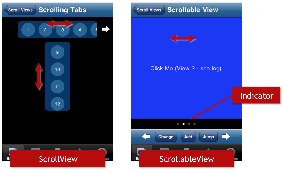
As shown in the preceding image:
A ScrollView (opens new window) is a scrollable area of content that doesn’t have to fill the viewport. Users can drag to scroll in either direction.
A ScrollableView (opens new window) is a screen-size component containing multiple sub-views. ScrollableViews are sort of like a coverflow view, or scrolling image gallery in that they contain "pages" that "snap" into place as you swipe across the container. In common usage, ScrollableViews typically display a page indicator. ScrollableViews scroll horizontally (side-to-side) only.
View the video, scrollingviews.mov, which may make the differences clearer.
# ScrollView
You create a ScrollView using the createScrollView() method, as shown here:
var sv = Ti.UI.createScrollView({
  height: 200,
  width: 200,
  /* left & right work too */
  contentHeight: Ti.UI.SIZE,
  contentWidth: Ti.UI.SIZE
})
The height and width properties define the dimensions of the ScrollView – meaning how much space within the window is used by the ScrollView. The contentHeight and contentWidth properties define the dimensions of the scrolling content within the ScrollView. By default, these values are set to the size of the content. If you set contentHeight/contentWidth smaller than the content requires, that content will be clipped. If you set those dimensions larger than the content, extra "padding" will be displayed.
# ScrollView properties
There are a few interesting properties on the ScrollView. These include:
| Property | Description |
|---|---|
| zoomScale, minZoomScale, maxZoomScale | You can control zooming of the content within the ScrollView with these properties. Each accepts a numeric value between 0 and 1. |
| horizontalBounce, verticalBounce | (iOS only) These Boolean values control whether the ScrollView displays that "bounce" effect when the user has reached the end of the scrolling content. |
| showHorizontalScrollIndicator, showVerticalScrollIndicator | These Boolean values control whether the scroll indicator (scrollbar-like gizmo) is displayed. |
| scrollType | On Android, you can set the ScrollView to either "vertical" or "horizontal" but not both. |
| canCancelEvents | On iOS, you can set this value to true (default) so that events are handled by the ScrollView rather than the views it contains. |
# Android specifics
As noted in the preceding table, on Android, a ScrollView can be either vertical or horizontal but not both. If you do not specify a type, the following logic is used to determine which scrolling direction to enable:
If you provide a
widthandcontentWidthand they are equalscrollTypedefaults to "vertical"If you provide a
heightandcontentHeightand they are equalscrollTypedefaults to "horizontal"
If Titanium cannot determine a default scroll direction and you have not explicitly set one, (as of API 1.8) you will see a warning in the console: TiUIScrollView ... Scroll direction could not be determined..
# ScrollView events
You can add eventListeners to your ScrollView the same way you'd add them to buttons, labels, and so forth. Check out the API docs (opens new window) for a complete list of event types supported as well as the event object properties available within an event's listener.
# ScrollableView
ScrollableViews display a set of Ti.UI.View objects within a scrolling container. You can create those sub-views prior to creating the ScrollableView or add them later, as shown here:
var view1 = Titanium.UI.createView({backgroundColor:'#123'});
var view2 = Titanium.UI.createView({backgroundColor:'#234'});
var view3 = Titanium.UI.createView({backgroundColor:'#345'});
var scrollable = Titanium.UI.createScrollableView({
    views:[view1,view2,view3],
  showPagingControl: true
});
win.add(scrollable);
// add another view
var view4 = Titanium.UI.createView({backgroundColor:'#456'});
scrollable.addView(view4);
// and you could remove a view with
scrollable.removeView(view1);
In general, you should define the views first and add them to the views array when you create the ScrollableView. That method will (in theory) render the quickest.
# ScrollableView properties
There are a few interesting properties on the ScrollView. These include:
| Property | Description |
|---|---|
| showPagingControl | Boolean, set to false (default) to hide the paging control (the dots that show which page you're viewing) |
| pagingControlColor | Set the background color for the paging control; you can't control the color of the dots. |
| pagingControlHeight | Set the height of the paging control area. |
| currentPage | This property accepts an index number of the view to display (zero-based, so currentPage=2 would show the third view within the ScrollableView) |
| cacheSize | This iOS-only property accepts an integer value to control the number of views pre-rendered. See the API docs (opens new window) for considerations when using this property. |
# ScrollableView methods
| Method | Description |
|---|---|
| scrollToView() | Accepts an integer or object reference of the sub-view to scroll into view within the ScrollableView. |
| addView() | Adds a view to the ScrollableView, as shown in the code above. |
| removeView() | Removes a view from the ScrollableView, as shown in the code above. |
# ScrollableView events
The ScrollableView supports the standard set of events. The API docs (opens new window) list the events and event object properties available to you.
# Hands-on Practice
# Goal
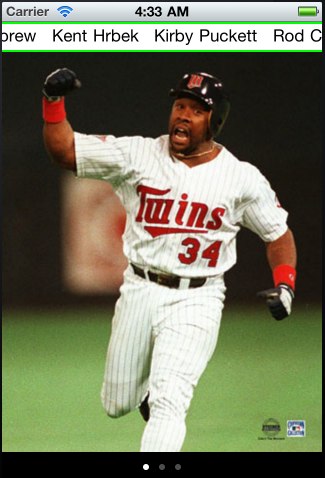
In this lab, you will create a scroll view containing a list of baseball players. That list will extend left/right beyond the width of the viewport. When the user taps a player's name, three images of that player will be displayed in a scrollable view located below the scroll view. The finished app will look like this:
# Steps
Download the starting point code, which includes the necessary graphics, from http://assets.appcelerator.com.s3.amazonaws.com/app_u/code/335.zip (opens new window).
Download and extract the starting point code.
In app.js, define three image view objects which initially display the images/harmon1.jpg, images/harmon2.jpg, and images/harmon3.jpg files. There's a placeholder comment in the file to help you locate the appropriate location.
Declare a scrollable view that is 30 points down from the top of the window. It should show a 30 point high paging controller. Set its views to be the three image views you created.
Write the
updateSVImages()function to update the three image views when called. This function accepts a simple array of image strings. Update the event listener to call your function, passing the required array of images. Make sure the first image view is displayed when the event listener is triggered.In
createCustomScrollView()create a scroll view object that fills the width of the screen but is 30 points tall. Make sure to provide for sufficient content width. Set the background color to be green.To the
containercomponent, add the five labels using thecreateCustomLabel()function provided.Write the event listener to watch for the click event. When fired, it should test for the existence of the
playercustom property. If it exists, fire the app level event to match the one you defined in the scrollable view. Pass an array of images constructed from the image path and the player's name as stored in theplayerproperty.Build and run your app in the simulator/emulator. Correct any errors and build again. Compare your finished work to the screenshot above. You should be able to click a player's name and have his pictures show in the scrollable view.
# References
API docs - ScrollView (opens new window)
API docs - ScrollableViews (opens new window)
WebViews as scrollable containers
# Summary
In this section, you learned the differences between the ScrollView and ScrollableView components. You also learned how to implement each of them. Along with the WebView, these scrolling content containers enable you to display more information than will fit onto a single screen.