Titanium.UI.ListView
Extends Titanium.UI.ViewTitanium.Proxy
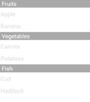
A list view is used to present information, organized in to sections and items, in a vertically-scrolling view.
| Android | iOS |
|---|---|
 |
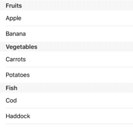 |
Use the Titanium.UI.createListView method or <ListView> Alloy element to create a ListView.
A ListView object is a container for ListSection
objects that are, in turn, containers for ListItem objects. This is
easily visualized as an Alloy view:
<Alloy>
    <ListView id="list">
        <ListSection>
            <ListItem title="List item 1"></ListItem>
            <ListItem title="List item 2"></ListItem>
            <ListItem title="List item 3"></ListItem>
        </ListSection>
    </ListView>
</Alloy>
For more instructions and examples of using ListView, refer to the
ListViews guide.
Creating a List
To create a ListView object using JavaScript, pass an array of ListDataItem objects to the list section's
items property, which creates and adds each array
element as a row to a single ListSection. Use the ListView's
sections property to add the section(s) to the list view.
By default, only the image, title and accessoryType of a list data item
are displayed in the list. Refer to the next section for using an item template.
See the "List View Sections" example.
Customizing the List Items
To create a custom list view, you need to define an ItemTemplate and define each view
component you want to add. Use the bindId property of the child template to bind a dictionary
property in the item data to a child view component.
Map the template to a style name using the Titanium.UI.ListView.templates property, then use the style name to set the Titanium.UI.ListView.defaultItemTemplate property to globally change all item styles or set the ListDataItem.template property when passing in your list data to apply the template to that one list item or to override the globally defined template.
On iOS, you can specify one of the template constants for the ListDataItem.template property or Titanium.UI.ListView.defaultItemTemplate: Titanium.UI.LIST_ITEM_TEMPLATE_CONTACTS, Titanium.UI.LIST_ITEM_TEMPLATE_SETTINGS or Titanium.UI.LIST_ITEM_TEMPLATE_SUBTITLE.
See Titanium.UI.ListItem for a detailed description of creating list items with a custom item template and see the "List View with Custom Item Template" example for a sample.
List and Table Views
This section describes the differences between the new list view and the old table view.
ListView is analogous to TableView, ListSection is analogous to TableViewSection, and
ListItem is analogous to TableViewRow.
Both list view and table view present data to user as a vertically scrolling list of rows. However, list view uses a data-oriented approach versus table view's view-oriented approach.
List view is designed for performance. One side effect of the design is that you cannot directly
manipulate the views--add children, set view properties and bind event callbacks--as you can in
TableView. Instead, you interact with list items indirectly, using templates and data items. The
next subsection describes how to use list items.
ListItem versus TableViewRow
With TableView, you can directly add rows to a table view using the data property and its accessors.
With TableViewRows, you can directly create a row using the Ti.UI.createTableViewRow and customize
its styling by setting its view properties. You can add view subcomponents to the row using the add
method.
With ListView, you need to explicitly create a ListSection in order to add a ListItem to a ListView.
You cannot directly add a ListItem to a ListView.
In a TableView, a TableViewRow can be directly added to a TableView because a
TableViewSection is implicitly created and added to the TableView.
A ListItem object is not created in the same method as a TableViewRow.
A ListItem is created by passing an array of ListDataItem objects to the ListSection.
You cannot add views to a ListItem using the add method, which could be done with a
TableViewRow. To add views to a ListItem, you need to define an ItemTemplate,
which is bound to a list data item using the template property.
You cannot explicitly set properties or bind events for a ListItem. You have to set them using the
properties dictionary of a ListDataItem or ItemTemplate and the events dictionary of the
ItemTemplate or ViewTemplate, respectively.
API Differences
-
TableViewRow properties: The following properties and their accessors are not available for
ListItem:accessibilityLabel,className,editable,hasCheck,hasChild,hasDetail,leftImage,moveableandrightImage.- For
hasCheck,hasChild, andhasDetail, use theaccessoryTypeproperty. - For
leftImageandrightImage, use theimageproperty or create a custom item template.
- For
-
TableViewRow methods:
ListItemdoes not support any methods. Adding views and binding event callbacks are supported through the item template. -
TableViewSection properties: The following properties and their accessors are not supported by
ListSection:rowsandrowCount.- For
rows, use theitemsproperty. - For
rowCount, use theitemCountproperty. (Not yet implemented.)
- For
-
TableViewSection methods: The following methods are not supported by
ListSection:add,removeandrowAtIndex.- For
rowAtIndex, use thegetItemAtmethod. - For
addandremove, use the otherListSectionmethods to manipulate theListItemobjects in theListSection.
- For
-
TableView properties: The
dataproperty and its accessors are not available forListView. Use thesectionsproperty to set theListSectionsfor aListView. You cannot directly addListItemobjects to aListView. -
TableView methods: The following methods are not available to
ListView:appendRow,deleteRow,deselectRow,insertRowAfter,insertRowBefore,selectRow,updateRow,scrollToIndexandselectRow.- For
scrollToIndex, use thescrollToItemmethod. - For
selectRow, use theselectItemmethod. (Currently implemented only for iOS.) - For all other row methods, you cannot manipulate
ListItemswith aListView. You have to manipulate them with theListSectionthey are contained in.
- For
List and Scroll Views
As a list view inherently scrolls, it creates a very poor user experience when it contains other scrolling views, such as a ScrollableView or TextArea. Thus, this layout is strongly discouraged.
TextFields in Lists with SOFT_INPUT_ADJUST_PAN (Android)
In order to use TextField inside ListView, SOFT_INPUT_ADJUST_PAN
must be set to the window that is containing the ListView, otherwise the TextField may not be able to gain focus.
When a TextField is placed in a row near the bottom of a ListView,
in a window that is configured with
SOFT_INPUT_ADJUST_PAN, it is expected for the
text field to automatically move to a visible position after it is focused and the software
keyboard displayed. However, due to a known problem caused by native Android's ListView behavior,
the keyboard is likely to completely obscure the text field.
To mitigate this, a ScrollView may be used instead of a list view, as demonstrated in the
ScrollView, "Scroll View as a Table View", example.
Editing Support
Editing a ListView through user initiated actions is supported through the following properties.
-
ListItem properties:
-
canEdit - When this is set to true, it allows the item to be deleted from the ListView through a user initiated action. The item can only be deleted when the ListView is in editing mode. The ListView can enter 'editing' mode either by explicitly setting the editing property to true, or by swiping across an item whose
canEditproperty is set to true. When the user deletes the item, a delete event is fired. -
editActions - When canEdit is set to true, the default behavior is to allow the item to be deleted. This behavior can be overridden by using the editActions property of the item. When this property is defined, the user is instead presented with the options as defined by the title property. In this scenario the ListView does not fire a delete event. Instead the editaction event is fired and the developer is free to update the ListView as required. This is supported on Titanium SDK 4.1.0 and later on the iOS platform.
-
canInsert - When this is set to true, it allows the item to insert a new item to the ListView through a user initiated action. A new item can only be inserted when the ListView is in editing mode. The ListView can enter 'editing' mode by explicitly setting the editing property to true. When the user clicks on the '+' sign of the item, an insert event is fired. Note: A new item is not inserted automatically when clicking on the '+' sign to let you decide the way to insert a new item. You can use any inserting method of Ti.UI.ListSection, for example insertItemsAt and appendItems.
-
canMove - When this item is set to true, it allows the item to be moved to a different location within the ListView. The item can only be moved when the ListView is put in editing mode by explicitly setting the editing property to true. When the user moves an item, a move event is fired.
-
-
ListView properties:
-
editing - Determines if the List View is in a state where items can be deleted or reordered.
-
requiresEditingToMove - Determines if the ListView should be able to drag-and-drop without explicitly enabling editing support (like drag bars).
-
pruneSectionsOnEdit - When this property is set to true and the user action results in a section having no other items, the section is deleted from the List View. Please note that this property only applies to the sections whose items are being edited.
-
Examples
List View Sections
Creates a list with three sections, each with two rows. Adds two sections to the table before and one after it is rendered.
var win = Ti.UI.createWindow({backgroundColor: 'gray'});
var listView = Ti.UI.createListView();
var sections = [];

var fruitDataSet = [
    {properties: { title: 'Apple'}},
    {properties: { title: 'Banana'}},
];
var fruitSection = Ti.UI.createListSection({ headerTitle: 'Fruits', items: fruitDataSet});
sections.push(fruitSection);

var vegDataSet = [
    {properties: { title: 'Carrots'}},
    {properties: { title: 'Potatoes'}},
];
var vegSection = Ti.UI.createListSection({ headerTitle: 'Vegetables', items: vegDataSet});
sections.push(vegSection);

listView.sections = sections;
win.add(listView);
win.open();

var fishDataSet = [
    {properties: { title: 'Cod'}},
    {properties: { title: 'Haddock'}},
];
var fishSection = Ti.UI.createListSection({ headerTitle: 'Fish', items: fishDataSet});
listView.appendSection(fishSection);
List View with Custom Item Template
Modifies the previous example to create a list using an item template to customize the view layout.
var win = Ti.UI.createWindow({backgroundColor: 'white'});

// Create a custom template that displays an image on the left,
// then a title next to it with a subtitle below it.
var myTemplate = {
    childTemplates: [
        {                            // Image justified left
            type: 'Ti.UI.ImageView', // Use an image view for the image
            bindId: 'pic',           // Maps to a custom pic property of the item data
            properties: {            // Sets the image view  properties
                width: '50dp', height: '50dp', left: 0
            }
        },
        {                            // Title
            type: 'Ti.UI.Label',     // Use a label for the title
            bindId: 'info',          // Maps to a custom info property of the item data
            properties: {            // Sets the label properties
                color: 'black',
                font: { fontFamily:'Arial', fontSize: '20dp', fontWeight:'bold' },
                left: '60dp', top: 0,
            }
        },
        {                            // Subtitle
            type: 'Ti.UI.Label',     // Use a label for the subtitle
            bindId: 'es_info',       // Maps to a custom es_info property of the item data
            properties: {            // Sets the label properties
                color: 'gray',
                font: { fontFamily:'Arial', fontSize: '14dp' },
                left: '60dp', top: '25dp',
            }
        }
    ]
};

var listView = Ti.UI.createListView({
    // Maps myTemplate dictionary to 'template' string
    templates: { 'template': myTemplate },
    // Use 'template', that is, the myTemplate dict created earlier
    // for all items as long as the template property is not defined for an item.
    defaultItemTemplate: 'template'
});
var sections = [];

var fruitDataSet = [
    // the text property of info maps to the text property of the title label
    // the text property of es_info maps to text property of the subtitle label
    // the image property of pic maps to the image property of the image view
    { info: {text: 'Apple'}, es_info: {text: 'Manzana'}, pic: {image: 'apple.png'}},
    { info: {text: 'Banana'}, es_info: {text: 'Banana'}, pic: {image: 'banana.png'}}
];
var fruitSection = Ti.UI.createListSection({ headerTitle: 'Fruits / Frutas', items: fruitDataSet});
sections.push(fruitSection);

var vegDataSet = [
    { info: {text: 'Carrot'}, es_info: {text: 'Zanahoria'}, pic: {image: 'carrot.png'}},
    { info: {text: 'Potato'}, es_info: {text: 'Patata'}, pic: {image: 'potato.png'}}
];
var vegSection = Ti.UI.createListSection({ headerTitle: 'Vegetables / Verduras', items: vegDataSet});
sections.push(vegSection);

var grainDataSet = [
    { info: {text: 'Corn'}, es_info: {text: 'Maiz'}, pic: {image: 'corn.png'}},
    { info: {text: 'Rice'}, es_info: {text: 'Arroz'}, pic: {image: 'rice.png'}}
];
var grainSection = Ti.UI.createListSection({ headerTitle: 'Grains / Granos', items: grainDataSet});
sections.push(grainSection);

listView.sections = sections;
win.add(listView);
win.open();
List View with a pullView
This sample shows how the pullView property could be utilized along with the pull and pullend events to create a refresh control.
var win = Ti.UI.createWindow();
var listView = Ti.UI.createListView({height:'90%', top:0});
var sections = [];

var fruitDataSet = [
    {properties: { title: 'Apple'}},
    {properties: { title: 'Banana'}},
];
var fruitSection = Ti.UI.createListSection({ headerTitle: 'Fruits', items: fruitDataSet});
sections.push(fruitSection);

var vegDataSet = [
    {properties: { title: 'Carrots'}},
    {properties: { title: 'Potatoes'}},
];
var vegSection = Ti.UI.createListSection({ headerTitle: 'Vegetables', items: vegDataSet});

var fishDataSet = [
    {properties: { title: 'Cod'}},
    {properties: { title: 'Haddock'}},
];
var fishSection = Ti.UI.createListSection({ headerTitle: 'Fish', items: fishDataSet});

listView.sections = sections;
var refreshCount = 0;

function getFormattedDate(){
    var date = new Date();
    return date.getMonth() + '/' + date.getDate() + '/' + date.getFullYear() + ' ' + date.getHours() + ':' + date.getMinutes();
}

function resetPullHeader(){
    actInd.hide();
    imageArrow.transform=Ti.UI.createMatrix2D();
    if (refreshCount < 2) {
        imageArrow.show();
        labelStatus.text = 'Pull down to refresh...';
        labelLastUpdated.text = 'Last Updated: ' + getFormattedDate();
    } else {
        labelStatus.text = 'Nothing To Refresh';
        labelLastUpdated.text = 'Last Updated: ' + getFormattedDate();
        listView.removeEventListener('pull', pullListener);
        listView.removeEventListener('pullend', pullendListener);
        eventStatus.text = 'Removed event listeners.';
    }
    listView.setContentInsets({top:0}, {animated:true});
}

function loadTableData()
{
    if (refreshCount == 0) {
        listView.appendSection(vegSection);
    } else if (refreshCount == 1) {
        listView.appendSection(fishSection);
    }
    refreshCount ++;
    resetPullHeader();
}

function pullListener(e){
    eventStatus.text = 'EVENT pull FIRED. e.active = '+e.active;
    if (e.active == false) {
        var unrotate = Ti.UI.createMatrix2D();
        imageArrow.animate({transform:unrotate, duration:180});
        labelStatus.text = 'Pull down to refresh...';
    } else {
        var rotate = Ti.UI.createMatrix2D().rotate(180);
        imageArrow.animate({transform:rotate, duration:180});
        if (refreshCount == 0) {
            labelStatus.text = 'Release to get Vegetables...';
        } else {
            labelStatus.text = 'Release to get Fish...';
        }
    }
}

function pullendListener(e){
    eventStatus.text = 'EVENT pullend FIRED.';

    if (refreshCount == 0) {
        labelStatus.text = 'Loading Vegetables...';
    } else {
        labelStatus.text = 'Loading Fish...';
    }
    imageArrow.hide();
    actInd.show();
    listView.setContentInsets({top:80}, {animated:true});
    setTimeout(function(){
        loadTableData();
    }, 2000);
}

var tableHeader = Ti.UI.createView({
    backgroundColor:'#e2e7ed',
    width:320, height:80
});

var border = Ti.UI.createView({
    backgroundColor:'#576c89',
    bottom:0,
    height:2
});
tableHeader.add(border);

var imageArrow = Ti.UI.createImageView({
    image:'arrow.png',
    left:20, bottom:10,
    width:23, height:60
});
tableHeader.add(imageArrow);

var labelStatus = Ti.UI.createLabel({
    color:'#576c89',
    font:{fontSize:13, fontWeight:'bold'},
    text:'Pull down to refresh...',
    textAlign:'center',
    left:55, bottom:30,
    width:200
});
tableHeader.add(labelStatus);

var labelLastUpdated = Ti.UI.createLabel({
    color:'#576c89',
    font:{fontSize:12},
    text:'Last Updated: ' + getFormattedDate(),
    textAlign:'center',
    left:55, bottom:15,
    width:200
});
tableHeader.add(labelLastUpdated);

var actInd = Ti.UI.createActivityIndicator({
    left:20, bottom:13,
    width:30, height:30
});
tableHeader.add(actInd);
listView.pullView = tableHeader;
listView.addEventListener('pull', pullListener);
listView.addEventListener('pullend',pullendListener);

var eventStatus = Ti.UI.createLabel({
    font:{fontSize:13, fontWeight:'bold'},
    text: 'Event data will show here',
    bottom:0,
    height:'10%'
})

win.add(listView);
win.add(eventStatus);
win.open();
Alloy XML Markup
'List View with Custom Item Template' as an Alloy view. List view markup is supported in Alloy 1.2.0 and later.
app/views/index.xml:
<Alloy>
    <Window>
        <ListView id="listView" defaultItemTemplate="template">

            <!-- The Templates tag sets the ListView's templates property -->

            <Templates>

                <!-- Define your item templates within the Templates tags or use the
                      Require tag to include a view that only contains an ItemTemplate -->

                <ItemTemplate name="template">
                    <ImageView bindId="pic" id="icon" />
                    <Label bindId="info" id="title" />
                    <Label bindId="es_info" id="subtitle" />
                </ItemTemplate>

            </Templates>

            <ListSection headerTitle="Fruit / Frutas">

                <!-- You can specify any ListItem or ListDataItem properties in ListItem -->

                <!-- Specify data to bind to the item template with inline attributes
                      defined as <bindId>:<Ti.UI.Component.property> -->

                <ListItem info:text="Apple" es_info:text="Manzana" pic:image="/apple.png" />
                <ListItem info:text="Banana" es_info:text="Banana" pic:image="/banana.png" />
            </ListSection>
            <ListSection headerTitle="Vegetables / Verduras">
                <ListItem info:text="Carrot" es_info:text="Zanahoria" pic:image="/carrot.png" />
                <ListItem info:text="Potato" es_info:text="Patata" pic:image="/potato.png" />
            </ListSection>
            <ListSection headerTitle="Grains / Granos">
                <ListItem info:text="Corn" es_info:text="Maiz" pic:image="/corn.png" />
                <ListItem info:text="Rice" es_info:text="Arroz" pic:image="/rice.png" />
            </ListSection>
        </ListView>
    </Window>
</Alloy>app/styles/index.tss:
"#icon" : {
    width: '50dp', height: '50dp', left: 0
},
"#title" : {
    color: 'black',
    font: { fontFamily:'Arial', fontSize: '20dp', fontWeight:'bold' },
    left: '60dp', top: 0
},
"#subtitle" : {
    color: 'gray',
    font: { fontFamily:'Arial', fontSize: '14dp' },
    left: '60dp', top: '25dp'
}
Alloy example of ListView properties
Supported in Alloy 1.3.0 and later.
In Alloy, ListView's searchView, headerView, footerView, and pullView
properties may be declared as XML elements inline with the ListView element. The example
below demonstrates how to use searchView, headerView and footerView.
<Alloy>
    <Window fullscreen="true">
        <ListView>
            <!-- Sets ListView's searchView property.
                  For Android, you can also do <SearchView platform="android" />
                  to use a Ti.UI.Android.SearchView instead of a search bar. -->
            <SearchBar barColor="#000" />

            <!-- Sets ListView's headerView property -->
            <HeaderView>
                <View backgroundColor="#DDD" height="Ti.UI.SIZE">
                    <Label>Header View</Label>
                </View>>
            </HeaderView>

            <ListSection>
                <ListItem title="Papaya" searchableText="Papaya"/>
                <ListItem title="Peach" searchableText="Peach"/>
                <ListItem title="Pear" searchableText="Pear"/>
                <ListItem title="Persimmon" searchableText="Persimmon"/>
                <ListItem title="Pineapple" searchableText="Pineapple"/>
                <ListItem title="Pluot" searchableText="Pluto"/>
                <ListItem title="Pomegranate" searchableText="Pomegranate"/>
            </ListSection>

            <!-- Sets ListView's footerView property -->
            <FooterView>
                <View backgroundColor="#DDD" height="Ti.UI.SIZE">
                    <Label>Footer View</Label>
                </View>
            </FooterView>
        </ListView>
    </Window>
</Alloy>
Alloy example of `<PullView>` element
The example below demonstrates how to use a <PullView> Alloy element.
<!-- views/index.xml -->
<Alloy>
    <Window class="container" >
        <ListView id="list">
            <ListSection>
                <ListItem title="Number 1"></ListItem>
                <ListItem title="Number 2"></ListItem>
            </ListSection>
            <PullView>
                <View backgroundColor="red" height="50">
                    <Label>Release to reload</Label>
                </View>
            </PullView>
        </ListView>
    </Window>
</Alloy>
Properties 122
Inherited from Titanium.UI.View
Boolean value to remove the long press notification for the device's accessibility service.
Default: true
Inherited from Titanium.UI.View
Whether the view should be "hidden" from (i.e., ignored by) the accessibility service.
Default: false
Inherited from Titanium.UI.View
Briefly describes what performing an action (such as a click) on the view will do.
Default: null
Inherited from Titanium.UI.View
A succinct label identifying the view for the device's accessibility service.
Inherited from Titanium.UI.View
A string describing the value (if any) of the view for the device's accessibility service.
allowsMultipleSelectionDuringEditing
Booleansince Android 10.1.0, iPhone 7.0.0, iPad 7.0.0, macOS 9.2.0Determines whether multiple items of this list view can be selected at the same time while editing the table.
Default: false
allowsMultipleSelectionInteraction
Booleansince Android 10.1.0, iPhone 8.2.0, iPad 8.2.0, macOS 9.2.0Allows a two-finger pan gesture to automatically transition the table view into editing mode and start selecting rows.
Setting this property to true allows the user to start selecting multiple contiguous rows via a two-finger pan gesture. If the table view is already in editing mode, the user can also select multiple rows via a one-finger pan gesture along the edge of the table that contains editing controls (checkboxes). In order to support this behavior, you must also set Titanium.UI.ListView.allowsMultipleSelectionDuringEditing to true. Once user interaction stops the Titanium.UI.ListView.itemsselected event is fired.
Default: false
Determines whether this item can be selected.
Set to false to prevent the item from being selected.
On iOS, even if this property is set to false, you can interact with the detail disclosure
accessory (accessoryType set to Titanium.UI.LIST_ACCESSORY_TYPE_DETAIL) and any child
templates that are controls, such as a button, slider, etc.
Default: true
Determines whether this list view items can be selected while editing the table.
Default: false
Inherited from Titanium.UI.View
Coordinate of the view about which to pivot an animation.
Inherited from Titanium.UI.View
Current position of the view during an animation.
Inherited from Titanium.Proxy
The name of the API that this proxy corresponds to.
backgroundColor
String | Titanium.UI.ColorInherited from Titanium.UI.View
Background color of the view, as a color name or hex triplet.
Inherited from Titanium.UI.View
Disabled background color of the view, as a color name or hex triplet.
Inherited from Titanium.UI.View
Disabled background image for the view, specified as a local file path or URL.
Inherited from Titanium.UI.View
Focused background color of the view, as a color name or hex triplet.
Inherited from Titanium.UI.View
Focused background image for the view, specified as a local file path or URL.
Inherited from Titanium.UI.View
A background gradient for the view.
Linear and Radial Gradients
The following code excerpt creates two views, one with a linear gradient and one with a radial gradient.
var win1 = Titanium.UI.createWindow({
    title:'Tab 1',
    backgroundColor:'#fff',
    layout: 'vertical'
});

var radialGradient = Ti.UI.createView({
    top: 10,
    width: 100,
    height: 100,
    backgroundGradient: {
        type: 'radial',
        startPoint: { x: 50, y: 50 },
        endPoint: { x: 50, y: 50 },
        colors: [ 'red', 'blue'],
        startRadius: 50,
        endRadius: 0,
        backfillStart: true
    }
});
var linearGradient = Ti.UI.createView({
    top: 10,
    width: 100,
    height: 100,
    backgroundGradient: {
        type: 'linear',
        startPoint: { x: '0%', y: '50%' },
        endPoint: { x: '100%', y: '50%' },
        colors: [ { color: 'red', offset: 0.0}, { color: 'blue', offset: 0.25 }, { color: 'red', offset: 1.0 } ],
    }
});
win1.add(radialGradient);
win1.add(linearGradient);
win1.open();
backgroundImage
StringInherited from Titanium.UI.View
Background image for the view, specified as a local file path or URL.
Inherited from Titanium.UI.View
Size of the left end cap.
Default: 0
backgroundRepeat
BooleanInherited from Titanium.UI.View
Determines whether to tile a background across a view.
Default: false
Inherited from Titanium.UI.View
Size of the top end cap.
Default: 0
borderColor
String | Titanium.UI.ColorInherited from Titanium.UI.View
Border color of the view, as a color name or hex triplet.
borderRadius
Number | String | Array<Number> | Array<String>Inherited from Titanium.UI.View
Radius for the rounded corners of the view's border.
Default: 0
borderWidth
NumberInherited from Titanium.UI.View
Border width of the view.
Default: 0
bottom
Number | StringInherited from Titanium.UI.View
View's bottom position, in platform-specific units.
Inherited from Titanium.Proxy
Indicates if the proxy will bubble an event to its parent.
Default: true
Determines if the list view can scroll in response to user actions.
Set to false to disable scrolling.
Default: true
Determines if the search performed is case insensitive.
Used in conjunction with searchView and searchText properties of List View and searchableText property of List Item.
Default: true
Inherited from Titanium.UI.View
View's center position, in the parent view's coordinates.
Inherited from Titanium.UI.View
View's clipping behavior.
X and Y coordinates to which to reposition the top-left point of the content region.
Determines if the scrolling event should fire every time there is a new visible item.
When setting continuousUpdate to true the scrolling event will fire every time a new item is scrolled in.
Default: false
defaultItemTemplate
String | NumberSets the default template for list data items that do not specify the template property.
Can be set to any of the built-in templates or those defined in the templates property.
Can be changed dynamically.
Default: Titanium.UI.LIST_ITEM_TEMPLATE_DEFAULT
A Boolean indicating whether the underlying content is dimmed during a search.
If you do not want to show the dimmed background when clicking on the search bar,
set this property false during creation.
Default: true
Determines whether the scroll-bounce of the list view should be disabled.
Set to true to disable the vertical bounce.
Default: false
Determines if the list view is currently in editing mode.
For more information see the "Editing Support" section of Titanium.UI.ListView.
Default: false
Inherited from Titanium.UI.View
Base elevation of the view relative to its parent in pixels.
Sets the fastScroll mode on Android ListViews.
Set to true to enable fastScroll mode. When fast scrolling is enabled, the user
can quickly scroll through lists by dragging the fast scroll thumb.
Default: false
Inherited from Titanium.UI.View
Discards touch related events if another app's system overlay covers the view.
Default: false
Sets fixedSize mode on Android ListViews.
Set it to true if all ListItems have the same size to gain some performance.
Default: false
Inherited from Titanium.UI.View
Whether view should be focusable while navigating with the trackball.
Default: false
When set to false, the ListView will not draw the divider before the footer view.
Default: undefined but behaves as false
footerTitle
StringList view footer title.
List view footer as a view that will be rendered instead of a label.
In Alloy you can specify this property with a <FooterView> child element of a <ListView>
element (see Examples). On Android, this is a creation only property.
Optimize the continuousUpdate scrolling event.
If continuousUpdate is enabled and you set forceUpdates to true it will fire the scrolling](Titanium.UI.ListView.scrolling) all the time.
Otherwise it will only update when a new item is scrolled in (default).
Default: false
When set to false, the ListView will not draw the divider after the header view.
Default: undefined but behaves as false
headerTitle
StringList view header title.
List view header as a view that will be rendered instead of a label.
On Android, this is a creation only property.
In Alloy you can specify this property with a <HeaderView> child element of a <ListView>
element (see Examples).
height
Number | StringInherited from Titanium.UI.View
View height, in platform-specific units.
Inherited from Titanium.UI.View
Adds a horizontal parallax effect to the view
Inherited from Titanium.UI.View
Determines whether the layout has wrapping behavior.
Default: true
id
StringInherited from Titanium.UI.View
View's identifier.
Inherited from Titanium.UI.View
A value indicating the render mode of the View
Default: false
Inherited from Titanium.UI.View
Determines whether to keep the device screen on.
Default: false
Determines if the section information is displayed in the search results when using the searchText property.
Used in conjunction with searchText property of List View and searchableText property of List Item.
Default: false
The manner in which the keyboard is dismissed when a drag begins in the list view.
Default: Undefined (behaves like <Titanium.UI.iOS.KEYBOARD_DISMISS_MODE_NONE>)
layout
StringInherited from Titanium.UI.View
Specifies how the view positions its children. One of: 'composite', 'vertical', or 'horizontal'.
Determines if the list view should use lazy loading to load remote images.
Lazy loading is used to load remote images only if they are in the visible view area. It is enabled by default. If you disable it, images will be loaded even if they are currently not visible. Disabling improves the loading of images, but can also cause trouble in list views having a lot of remote images, because every remote image opens a new HTTP request.
Default: true
left
Number | StringInherited from Titanium.UI.View
View's left position, in platform-specific units.
Inherited from Titanium.Proxy
The Window or TabGroup whose Activity lifecycle should be triggered on the proxy.
The insets for the list view header and footer.
Cell separators do not extend all the way to the edge of the list view. Set this to a
dictionary with two keys, left specifying inset from left edge and right specifying the inset from the
right edge. If the rowSeparatorInsets is not set, the listSeparatorInsets will also set the cell insets.
For example:
listView.listSeparatorInsets = {
    left: 10,
    right: 10
};
opacity
NumberInherited from Titanium.UI.View
Opacity of this view, from 0.0 (transparent) to 1.0 (opaque). Defaults to 1.0 (opaque).
Inherited from Titanium.UI.View
When on, animate call overrides current animation if applicable.
Inherited from Titanium.UI.View
The preview context used in the 3D-Touch feature "Peek and Pop".
Determines if empty sections are retained when the user completes editing the list view.
For more information see the "Editing Support" section of Titanium.UI.ListView.
Default: false
Inherited from Titanium.UI.View
Background color of the wrapper view when this view is used as either Titanium.UI.ListView.pullView or Titanium.UI.TableView.headerPullView.
Defaults to undefined. Results in a light grey background color on the wrapper view.
View positioned above the first row that is only revealed when the user drags the list view contents down.
A pullView is a UI control that is often used to provide a convenient way for the user to refresh
a table's data. Typically used in conjunction with setContentInsets
method and pull and pullend events.
To specify the wrapper color see Titanium.UI.View.pullBackgroundColor.
In Alloy you can assign this property with a <PullView> child element of a <ListView>
element:
<Alloy>
  <ListView>
    <ListSection>
      <ListItem title="Item a"></ListItem>
      <ListItem title="Item b"></ListItem>
      <ListItem title="Item c"></ListItem>
    </ListSection>
    <PullView>
      <View height="50" backgroundColor="black">
        <Label/>
      </View>
    </PullView>
  </ListView>
</Alloy>
See the code example on pullView to see how it may be utilized.
Inherited from Titanium.UI.View
The bounding box of the view relative to its parent, in system units.
View positioned above the first row that is only revealed when the user drags the list view contents down.
An alternate to the pullView property. See Titanium.UI.RefreshControl for usage and examples.
Determines if the list view should allow drag-and-drop even without going into the editing mode
For more information see the "Editing Support" section of Titanium.UI.ListView.
Default: true
The background color of the search results (iOS-only).
For information about color values, see the "Colors" section of Titanium.UI. Note: A transparent background-color is not officially supported by Apple to prevent that the list of results overlaps with the list view below it.
Default: undefined (behaves as white)
Separator line color between rows inside search results, as a color name or hex triplet (iOS-only).
To make the line invisible, set this property to transparent, or the same value as the
backgroundColor property.
For information about color values, see the "Colors" section of Titanium.UI.
Default: undefined (behaves as gray)
The insets for search results separators (applies to all cells & iOS-only).
Cell separators do not extend all the way to the edge of the list view.
This property sets the default inset for all cells in the table.
Set this to a dictionary with two keys, left specifying inset from left edge and right
specifying the inset from the right edge.
The separator style of the search results (iOS-only).
right
Number | StringInherited from Titanium.UI.View
View's right position, in platform-specific units.
Inherited from Titanium.UI.View
Clockwise 2D rotation of the view in degrees.
Inherited from Titanium.UI.View
Clockwise rotation of the view in degrees (x-axis).
Inherited from Titanium.UI.View
Clockwise rotation of the view in degrees (y-axis).
The insets for list view cells (applies to all cells).
Cell separators do not extend all the way to the edge of the list view. Set this to a
dictionary with two keys, left specifying inset from left edge and right specifying the inset from the
right edge. This property is only available upon creation of the cells.
For example:
listView.rowSeparatorInsets = {
    left: 10,
    right: 10
};Inherited from Titanium.UI.View
Scaling of the view in x-axis in pixels.
Inherited from Titanium.UI.View
Scaling of the view in y-axis in pixels.
Style of the scrollbar.
Default: <Titanium.UI.iOS.ScrollIndicatorStyle.DEFAULT>
The string to use as the search parameter.
Provides a generic search API for the List View. This property can not be used when the searchView property is set. Used in conjunction with caseInsensitiveSearch property of List View and searchableText property of List Item.
On iOS, when using this property the style property of the List View is honored. If the keepSectionsInSearch property is set to true then section information is preserved in the search results, otherwise the search results are displayed in a single section.
Search field to use for the list view.
Provides the same functionality as the search property in TableView. Used in conjunction with caseInsensitiveSearch property of List View and searchableText property of List Item.
On Android, you can either specify Titanium.UI.SearchBar or Titanium.UI.Android.SearchView, while on iOS only Titanium.UI.SearchBar is supported.
In an Alloy application, you can use a <SearchView> or <SearchBar> element inside a <ListView> element.
<Alloy>
    <ListView>
        <!-- search, shorthand with Ti.UI.SearchBar -->
      <SearchBar class="search" platform="ios"/>
      <!-- search, shorthand with Ti.UI.Android.SearchView -->
      <SearchView ns="Ti.UI.Android" class="search" platform="android"/>
    </ListView>
</Alloy>Number of sections in this list view.
Padding above each section header.
If not set or set to -1, it defaults to an automatic spacing determined by the system.
Array of objects (with title and index properties) to control the list view index.
If an index array is specified, an index bar is displayed on the right-hand side of the list view. Clicking on a title in the index bar scrolls the list view to the section index associated with that title.
Sections of this list.
Returns the selected list view items.
Separator line color between items, as a color name or hex triplet.
To make the line invisible, set this property to transparent, or the same value as the
backgroundColor property.
For information about color values, see the "Colors" section of Titanium.UI.
Default: platform-specific default color
height of the ListView separator.
Height of the ListView separator, in platform-specific units. If undefined, default native height will be used. Numerical inputs are treated as pixels. For example, 3 and "3px" are equivalent. On Android API < 23 you must specify Titanium.UI.ListView.separatorStyle and Titanium.UI.ListView.separatorColor for this property to work.
Deprecated since 5.2.0
Use Titanium.UI.ListView.listSeparatorInsets instead.
The insets for list view separators (applies to all cells).
Cell separators do not extend all the way to the edge of the list view.
This property sets the default inset for all cells in the table.
Set this to a dictionary with two keys, left specifying inset from left edge and right specifying the inset from the right edge.
Separator style constant.
A Boolean indicating whether search bar will be in navigation bar.
If you want to show the search bar in navigation bar, set this property true during creation.
Use the Titanium.UI.Window.hidesSearchBarWhenScrolling property to control the visibility of the
searchbar when scrolling.
Default: false
Determines whether the selection checkmark is displayed on selected items.
Default: true
showVerticalScrollIndicator
BooleanDetermines whether this list view displays a vertical scroll indicator.
Set to false to hide the vertical scroll indicator.
Default: true
Inherited from Titanium.UI.View
The size of the view in system units.
Inherited from Titanium.UI.View
Determines keyboard behavior when this view is focused. Defaults to Titanium.UI.Android.SOFT_KEYBOARD_DEFAULT_ON_FOCUS.
Style of the list view.
Style should always be set before setting the sections on list view.
Default: Titanium.UI.iOS.ListViewStyle.PLAIN
Deprecated since 5.4.0
Use Titanium.UI.ListView.listSeparatorInsets instead.
The insets for the table view header and footer.
Cell separators do not extend all the way to the edge of the list view. Set this to a
dictionary with two keys, left specifying inset from left edge and right specifying the inset from the
right edge. If the rowSeparatorInsets is not set, the tableSeparatorInsets will also set the cell insets.
For example:
listView.tableSeparatorInsets = {
    left: 10,
    right: 10
};Contain key-value pairs mapping a style name (key) to an ItemTemplate (value).
This property cannot be changed once a window has been opened.
Inherited from Titanium.UI.View
The view's tintColor
Default: null
Inherited from Titanium.UI.View
The default text to display in the control's tooltip.
top
Number | StringInherited from Titanium.UI.View
The view's top position.
touchEnabled
BooleanInherited from Titanium.UI.View
Determines whether view should receive touch events.
Default: true
A material design visual construct that provides an instantaneous visual confirmation of touch point.
Touch feedback is only applied to a view's background.
Default: true
Inherited from Titanium.UI.View
Optional touch feedback ripple color. This has no effect unless touchFeedback is true.
Inherited from Titanium.UI.View
Transformation matrix to apply to the view.
Default: Identity matrix
Inherited from Titanium.UI.View
A name to identify this view in activity transition.
Inherited from Titanium.UI.View
Horizontal location of the view relative to its left position in pixels.
Inherited from Titanium.UI.View
Vertical location of the view relative to its top position in pixels.
Inherited from Titanium.UI.View
Depth of the view relative to its elevation in pixels.
Inherited from Titanium.UI.View
Adds a vertical parallax effect to the view
viewShadowColor
String | Titanium.UI.Colorsince Android 11.1.0, iPhone 3.3.0, iPad 3.3.0, macOS 9.2.0Inherited from Titanium.UI.View
Determines the color of the shadow.
Inherited from Titanium.UI.View
Determines the offset for the shadow of the view.
Inherited from Titanium.UI.View
Determines the blur radius used to create the shadow.
visible
BooleanInherited from Titanium.UI.View
Determines whether the view is visible.
Default: true
width
Number | StringInherited from Titanium.UI.View
View's width, in platform-specific units.
Controls the scroll-to-top gesture.
If the user taps on the status bar, the view scrolls to the top.
This gesture works when you have a single visible list view.
If there are multiple list views, table views, web views, text areas, and/or scroll views visible,
you need to disable (set to false) this property on the views you DO NOT want to
enable this behavior for. The remaining view responds to the scroll-to-top gesture.
Default: true
zIndex
NumberInherited from Titanium.UI.View
Z-index stack order position, relative to other sibling views.
Methods 24
Inherited from Titanium.Proxy
Adds the specified callback as an event listener for the named event.
| Parameters | Type | Description |
|---|---|---|
| name | String | Name of the event. |
| callback | Callback<Titanium.Event> | Callback function to invoke when the event is fired. 4 fields
|
addMarker
since 4.1.0Adds a reference item in the list view.
See marker event for details.
| Parameters | Type | Description |
|---|---|---|
| markerProps | ListViewMarkerProps | Dictionary to describe the reference item. 2 fields
|
Inherited from Titanium.UI.View
Animates this view.
| Parameters | Type | Description |
|---|---|---|
| animation | Titanium.UI.Animation | Dictionary<Titanium.UI.Animation> | Either a dictionary of animation properties or an Animation object. |
| callback? | Callback<Object> | Function to be invoked upon completion of the animation. |
Appends a single section or an array of sections to the end of the list.
On iOS, the section(s) can be inserted with an animation by specifying the animation
parameter.
| Parameters | Type | Description |
|---|---|---|
| section | Titanium.UI.ListSection | Array<Titanium.UI.ListSection> | Section or sections to add to the list. |
| animation? | ListViewAnimationProperties | Animation properties. (iOS only.) |
applyProperties
since 3.0.0Inherited from Titanium.Proxy
Applies the properties to the proxy.
| Parameters | Type | Description |
|---|---|---|
| props | Dictionary | A dictionary of properties to apply. |
Inherited from Titanium.UI.View
Removes all previously added motion effects.
convertPointToView
since Android 1.8, iPhone 1.8, iPad 1.8, macOS 9.2.0Inherited from Titanium.UI.View
Translates a point from this view's coordinate system to another view's coordinate system.
| Parameters | Type | Description |
|---|---|---|
| point | Point | A point in this view's coordinate system. If this argument is missing an |
| destinationView | Titanium.UI.View | View that specifies the destination coordinate system to convert to. If this argument is not a view, an exception will be raised. |
Deletes an existing section.
On iOS, the section can be deleted with an animation by specifying the animation parameter.
| Parameters | Type | Description |
|---|---|---|
| sectionIndex | Number | Index of the section to delete. |
| animation? | ListViewAnimationProperties | Animation properties. (iOS only.) |
Deselects a specific item.
| Parameters | Type | Description |
|---|---|---|
| sectionIndex | Number | Section index. |
| itemIndex | Number | Item index. |
Inherited from Titanium.Proxy
Fires a synthesized event to any registered listeners.
| Parameters | Type | Description |
|---|---|---|
| name | String | Name of the event. |
| event? | Dictionary | A dictionary of keys and values to add to the Titanium.Event object sent to the listeners. |
getViewById
since 6.1.0Inherited from Titanium.UI.View
Returns the matching view of a given view ID.
| Parameters | Type | Description |
|---|---|---|
| id | String | The ID of the view that should be returned. Use the |
Inherited from Titanium.UI.View
Hides this view.
| Parameters | Type | Description |
|---|---|---|
| options? | AnimatedOptions | Animation options for Android only. Since SDK 5.1.0 and used only on Android 5.0+ Determines whether to enable a circular reveal animation.
Note that the default here is equivalent to passing in |
insertAt
since 3.3.0Inherited from Titanium.UI.View
Inserts a view at the specified position in the children array.
| Parameters | Type | Description |
|---|---|---|
| params | ViewPositionOptions | Pass an object that specifies the view to insert and optionally at which position (defaults to end) 2 fields
|
Inserts a section or an array of sections at a specific index.
Existing sections at that index and after are pushed down.
On iOS, the section(s) may be inserted with an animation by setting the animation parameter.
| Parameters | Type | Description |
|---|---|---|
| sectionIndex | Number | Index of the section to insert before. |
| section | Titanium.UI.ListSection | Array<Titanium.UI.ListSection> | Section or sections to insert. |
| animation? | ListViewAnimationProperties | Animation properties. (iOS only.) |
Inherited from Titanium.Proxy
Removes the specified callback as an event listener for the named event.
| Parameters | Type | Description |
|---|---|---|
| name | String | Name of the event. |
| callback | Callback<Titanium.Event> | Callback function to remove. Must be the same function passed to 4 fields
|
Replaces an existing section.
On iOS, the section may be replaced with an animation by setting the animation parameter.
| Parameters | Type | Description |
|---|---|---|
| sectionIndex | Number | Index of the section to update. |
| section | Titanium.UI.ListSection | section data to update. |
| animation? | ListViewAnimationProperties | Animation properties. (iOS only.) |
Scrolls to a specific item.
On Android 4.x, the list does not stop at the correct position. This is a known bug in Android. (Android Issue #37278)
Android added support for the animation parameter in Release 3.3.0 on the Titanium SDK.
| Parameters | Type | Description |
|---|---|---|
| sectionIndex | Number | Section index. |
| itemIndex | Number | Item index. |
| animation? | ListViewAnimationProperties | Animation properties. (iOS, Android and Windows) |
selectItem
iPhoneiPadmacOSSelects an item in the list using the specified item and section indices.
| Parameters | Type | Description |
|---|---|---|
| sectionIndex | Number | Index of the section the item is in. |
| itemIndex | Number | Index of the item to select. |
Sets this list view's content insets.
A list view is essentially a scroll view that contains a set of static row views that
represents the content. Thus, the setContentInsets method facilitates a margin, or inset,
distance between the content and the container scroll view.
Typically used with the pullView property.
| Parameters | Type | Description |
|---|---|---|
| edgeInsets | Padding | Sets the distance that the content view is inset from the enclosing scroll view of the list view. For example |
| options? | AnimatedWithDurationOptions | Determines whether, and how, the content inset change should be animated.
Note that the default here is equivalent to passing in |
setContentOffset
since Android 10.1.0, iPhone 3.4.0, iPad 3.4.0, macOS 9.2.0Sets the value of the content offset of the list view without animation by default.
| Parameters | Type | Description |
|---|---|---|
| contentOffset | Point | Dictionary with the properties |
| options? | AnimatedOptions | Pass in |
setMarker
since 3.2.0Sets a reference item in the list view.
This method replaces previous reference items with the current one. See marker event for details.
| Parameters | Type | Description |
|---|---|---|
| markerProps | ListViewMarkerProps | Dictionary to describe the reference item. 2 fields
|
Inherited from Titanium.UI.View
Makes this view visible.
| Parameters | Type | Description |
|---|---|---|
| options? | AnimatedOptions | Animation options for Android only. Since SDK 5.1.0 and only used on Android 5.0+ Determines whether to enable a circular reveal animation.
Note that the default here is equivalent to passing in |
Inherited from Titanium.UI.View
Stops a running animation.
Inherited from Titanium.UI.View
Returns an image of the rendered view, as a Blob.
| Parameters | Type | Description |
|---|---|---|
| callback? | Callback<Titanium.Blob> | Function to be invoked upon completion. If non-null, this method will be performed asynchronously. If null, it will be performed immediately. |
| honorScaleFactor? | Boolean | Determines whether the image is scaled based on scale factor of main screen. (iOS only) When set to true, image is scale factor is honored. When set to false, the image in the blob has the same dimensions for retina and non-retina devices. |
Events 21
Fired when list items that previously were considered as candidates for pre-fetching were not actually used. Note that this event is only available on iOS 10 and later
Use the sectionIndex and itemIndex, or the itemId to determine the list item that generated
the event, and use the bindId to check which child control fired the event.
| Event properties | Type | Description |
|---|---|---|
| prefetchedItems | Array<ListItemEventType> | An array of prefetched items. 4 fields
|
delete
since Android 10.0.0, iPhone 3.2.0, iPad 3.2.0, macOS 9.2.0Fired when a list row is deleted by the user.
Do not rely on the source property to determine which item fired the event. Use the
sectionIndex and itemIndex, or the itemId to determine the list item that generated
the event, and use the bindId to check which child control fired the event.
Note that the sectionIndex and itemIndex properties of this event correspond to the List View state
before the user action.
| Event properties | Type | Description |
|---|---|---|
| section | Titanium.UI.ListSection | List section from which the item is deleted. |
| sectionIndex | Number | Section index. |
| itemIndex | Number | Item index. |
| itemId | String | The item ID bound to the list item that generated the event. |
| bubbles | Boolean | false. This event does not bubble. |
Fired when the user stops dragging the list view.
Different to the pullend event, this event does also fire when no pullView
is specified and the user drags inside the list view.
| Event properties | Type | Description |
|---|---|---|
| bubbles | Boolean | false. This event does not bubble. |
Fired when the user starts dragging the list view.
Different to the pull event, this event does also fire when no pullView
is specified and the user drags inside the list view.
| Event properties | Type | Description |
|---|---|---|
| bubbles | Boolean | false. This event does not bubble. |
Fired when the user interacts with one of the custom edit actions defined by Titanium.UI.ListItem.editActions.
Do not rely on the source property to determine which item fired the event. Use the
sectionIndex and itemIndex, or the itemId to determine the list item that generated
the event.
Note that the sectionIndex and itemIndex properties of this event correspond to the list view state
before the user action.
| Event properties | Type | Description |
|---|---|---|
| action | String | The title as defined in the row action object. |
| identifier | String | The [identifier](RowActionType. identifier) of the row action. Only included in the event if previously defined. Available in Titanium 6.0.0 and later. |
| section | Titanium.UI.ListSection | List section from which the event was generated. |
| sectionIndex | Number | Section index. |
| itemIndex | Number | Item index. |
| itemId | String | The item ID bound to the list item that generated the event. |
| bubbles | Boolean | false. This event does not bubble. |
Fired when the index bar is clicked by the user.
If the list view contains the sectionIndexTitles array of indices the index bar will appear on the side. This event will fire when this bar is clicked
| Event properties | Type | Description |
|---|---|---|
| title | String | The title of the index clicked. |
| index | Number | The index number clicked. |
Fired when a list row is inserted by the user.
Do not rely on the source property to determine which item fired the event. Use the
sectionIndex and itemIndex, or the itemId to determine the list item that generated
the event, and use the bindId to check which child control fired the event.
Note that the sectionIndex and itemIndex properties of this event correspond to the List View state
before the user action.
| Event properties | Type | Description |
|---|---|---|
| section | Titanium.UI.ListSection | List section from which the item is deleted. |
| sectionIndex | Number | Section index. |
| itemIndex | Number | Item index. |
| itemId | String | The item ID bound to the list item that generated the event. |
| bubbles | Boolean | false. This event does not bubble. |
Fired when a list row is clicked by the user.
Do not rely on the source property to determine which item fired the event. Use the
sectionIndex and itemIndex, or the itemId to determine the list item that generated
the event, and use the bindId to check which child control fired the event.
| Event properties | Type | Description |
|---|---|---|
| section | Titanium.UI.ListSection | List section if the item is contained in a list section. |
| sectionIndex | Number | Section index. |
| itemIndex | Number | Item index. |
| itemId | String | The item ID bound to the list item that generated the event. |
| bindId | String | The bind ID of the control that generated this event, if one exists. |
| accessoryClicked | Boolean | Returns Only returns |
itemsselected
since Android 10.1.0, iPhone 8.2.0, iPad 8.2.0, macOS 9.2.0Fired when user stops two-pan gesture interaction for selecting multiple items. It is used with Titanium.UI.ListView.allowsMultipleSelectionInteraction.
| Event properties | Type | Description |
|---|---|---|
| selectedItems | Array<SelectedItem> | List of items selected by user. 3 fields
|
| startingItem | SelectedItem | First item selected when user started interaction. 3 fields
|
marker
since 3.2.0Fired when the list view displays the reference item.
This event is fired only once per reference item. Use this in conjunction with the setMarker and addMarker methods. On iOS this method does not fire when list view is in search mode.
| Event properties | Type | Description |
|---|---|---|
| bubbles | Boolean | false. This event does not bubble. |
| sectionIndex | Number | section index of the reference item. |
| itemIndex | Number | section item index of the reference item. |
move
since Android 9.3.0, iPhone 3.2.0, iPad 3.2.0, macOS 9.2.0Fired when a list row is moved to a different location by the user.
Do not rely on the source property to determine which item fired the event. Use the
sectionIndex and itemIndex, or the itemId to determine the list item that generated
the event, and use the bindId to check which child control fired the event.
Note that the sectionIndex,itemIndex,targetSectionIndex and targetItemIndex properties of this event correspond to the List View state
before the user action.
| Event properties | Type | Description |
|---|---|---|
| section | Titanium.UI.ListSection | List section from which the item is moved. |
| sectionIndex | Number | Section index. |
| itemIndex | Number | Item index. |
| targetSection | Titanium.UI.ListSection | List section to which the item is moved. Might be the same as |
| targetSectionIndex | Number | Section index. |
| targetItemIndex | Number | Position within the |
| itemId | String | The item ID bound to the list item that generated the event. |
| bubbles | Boolean | false. This event does not bubble. |
moveend
since 11.1.0Fired when a list row has ended moving.
This property can be used to change the UI once a drag-and-drop interaction ends.
movestart
since 11.1.0Fired when a list row has started moving.
This event can be used to change the UI once a new drag-and-drop interaction starts. The event properties are available in Titanium SDK 12.0.0+
| Event properties | Type | Description |
|---|---|---|
| section | Titanium.UI.ListSection | List section from which the item is moved. |
| sectionIndex | Number | section index of the reference item. |
| itemIndex | Number | section item index of the reference item. |
noresults
since Android 4.2.0, iPhone 3.3.0, iPad 3.3.0Fired when the search using either searchView or searchText has no results.
When items are filtered in a list view using either the searchView or searchText, it is possible that the search
returns an empty set.
While the searchView API automatically shows a No Results cell in the list view, the searchText API does not do so.
Developers can listen to this event and perform appropriate actions when the search result set is empty.
| Event properties | Type | Description |
|---|---|---|
| bubbles | Boolean | false. This event does not bubble. |
Fired when new list items are prefetched. The items are ordered ascending by geometric distance from the list view. Note that this event is only available on iOS 10 and later.
Use the sectionIndex and itemIndex, or the itemId to determine the list item that generated
the event, and use the bindId to check which child control fired the event.
| Event properties | Type | Description |
|---|---|---|
| prefetchedItems | Array<ListItemEventType> | An array of prefetched items. 4 fields
|
Fired when the user drags the list view past the top edge of the pullView.
| Event properties | Type | Description |
|---|---|---|
| active | Boolean | Determines if the |
| bubbles | Boolean | false. This event does not bubble. |
Fired when the user stops dragging the list view and the pullView is completely visible.
| Event properties | Type | Description |
|---|---|---|
| bubbles | Boolean | false. This event does not bubble. |
rotate
since 12.7.0Inherited from Titanium.UI.View
Fired when the device detects a two finger rotation.
| Event properties | Type | Description |
|---|---|---|
| rotate | Number | Rotation in degrees. |
scrollend
since 4.1.0Fires when the list view ends scrolling. Calling the scrollTo methods will not fire this event
This event will fire when the list view ends scrolling. Use the firstVisibleSectionIndex and
the firstVisibleItemIndex to determine the position of the list view.
| Event properties | Type | Description |
|---|---|---|
| visibleItemCount | Number | The number of visible items in the list view when the event fires. |
| firstVisibleItem | Object | Number | The first visible item in the list view when the event fires; this item might not be fully visible. May be -1 on iOS. |
| firstVisibleSection | Titanium.UI.ListSection | The first visible section in the list view when the event fires. |
| firstVisibleItemIndex | Number | The index of the first visible item in the list view when the event fires; this item might not be fully visible. |
| firstVisibleSectionIndex | Number | The index of the first visible section in the list view when the event fires. |
| bubbles | Boolean | false. This event does not bubble. |
scrolling
since Android 6.1.0, iPhone 5.4.0, iPad 5.4.0Fires when the list view is scrolling. Calling the scrollTo methods will not fire this event
This event will fire while the list view is scrolling and the user releases the finger.
On iOS no event is fired when the finger is not released. Use direction to determine the scroll direction,
velocity to determine scroll speed, targetContentOffset to determine where the scrolling will end (in dpi).
When direction is down, velocity is negative and vice versa. On Android velocity and targetContentOffset is 0.
| Event properties | Type | Description |
|---|---|---|
| direction | String | Direction of the scroll either 'up', 'down' or 'unknown'. |
| velocity | Number | The velocity of the scroll in scale factor per second |
| targetContentOffset | Number | The expected y axis offset when the scrolling action decelerates to a stop. |
| visibleItemCount | Number | The number of visible items in the list view when the event fires. |
| firstVisibleItem | Object | Number | The first visible item in the list view when the event fires; this item might not be fully visible. May be -1 on iOS. |
| firstVisibleSection | Titanium.UI.ListSection | The first visible section in the list view when the event fires. |
| firstVisibleItemIndex | Number | The index of the first visible item in the list view when the event fires; this item might not be fully visible.
Note: The index is |
| firstVisibleSectionIndex | Number | The index of the first visible section in the list view when the event fires.
Note: The index is |
scrollstart
since 4.1.0Fires when the list view starts scrolling by user interaction. Calling the scrollTo methods will not fire this event
This event will fire when the user starts scrolling the list view. Use the firstVisibleSectionIndex and
the firstVisibleItemIndex to determine the position of the list view.
| Event properties | Type | Description |
|---|---|---|
| visibleItemCount | Number | The number of visible items in the list view when the event fires. |
| firstVisibleItem | Object | Number | The first visible item in the list view when the event fires; this item might not be fully visible. May be -1 on iOS. |
| firstVisibleSection | Titanium.UI.ListSection | The first visible section in the list view when the event fires. |
| firstVisibleItemIndex | Number | The index of the first visible item in the list view when the event fires; this item might not be fully visible.
Note: The index is |
| firstVisibleSectionIndex | Number | The index of the first visible section in the list view when the event fires.
Note: The index is |
| bubbles | Boolean | false. This event does not bubble. |