Layout & positioning
Written for Titanium SDK 13.4.0 and later
Titanium positions a view from properties you set on it: top, left,
right, bottom, center, width, height. Which of them apply depends on
one property on the parent: its layout.
There are three modes, and the default is the one people trip over.
The three layout modes
composite is the default. Children are pinned to the parent's edges, and a
child with no positioning properties at all is centred.
vertical stacks children top to bottom in the order you add them.
horizontal places them left to right, wrapping onto a new row when they run
out of width.
const win = Ti.UI.createWindow({ backgroundColor: 'white' });

const stack = Ti.UI.createView({
  layout: 'vertical',
  top: 40,
  width: '80%',
  height: Ti.UI.SIZE
});

stack.add(Ti.UI.createLabel({ text: 'First', top: 10 }));
stack.add(Ti.UI.createLabel({ text: 'Second', top: 10 }));
stack.add(Ti.UI.createLabel({ text: 'Third', top: 10 }));

win.add(stack);
win.open();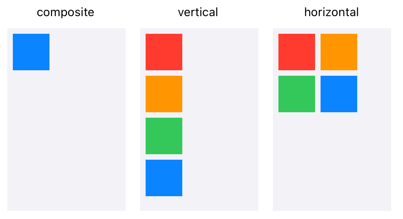
layout is set on the container, never on the child. A child cannot ask to be
stacked; its parent decides.
Sizing: SIZE, FILL, and numbers
width and height each take one of four kinds of value.
| Value | Meaning |
|---|---|
Ti.UI.SIZE |
As large as the content needs, and no larger |
Ti.UI.FILL |
As large as the parent allows |
| A number | That many units. 120 is 120dp with the template's default unit |
| A string | An explicit unit or a percentage: '120dp', '50%' |
A plain number is in whatever ti.ui.defaultunit says in tiapp.xml, which
ti create sets to dp. Density-independent pixels, so 120 is the same
physical size on any screen. Write '120px' if you really mean device pixels,
which you rarely do.
Important
Ti.UI.SIZE on a container measures its children. A container with
height: Ti.UI.SIZE and no children is zero tall and invisible, which is the
usual reason a view you definitely added is nowhere on screen.
What a view does when you say nothing
Leave width and height unset and each view falls back to its own default,
which is SIZE for things that wrap content and FILL for things that own a
region:
| View | Default width | Default height |
|---|---|---|
Label, Button, Switch, ImageView |
SIZE | SIZE |
ActivityIndicator, Picker |
SIZE | SIZE |
TextField, TextArea, SearchBar |
FILL | SIZE |
Slider, ProgressBar, Toolbar |
FILL | SIZE |
ScrollView, ScrollableView, WebView |
FILL | FILL |
ListView, TableView, TabGroup |
FILL | FILL |
Read off the iOS layout code, where these are declared. Android reaches the
same answers through each native widget's own measurement rather than a
declared default, so treat the table as the shape of the behaviour and set
width and height yourself wherever it matters.
A plain View declares neither. Give it a size, or give it children and
Ti.UI.SIZE.
Composite layout, and why your property was ignored
In composite layout you can over-specify a view: height, top, center and
bottom can all be set, and they cannot all be honoured. Rather than erroring,
Titanium applies a fixed precedence and silently drops the rest.
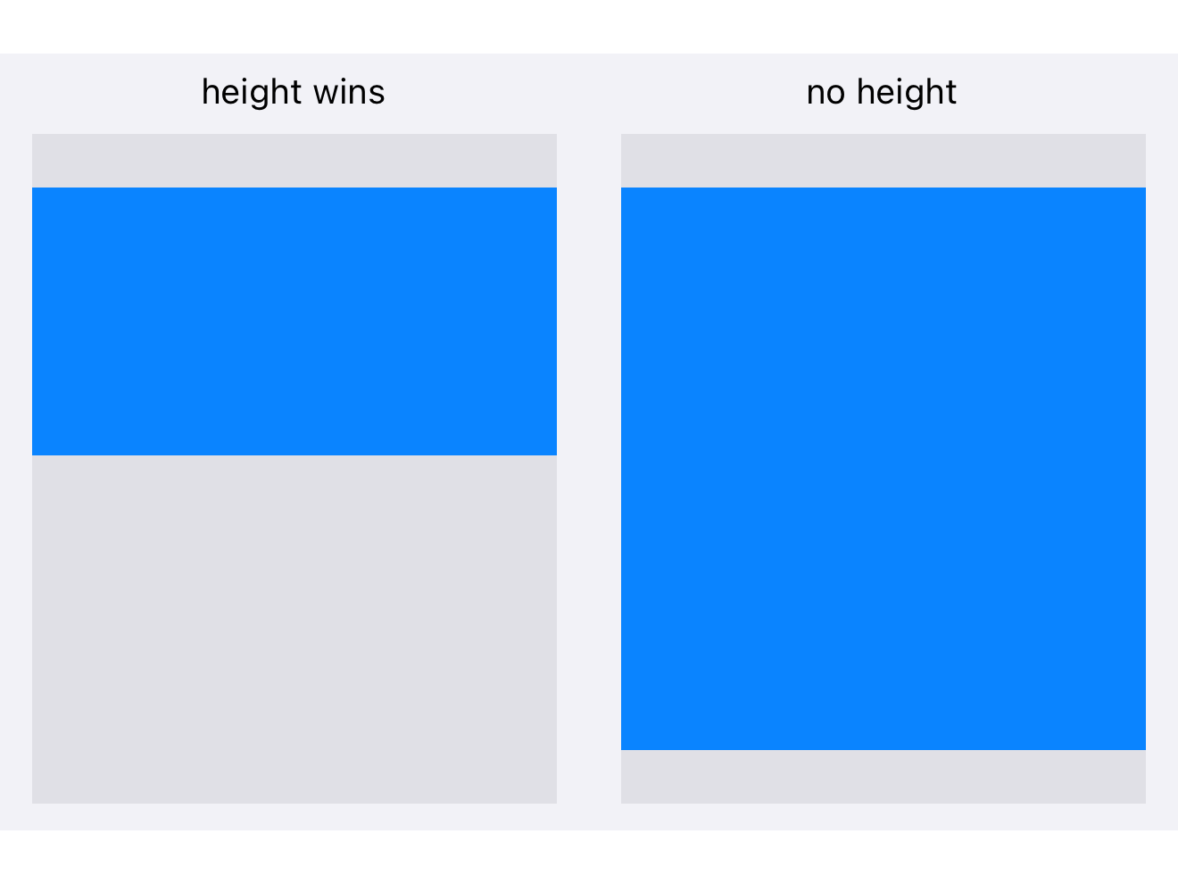
Vertically the order is height, top, center.y, bottom. The two
highest-precedence properties you set are the two that win.
| What you set | What happens |
|---|---|
height and top |
Positioned top from the parent's top, at that height. center.y and bottom ignored |
height and center.y |
Centred on center.y, at that height. bottom ignored |
height and bottom |
Positioned bottom from the parent's bottom, at that height |
top and bottom |
Both edges pinned. Height is whatever is left between them |
top and center.y |
Top edge pinned, centre pinned, height implied. bottom ignored |
top only |
Pinned from the top, at the view's default height |
bottom only |
Pinned from the bottom, at the view's default height |
| none of them | Centred vertically, at the view's default height |
Horizontally it works the same way, with the order width, left,
center.x, right.
That table is the answer to most "why is my view the wrong size" questions.
Setting top, bottom and height does not stretch anything: height
outranks bottom, so the view sits at the top with the height you asked for.
Drop the height and the two pins size it.
Vertical layout
Children stack in the order added. A child's top is the gap above it and its
bottom is the gap below, so the space between two children is the upper
one's bottom plus the lower one's top.
const win = Ti.UI.createWindow({ backgroundColor: 'white', layout: 'vertical' });

win.add(Ti.UI.createLabel({ text: 'Title', top: 60, left: 20 }));
win.add(Ti.UI.createLabel({ text: 'Subtitle', top: 8, left: 20 }));
win.add(Ti.UI.createView({ height: 1, width: Ti.UI.FILL, top: 16, backgroundColor: '#ccc' }));

win.open();
Horizontally each child still behaves as it would in composite layout, which is
why left: 20 works above and why a child with no horizontal properties is
centred.
Warning
A child with height: Ti.UI.FILL in a vertical layout takes everything left
over, and every child after it gets nothing. One FILL child per vertical
container, and put it last unless you mean to push the rest off screen.
Horizontal layout
Children run left to right. Wrapping is on by default: when a child does not fit in the current row it starts a new one, and each row is as tall as its tallest child.
const tags = Ti.UI.createView({
  layout: 'horizontal',
  top: 40,
  width: 240,
  height: Ti.UI.SIZE
});

for (const name of ['alloy', 'android', 'ios', 'layout', 'listview']) {
  tags.add(Ti.UI.createLabel({
    text: name,
    width: Ti.UI.SIZE,
    height: Ti.UI.SIZE,
    left: 4,
    right: 4,
    top: 4,
    bottom: 4,
    color: '#fff',
    backgroundColor: '#4a4a4a'
  }));
}
Give each child a size. A label with no width fills the row rather than
shrinking to its text, and five of them stack into one dark block instead of
five chips. Ti.UI.SIZE is what makes a child as wide as its content, and it
is the first thing to check when a horizontal layout comes out wrong.
Within a row, a child with neither top nor bottom is centred; with one of
them it aligns to that edge with that much padding; with both, the two are
treated as padding.
Set horizontalWrap: false and the children stay on one line instead, with
left and right acting as the gaps between them.
Overlap and stacking
Composite layout lets children overlap. Later children draw on top of earlier
ones, and zIndex overrides that for siblings:
const badge = Ti.UI.createView({
  width: 20,
  height: 20,
  borderRadius: 10,
  backgroundColor: 'red',
  top: -6,
  right: -6,
  zIndex: 1
});
Negative pins put a child outside its parent's bounds, which is how a badge sits on a corner. On Android a child drawn outside its parent may be clipped, so give the parent enough room rather than relying on the overflow.
Reading a size back
width and height are what you asked for, not what happened. A view whose
width is Ti.UI.FILL reports Ti.UI.FILL, not a number. For the measured
result use rect or size, and only after the view has been laid out:
view.addEventListener('postlayout', () => {
  Ti.API.info(`${view.rect.width} x ${view.rect.height}`);
});
postlayout fires whenever the view is measured, which is more than once. If
you only want the first, remove the listener inside it.
Common mistakes
A container sized Ti.UI.SIZE with no children is zero by zero. Nothing is
wrong with the children you add later; they are inside a box with no area.
top and bottom with a height does not stretch. See the precedence
table above.
Two Ti.UI.FILL children in a vertical layout. The first takes the
remaining space and the second has none.
Setting layout on the child. It controls that view's own children, not
where it sits in its parent.
A percentage against a Ti.UI.SIZE parent. '50%' of a parent that is
sizing itself to its children is not a number anyone can compute, and the
result is not useful. Give the parent a real size first.
Next
Lists and tables covers the two scrolling list types and which to use.