Lists & tables
Written for Titanium SDK 13.4.0 and later
Titanium has two scrolling list types. Reach for ListView.
TableView came first and builds one view per row, in JavaScript, and keeps
them all. ListView describes rows as templates that the native list recycles,
the way UITableView and RecyclerView do underneath. On a long list that is
the difference between a list that scrolls and one that stutters.
Neither is deprecated, and TableView is still the simpler thing to reach for
when a "list" is a settings screen of eight fixed rows. Past that, use
ListView.
A list in three parts
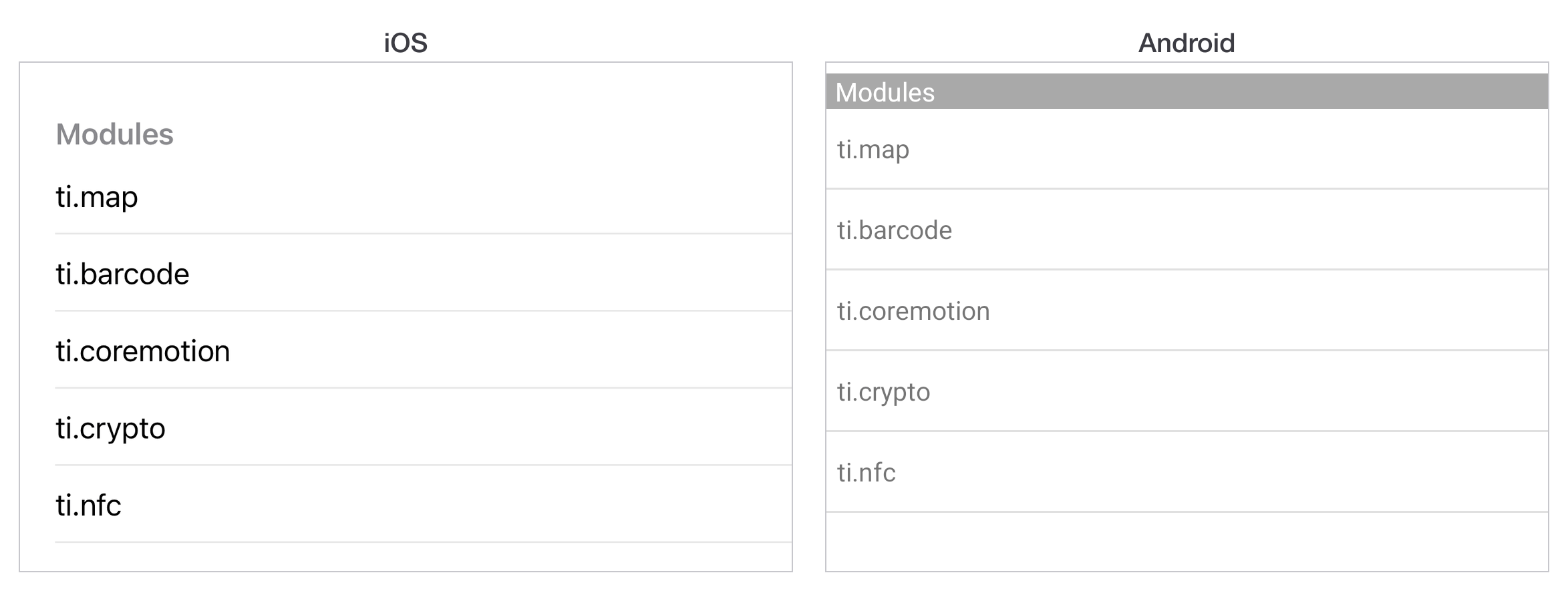
A ListView holds ListSections, and a section holds items. An item is plain
data, not a view: it says which template to use and what to put in it.
const win = Ti.UI.createWindow({ backgroundColor: 'white' });

const section = Ti.UI.createListSection({ headerTitle: 'Modules' });
section.setItems([
  { properties: { title: 'ti.map' } },
  { properties: { title: 'ti.barcode' } },
  { properties: { title: 'ti.coremotion' } }
]);

const list = Ti.UI.createListView({ sections: [section] });

list.addEventListener('itemclick', (e) => {
  const item = e.section.getItemAt(e.itemIndex);
  Ti.API.info(`tapped ${item.properties.title}`);
});

win.add(list);
win.open();
properties sets properties on the row itself. With no template, title is
the one that shows.
Templates
A template names the views in a row and gives each one a bindId. Items then
address those views by that id, so the data and the layout stay separate.
const template = {
  childTemplates: [
    {
      type: 'Ti.UI.Label',
      bindId: 'name',
      properties: { left: 16, font: { fontSize: 16, fontWeight: 'bold' } }
    },
    {
      type: 'Ti.UI.Label',
      bindId: 'detail',
      properties: { right: 16, color: '#888', font: { fontSize: 14 } }
    }
  ]
};

const list = Ti.UI.createListView({
  templates: { row: template },
  defaultItemTemplate: 'row',
  sections: [section]
});

section.setItems([
  { name: { text: 'ti.map' }, detail: { text: '5.7.0' } },
  { name: { text: 'ti.barcode' }, detail: { text: '4.2.0' } }
]);
Each key in an item that is not properties or template is a bindId, and
its value is the properties to set on that view.
Important
Row views are recycled. Every property a template sets on a row must be set
by every item that uses it, or a row will inherit whatever the last item
in that slot left behind. Set color on one item and not the next and the
colour follows the recycled view down the list.
Changing the contents
Replace everything with setItems. Add to the end with appendItems. Change
one row in place with updateItemAt, which is what to use for a checkbox or a
"favourited" state, because it does not rebuild the section.
section.updateItemAt(0, { name: { text: 'ti.map' }, detail: { text: '5.8.0' } });Sections are managed on the list: appendSection, insertSectionAt,
replaceSectionAt, deleteSectionAt.
Which events fire
itemclick is the one you want, and it gives you sectionIndex, itemIndex,
section and bindId - the last being which view inside the row was tapped,
which is how one row can have a tappable button and a tappable body.
scrollstart, scrolling, scrollend, dragstart and dragend cover
scrolling. marker fires when a row you nominated with setMarker comes into
view, which is the hook for loading the next page of results.
TableView
TableView builds rows as real views, so a row is a view you can hold onto and
change directly:
const table = Ti.UI.createTableView({
  data: [
    { title: 'General' },
    { title: 'Notifications' },
    { title: 'Privacy' }
  ]
});

table.addEventListener('click', (e) => Ti.API.info(`row ${e.index}`));
That directness is the reason to use it for a short fixed list, and the reason not to use it for a long one: nothing is recycled, so a thousand rows is a thousand view hierarchies.
The event is click, not itemclick.
Next
Icons and launch screens is what the app looks like before it opens.