You are reading 13.1.0. See this page in 13.4.1.
Titanium.UI.AlertDialog
Extends Titanium.UI.ViewTitanium.Proxy
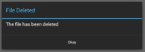
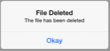
An alert dialog is a modal view that includes an optional title, a message and buttons, positioned in the middle of the display.
| Android | iOS |
|---|---|
 |
 |
An alert dialog is created using Titanium.UI.createAlertDialog or <AlertDialog> Alloy element.
Although this dialog always appears in the middle of the display (not touching the edges), other aspects of its aesthetics and the way the user interacts with it are different for each platform, as described below.
Android
On Android, the default alert dialog displays text information, via a title and message, without
any buttons. As the user can use the system hardware back button to dismiss it, a button is
optional.
Buttons are shown if the buttonNames property is defined, and are rendered horizontally below
the message.
To create a custom layout, a view may be added and, in turn, a hierarchy of views added to that child view.
iOS
On iOS, the default alert dialog displays text information, via a title and message, with a single button to allow it to be dismissed.
Buttons are defined using the buttonNames property and are rendered vertically below
the message. Alert dialogs are automatically cancelled when the application is
paused/suspended. This behavior can be avoided by setting persistent property on alert dialog
to be true.
The style property can be used to allow the user to enter plain text,
obscured text or login identifier and password. Entered values can be captured with listening
cancel event.
Starting at Titanium SDK 5.1.0, you can also specify the placeholder, keyboardType and returnKeyType
properties when using the alert dialog style Titanium.UI.iOS.AlertDialogStyle.PLAIN_TEXT_INPUT or
Titanium.UI.iOS.AlertDialogStyle.SECURE_TEXT_INPUT.
When using the alert dialog style Titanium.UI.iOS.AlertDialogStyle.LOGIN_AND_PASSWORD_INPUT, you can
specify the loginPlaceholder, loginKeyboardType and loginReturnKeyType properties for the login field,
as well as the passwordPlaceholder, passwordKeyboardType and passwordReturnKeyType properties for the password field.
Global Alias
A global method alert() is aliased to this object, and can be invoked with a single message.
For example
alert('this is a message');This will generate an alert with a title of "Alert" and an "OK" button.
Caveats
Multiple alerts should not be shown at once.
The title and ok properties cannot be changed while the alert dialog is being displayed. On
Android only, you can change the message property while the alert dialog is being displayed.
Examples
Single-button Alert Dialog (using alias)
Create a single-button alert dialog using the global alert() alias.
var win = Ti.UI.createWindow({
  title: 'Click window to test',
  backgroundColor: 'white'
});

win.addEventListener('click', function(e) {
  alert('The file has been deleted');
});
win.open();
Single-button Alert Dialog (standard)
Create a single-button alert dialog, without explicitly defining it using the buttonNames
property, which is invoked when the app window is clicked.
var win = Ti.UI.createWindow({
  title: 'Click window to test',
  backgroundColor: 'white'
});

win.addEventListener('click', function(e) {
  var dialog = Ti.UI.createAlertDialog({
    message: 'The file has been deleted',
    ok: 'Okay',
    title: 'File Deleted'
  });
  dialog.show();
});
win.open();
Three-button Alert Dialog
Create a three-button alert dialog, which is invoked when the app window is clicked. Output a message to the log when the cancel button is clicked.
var win = Ti.UI.createWindow({
  title: 'Click window to test',
  backgroundColor: 'white'
});
win.addEventListener('click', function(e) {
  var dialog = Ti.UI.createAlertDialog({
    cancel: 1,
    buttonNames: ['Confirm', 'Cancel', 'Help'],
    message: 'Would you like to delete the file?',
    title: 'Delete'
  });
  dialog.addEventListener('click', function(e) {
    if (e.index === e.source.cancel) {
      Ti.API.info('The cancel button was clicked');
    }
    Ti.API.info('e.cancel: ' + e.cancel);
    Ti.API.info('e.source.cancel: ' + e.source.cancel);
    Ti.API.info('e.index: ' + e.index);
  });
  dialog.show();
});
win.open();
Alert Dialog with Plain Text Input
Create an alert dialog and allow the user enter plain text, which is invoked when the app window is clicked. Output entered text value to the log when the OK button is clicked.
var win = Ti.UI.createWindow({
  title: 'Click window to test'
});
win.addEventListener('click', function(e) {
  var dialog = Ti.UI.createAlertDialog({
    title: 'Enter text',
    style: Ti.UI.iOS.AlertDialogStyle.PLAIN_TEXT_INPUT,
    buttonNames: ['OK']
  });
  dialog.addEventListener('click', function(e) {
    Ti.API.info('e.text: ' + e.text);
  });
  dialog.show();
});
win.open();
Alloy XML Markup
Previous three-button alert dialog example as an Alloy view.
alertdialog.xml:
<Alloy>
    <Window id="win" onClick="showDialog" title="Click window to test" backgroundColor="white"
        exitOnClose="true" fullscreen="false" >

        <AlertDialog id="dialog" onClick="doClick" title="Delete"
            message="Would you like to delete the file?" cancel="1">

            <!-- The ButtonNames tag sets the buttonNames property. -->
            <ButtonNames>
                <ButtonName>Confirm</ButtonName>
                <ButtonName>Cancel</ButtonName>
                <ButtonName>Help</ButtonName>
            </ButtonNames>
        </AlertDialog>
    </Window>
</Alloy>
alertdialog.js:
function showDialog() {
    $.dialog.show();
}

function doClick(e) {
    Ti.API.info('e.text: ' + e.text);
}

$.win.open();
Properties 59
Inherited from Titanium.UI.View
Boolean value to remove the long press notification for the device's accessibility service.
Default: true
View to load inside the message area, to create a custom layout.
In an Alloy application you can specify this property with either an <AndroidView/> or
<View/> element inside the <AlertDialog/> element, for example:
<Alloy>
    <AlertDialog onClick="doClick" title="Delete"
        message="Would you like to delete the file?" cancel="1">

        <!--  Add View or AndroidView for the androidView property  -->
        <View platform="android">
            <Label color="red" text="Warning!  This change is permanent and you cannot undo it!" />
        </View>

        <ButtonNames>
            <ButtonName>Confirm</ButtonName>
            <ButtonName>Cancel</ButtonName>
        </ButtonNames>
    </AlertDialog>
</Alloy>Inherited from Titanium.Proxy
The name of the API that this proxy corresponds to.
Inherited from Titanium.Proxy
Indicates if the proxy will bubble an event to its parent.
Default: true
Setting this to true requires the end-user to click a dialog button to close the dialog.
Set to true to prevent the dialog from being dismissed via back navigation or tapping outside of the dialog. This requires the end-user to click on one of the dialog buttons provided by property buttonNames. Note that if the dialog does not have any buttons, then the dialog can only be closed programmatically via the hide() method.
Default: false on Android
buttonNames
Array<String>Name of each button to create.
On iOS, a button will automatically be created if none are explicitly defined, because
without it users would be unable to dismiss the dialog. Conversely, a dialog with no
buttons may be created on Android, as the hardware back button may be used instead.
A maximum of 3 buttons is supported on Android.
Alloy applications can specify this property with a <ButtonNames> element containing
one or more <ButtonName> elements (see example).
<Alloy>
    <AlertDialog id="dialog" onClick="doClick" title="Decide!" message="Do you really want to do that?" cancel="1">
        <ButtonNames>
            <ButtonName>Confirm</ButtonName>
            <ButtonName>Cancel</ButtonName>
            <ButtonName>Help</ButtonName>
        </ButtonNames>
    </AlertDialog>
</Alloy>
Default: No buttons (Android), Single "OK" button (iOS)
cancel
NumberIndex to define the cancel button.
On iOS, set to -1 to disable the cancel option.
Default: undefined (Android), -1 (iOS)
When this is set to true, the dialog is canceled when touched outside the window's bounds.
Default: true on Android
Index to define the destructive button.
Setting this property to -1 disables this option.
Default: -1
Inherited from Titanium.UI.View
Base elevation of the view relative to its parent in pixels.
Inherited from Titanium.UI.View
Discards touch related events if another app's system overlay covers the view.
Default: false
Hint text of the text field inside the dialog.
Note that this property is only available if dialog style property is defined as
Titanium.UI.iOS.AlertDialogStyle.PLAIN_TEXT_INPUT or
Titanium.UI.iOS.AlertDialogStyle.SECURE_TEXT_INPUT.
Key identifying a string from the locale file to use for the hintText property.
Only one of hintText or hinttextid should be specified.
Inherited from Titanium.UI.View
Adds a horizontal parallax effect to the view
id
StringInherited from Titanium.UI.View
View's identifier.
Keyboard appearance to be displayed when the text field inside the dialog is focused.
Note that this property is only available if dialog style property is defined as
Titanium.UI.iOS.AlertDialogStyle.PLAIN_TEXT_INPUT or
Titanium.UI.iOS.AlertDialogStyle.SECURE_TEXT_INPUT.
Default: <Titanium.UI.KEYBOARD_APPEARANCE_DEFAULT>
Keyboard type to display when this text field inside the dialog is focused.
Note that this property is only available if dialog style property is defined as
Titanium.UI.iOS.AlertDialogStyle.PLAIN_TEXT_INPUT or
Titanium.UI.iOS.AlertDialogStyle.SECURE_TEXT_INPUT.
Accepts 11 constants
Default: <Titanium.UI.KEYBOARD_TYPE_DEFAULT>
Inherited from Titanium.Proxy
The Window or TabGroup whose Activity lifecycle should be triggered on the proxy.
Hint text of the login text field inside the dialog.
Note that this property is only available if dialog style property is defined as
Titanium.UI.iOS.AlertDialogStyle.LOGIN_AND_PASSWORD_INPUT.
Key identifying a string from the locale file to use for the loginHintText property.
Only one of loginHintText or loginhinttextid should be specified.
Keyboard type to display when this text field inside the dialog is focused.
Note that this property is only available if dialog style property is defined as
Titanium.UI.iOS.AlertDialogStyle.LOGIN_AND_PASSWORD_INPUT.
Accepts 14 constants
- KEYBOARD_APPEARANCE_DARK
- KEYBOARD_APPEARANCE_DEFAULT
- KEYBOARD_APPEARANCE_LIGHT
- KEYBOARD_TYPE_ASCII
- KEYBOARD_TYPE_DECIMAL_PAD
- KEYBOARD_TYPE_DEFAULT
- KEYBOARD_TYPE_EMAIL
- KEYBOARD_TYPE_NAMEPHONE_PAD
- KEYBOARD_TYPE_NUMBERS_PUNCTUATION
- KEYBOARD_TYPE_NUMBER_PAD
- KEYBOARD_TYPE_PHONE_PAD
- KEYBOARD_TYPE_TWITTER
- KEYBOARD_TYPE_URL
- KEYBOARD_TYPE_WEBSEARCH
Default: <Titanium.UI.KEYBOARD_DEFAULT>
Deprecated since 5.4.0
Use Titanium.UI.AlertDialog.loginHintText instead.
Placeholder of the login text field inside the dialog.
Note that this property is only available if dialog style property is defined as
Titanium.UI.iOS.AlertDialogStyle.LOGIN_AND_PASSWORD_INPUT.
Specifies the text to display on the keyboard Return key when this field is focused.
Note that this property is only available if dialog style property is defined as
Titanium.UI.iOS.AlertDialogStyle.LOGIN_AND_PASSWORD_INPUT.
Accepts 12 constants
Default: <Titanium.UI.RETURNKEY_NEXT>
Value of the login text field inside the dialog.
Note that this property is only available if dialog style property is defined as
Titanium.UI.iOS.AlertDialogStyle.LOGIN_AND_PASSWORD_INPUT.
message
StringDialog message.
messageid
StringKey identifying a string in the locale file to use for the message text.
ok
StringText for the OK button.
This property is useful when only one button is required, as it negates the need to define
the buttonNames property. If buttonNames is defined, this property is ignored.
Key identifying a string in the locale file to use for the ok text.
If buttonNames is defined, this property is ignored.
Hint text of the password text field inside the dialog.
Note that this property is only available if dialog style property is defined as
Titanium.UI.iOS.AlertDialogStyle.LOGIN_AND_PASSWORD_INPUT.
Key identifying a string from the locale file to use for the passwordHintText property.
Only one of passwordHintText or hinttextid should be specified.
Keyboard type to display when this text field inside the dialog is focused.
Note that this property is only available if dialog style property is defined as
Titanium.UI.iOS.AlertDialogStyle.LOGIN_AND_PASSWORD_INPUT.
Accepts 14 constants
- KEYBOARD_APPEARANCE_DARK
- KEYBOARD_APPEARANCE_DEFAULT
- KEYBOARD_APPEARANCE_LIGHT
- KEYBOARD_TYPE_ASCII
- KEYBOARD_TYPE_DECIMAL_PAD
- KEYBOARD_TYPE_DEFAULT
- KEYBOARD_TYPE_EMAIL
- KEYBOARD_TYPE_NAMEPHONE_PAD
- KEYBOARD_TYPE_NUMBERS_PUNCTUATION
- KEYBOARD_TYPE_NUMBER_PAD
- KEYBOARD_TYPE_PHONE_PAD
- KEYBOARD_TYPE_TWITTER
- KEYBOARD_TYPE_URL
- KEYBOARD_TYPE_WEBSEARCH
Default: <Titanium.UI.KEYBOARD_DEFAULT>
Deprecated since 5.4.0
Use Titanium.UI.AlertDialog.passwordHintText instead.
Placeholder of the password text field inside the dialog.
Note that this property is only available if dialog style property is defined as
Titanium.UI.iOS.AlertDialogStyle.LOGIN_AND_PASSWORD_INPUT.
Specifies the text to display on the keyboard Return key when this field is focused.
Note that this property is only available if dialog style property is defined as
Titanium.UI.iOS.AlertDialogStyle.LOGIN_AND_PASSWORD_INPUT.
Accepts 12 constants
Default: <Titanium.UI.RETURNKEY_DONE>
Value of the password text field inside the dialog.
Note that this property is only available if dialog style property is defined as
Titanium.UI.iOS.AlertDialogStyle.LOGIN_AND_PASSWORD_INPUT.
Boolean value indicating if the alert dialog should only be cancelled by user gesture or by hide method.
This property is useful to ensure that the alert dialog will not be ignored by the user when the application is paused/suspended.
Default: false on iOS, true on Android
Deprecated since 5.4.0
Use Titanium.UI.AlertDialog.hintText instead.
Placeholder of the text field inside the dialog.
Note that this property is only available if dialog style property is defined as
Titanium.UI.iOS.AlertDialogStyle.PLAIN_TEXT_INPUT or
Titanium.UI.iOS.AlertDialogStyle.SECURE_TEXT_INPUT.
Index to define the preferred button.
When you specify a preferred action, the alert dialog highlights the text of that action to give it emphasis. (If the alert also contains a cancel button, the preferred action receives the highlighting instead of the cancel button.) If the iOS device is connected to a physical keyboard, pressing the Return key triggers the preferred action.
Note that this property is only available on iOS 9 or above.
Default: -1
Inherited from Titanium.UI.View
The preview context used in the 3D-Touch feature "Peek and Pop".
Specifies the text to display on the keyboard Return key when this field is focused.
Note that this property is only available if dialog style property is defined as
Titanium.UI.iOS.AlertDialogStyle.PLAIN_TEXT_INPUT or
Titanium.UI.iOS.AlertDialogStyle.SECURE_TEXT_INPUT.
Accepts 12 constants
Default: <Titanium.UI.RETURNKEY_DEFAULT>
Inherited from Titanium.UI.View
Clockwise 2D rotation of the view in degrees.
Inherited from Titanium.UI.View
Clockwise rotation of the view in degrees (x-axis).
Inherited from Titanium.UI.View
Clockwise rotation of the view in degrees (y-axis).
Inherited from Titanium.UI.View
Scaling of the view in x-axis in pixels.
Inherited from Titanium.UI.View
Scaling of the view in y-axis in pixels.
Indicates the severity of the alert in apps built with Mac Catalyst.
This property defines the severity options used by the severity property of UIAlertController. In apps built with Mac Catalyst, the severity determines the style of the presented alert. A Titanium.UI.iOS.ALERT_SEVERITY_CRITICAL alert appears with a caution icon, and an alert with a Titanium.UI.iOS.ALERT_SEVERITY_DEFAULT severity doesn’t. UIKit ignores the alert severity on iOS.
You should only use the Titanium.UI.iOS.ALERT_SEVERITY_CRITICAL severity if an alert truly requires special attention from the user.
For more information, see the Human Interface Guidelines on alerts.
Default: <Titanium.UI.iOS.ALERT_SEVERITY_DEFAULT>
The style for the alert dialog.
Style of the alert dialog, specified using one of the constants from
Titanium.UI.iOS.AlertDialogStyle. Using styles other than default one can break
your dialog layout if more than two buttons used. All styles can handle up to two
buttons comfortably, except for default style can handle up to six buttons when title
and message is empty or not given. Note that this property is only available on
iOS SDK 5 or above.
Default: <Titanium.UI.iOS.AlertDialogStyle.DEFAULT>
The tint-color of the dialog.
This property is a direct correspondent of the tintColor property of
UIView on iOS. For a dialog, it will tint the color of it's buttons.
For information about color values, see the "Colors" section of Titanium.UI.
title
StringTitle of the dialog.
If not set, a dialog with no title bar will be created.
titleid
StringKey identifying a string in the locale file to use for the title text.
Inherited from Titanium.UI.View
The default text to display in the control's tooltip.
Inherited from Titanium.UI.View
A material design visual construct that provides an instantaneous visual confirmation of touch point.
Default: false
Inherited from Titanium.UI.View
Optional touch feedback ripple color. This has no effect unless touchFeedback is true.
Inherited from Titanium.UI.View
A name to identify this view in activity transition.
Inherited from Titanium.UI.View
Horizontal location of the view relative to its left position in pixels.
Inherited from Titanium.UI.View
Vertical location of the view relative to its top position in pixels.
Inherited from Titanium.UI.View
Depth of the view relative to its elevation in pixels.
Value of the text field inside the dialog.
Note that this property is only available if dialog style property is defined as
Titanium.UI.iOS.AlertDialogStyle.PLAIN_TEXT_INPUT or
Titanium.UI.iOS.AlertDialogStyle.SECURE_TEXT_INPUT.
Inherited from Titanium.UI.View
Adds a vertical parallax effect to the view
Methods 11
Inherited from Titanium.Proxy
Adds the specified callback as an event listener for the named event.
| Parameters | Type | Description |
|---|---|---|
| name | String | Name of the event. |
| callback | Callback<Titanium.Event> | Callback function to invoke when the event is fired. 4 fields
|
applyProperties
since 3.0.0Inherited from Titanium.Proxy
Applies the properties to the proxy.
| Parameters | Type | Description |
|---|---|---|
| props | Dictionary | A dictionary of properties to apply. |
Inherited from Titanium.UI.View
Removes all previously added motion effects.
Inherited from Titanium.Proxy
Fires a synthesized event to any registered listeners.
| Parameters | Type | Description |
|---|---|---|
| name | String | Name of the event. |
| event? | Dictionary | A dictionary of keys and values to add to the Titanium.Event object sent to the listeners. |
getViewById
since 6.1.0Inherited from Titanium.UI.View
Returns the matching view of a given view ID.
| Parameters | Type | Description |
|---|---|---|
| id | String | The ID of the view that should be returned. Use the |
Hides this dialog.
insertAt
since 3.3.0Inherited from Titanium.UI.View
Inserts a view at the specified position in the children array.
| Parameters | Type | Description |
|---|---|---|
| params | ViewPositionOptions | Pass an object that specifies the view to insert and optionally at which position (defaults to end) 2 fields
|
Inherited from Titanium.Proxy
Removes the specified callback as an event listener for the named event.
| Parameters | Type | Description |
|---|---|---|
| name | String | Name of the event. |
| callback | Callback<Titanium.Event> | Callback function to remove. Must be the same function passed to 4 fields
|
replaceAt
since 3.3.0Inherited from Titanium.UI.View
Replaces a view at the specified position in the children array.
| Parameters | Type | Description |
|---|---|---|
| params | ViewPositionOptions | Pass an object with the view to insert and the position of the view to replace. In this case the 2 fields
|
Shows this dialog.
Inherited from Titanium.UI.View
Stops a running animation.
Events 2
Fired when a button in the dialog is clicked.
| Event properties | Type | Description |
|---|---|---|
| cancel | Boolean | Number | Boolean type on Android; Number on iOS. On Android, indicates whether the cancel button was clicked, in which
case returns On iOS, the value of the cancel property is
returned, if defined, or See the |
| index | Number | Index of the button that was clicked. |
| login | String | Value of login field if dialog |
| password | String | Value of password field if dialog |
| text | String | Value of text field if dialog |
rotate
since 12.7.0Inherited from Titanium.UI.View
Fired when the device detects a two finger rotation.
| Event properties | Type | Description |
|---|---|---|
| rotate | Number | Rotation in degrees. |