You are reading 13.1.0. See this page in 13.4.1.
Titanium.UI.TableView
Extends Titanium.UI.ViewTitanium.Proxy
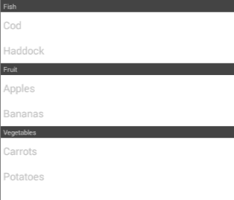
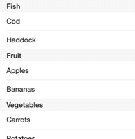
A table view is used to present information, organized in sections and rows, in a vertically-scrolling view.
| Android | iOS |
|---|---|
 |
 |
A TableView object is a container for TableViewSection
objects that are, in turn, containers for TableViewRow objects.
Use the Titanium.UI.createTableView method or <TableView> Alloy element to create a TableView.
Also see the TableViews guide.
Creating Tables
There are few approaches to creating and using TableView object.
The simplest approach is to pass dictionaries of TableViewRow properties, such as
backgroundColor,
color, and title, to the
createTableView method, which causes the rows to be implicitly
created, added to a single TableViewSection, and then added to
the TableView. Refer to the "Simple Table View with Basic Rows" example.
For more control over the layout of each row, however, TableViewRow objects can be created explicitly using the Titanium.UI.createTableViewRow method. Child views, such as labels, images, and buttons, may be added to each row. When one or more rows are added to the table view, a single TableViewSection is automatically created to hold the rows. See the "Table View with Composite Layout" example.
Lastly, sets of rows may be explicitly created and added to a their own
TableViewSection objects, which are then added to a TableView,
to enable the rows to be organized. Headers and footers titles or views must be configured
in order for the sections to be visible.
Tables and Scroll Views
As a table view inherently scrolls, it creates a very poor user experience when one contains other scrolling views, such as a ScrollableView or TextArea. Thus, this layout is strongly discouraged.
TextFields in Tables with SOFT_INPUT_ADJUST_PAN (Android)
When a TextField is placed in a row near the bottom of a TableView,
in a window that is configured with
SOFT_INPUT_ADJUST_PAN, it is expected for the
text field to automatically move to a visible position after it is focused and the software
keyboard displayed. However, due to a known problem caused by native Android's ListView behavior,
the keyboard is likely to completely obscure the text field.
To mitigate this, a ScrollView may be used instead of a table view, as demonstrated in the
ScrollView, "Scroll View as a Table View", example.
Row Editing and Moving Modes
Table views have an editing and a moving mode that may be activated to using their
respective editing and moving
properties. These allow rows to be deleted or re-ordered by the user, depending on each row's
editable and moveable
property that are either explicitly set or inherited from the table.
There are two UI controls available for deleting table view rows, depending on the combination of editing and moving modes enabled:
- "red icon delete" - a circular red icon is displayed on the left-hand side of a row, which reveals a delete button on the right-hand side of that row when clicked.
- "swipe delete" - without either of the table editing or moving modes enabled, a left or right swipe gesture on a row reveals a delete button on the right-hand side of the row.
Note that because the operating system handles the functionality of the swipe delete, the OS will capture swipe events and not bubble the event to Titanium listeners. As such, if you rely on swipe events, you must not set editing to true on such rows, and simulate the functionality you need.
When editable and moveable properties are set on the table view, they are known as inherited,
whereas when set on a row, they are known as explicit. As their resulting behavior may not
follow their literal meaning, depending on the combination of editing and moving modes that
are enabled, a detailed description of the behavior follows.
With editing:false and moving:true:
- For red icon delete and swipe delete, inherited and explicit
editableproperties may be set. - Inherited
moveableproperty is alwaystrue. Explicitmoveableproperty may be set.
With editing:true and moving:false:
- For red icon delete and swipe delete, inherited
editableproperty is alwaystrue. Expliciteditableproperty may be set. - Inherited and explicit
moveableproperties may be set.
With editing:false and moving: false:
- For red icon delete, inherited and explicit
editableproperties alwaysfalse. For swipe delete, inherited and expliciteditableproperties may be set. - Inherited
moveableproperty is alwaysfalse.
With editing:true and moving:true:
- For red icon delete and swipe delete, inherited and explicit
editableproperties may be set. - Inherited
moveableproperty is alwaystrue. Explicitmoveableproperty may be set.
Examples
Simple Table View
Create a basic table view.
Ti.UI.backgroundColor = 'white';
var win = Ti.UI.createWindow();

var tableData = [ {title: 'Apples'}, {title: 'Bananas'}, {title: 'Carrots'}, {title: 'Potatoes'} ];

var table = Ti.UI.createTableView({
  data: tableData
});
win.add(table);
win.open();
Table View Sections
Create a table with three sections, each with two rows. Add two sections to the table before and one after it is rendered. This sample only works on Release 3.0 and later.
Ti.UI.backgroundColor = 'white';
var win = Ti.UI.createWindow();

var sectionFruit = Ti.UI.createTableViewSection({ headerTitle: 'Fruit' });
sectionFruit.add(Ti.UI.createTableViewRow({ title: 'Apples' }));
sectionFruit.add(Ti.UI.createTableViewRow({ title: 'Bananas' }));

var sectionVeg = Ti.UI.createTableViewSection({ headerTitle: 'Vegetables' });
sectionVeg.add(Ti.UI.createTableViewRow({ title: 'Carrots' }));
sectionVeg.add(Ti.UI.createTableViewRow({ title: 'Potatoes' }));

var table = Ti.UI.createTableView({
  data: [sectionFruit, sectionVeg]
});

win.add(table);
win.open();

var sectionFish = Ti.UI.createTableViewSection({ headerTitle: 'Fish' });
sectionFish.add(Ti.UI.createTableViewRow({ title: 'Cod' }));
sectionFish.add(Ti.UI.createTableViewRow({ title: 'Haddock' }));

table.insertSectionBefore(0, sectionFish);
Table View with Composite Layout
Create a table of rows that contain a custom child-view layout.
var win = Ti.UI.createWindow({
  backgroundColor: 'black',
  title: 'TableView Demo'
});

// generate random number, used to make each row appear distinct for this example
function randomInt(max){
  return Math.floor(Math.random() * max) + 1;
}

var IMG_BASE = 'images/';
var defaultFontSize = Ti.Platform.name === 'android' ? 16 : 14;

var tableData = [];

for (var i=1; i<=20; i++){
  var row = Ti.UI.createTableViewRow({
    className: 'forumEvent', // used to improve table performance
    backgroundSelectedColor: 'white',
    rowIndex: i, // custom property, useful for determining the row during events
    height: 110
  });

  var imageAvatar = Ti.UI.createImageView({
    image: IMG_BASE + 'custom_tableview/user.png',
    left: 10, top: 5,
    width: 50, height: 50
  });
  row.add(imageAvatar);

  var labelUserName = Ti.UI.createLabel({
    color: '#576996',
    font: {fontFamily:'Arial', fontSize: defaultFontSize+6, fontWeight: 'bold'},
    text: 'Fred Smith ' + i,
    left: 70, top: 6,
    width: 200, height: 30
  });
  row.add(labelUserName);

  var labelDetails = Ti.UI.createLabel({
    color: '#222',
    font: {fontFamily:'Arial', fontSize: defaultFontSize+2, fontWeight: 'normal'},
    text: 'Replied to post with id ' + randomInt(1000) + '.',
    left: 70, top: 44,
    width: 360
  });
  row.add(labelDetails);

  var imageCalendar = Ti.UI.createImageView({
    image: IMG_BASE + 'custom_tableview/eventsButton.png',
    left: 70, bottom: 2,
    width: 32, height: 32
  });
  row.add(imageCalendar);

  var labelDate = Ti.UI.createLabel({
    color: '#999',
    font: {fontFamily:'Arial', fontSize: defaultFontSize, fontWeight: 'normal'},
    text: 'on ' + randomInt(30) + ' Nov 2012',
    left: 105, bottom: 10,
    width: 200, height: 20
  });
  row.add(labelDate);

  tableData.push(row);
}

var tableView = Ti.UI.createTableView({
  backgroundColor: 'white',
  data: tableData
});

win.add(tableView);
win.open();
Alloy XML Markup
Previous table view sections example as an Alloy view.
<Alloy>
    <Window id="win">
        <TableView id="table">
            <TableViewSection id="sectionFruit" headerTitle="Fruit">
                <TableViewRow title="Apple"/>
                <TableViewRow title="Bananas"/>
            </TableViewSection>
            <TableViewSection id="sectionVeg" headerTitle="Vegetables">
                <TableViewRow title="Carrots"/>
                <TableViewRow title="Potatoes"/>
            </TableViewSection>
            <TableViewSection id="sectionFish" headerTitle="Fish">
                <TableViewRow title="Cod"/>
                <TableViewRow title="Haddock"/>
            </TableViewSection>
        </TableView>
    </Window>
</Alloy>
Properties 121
Inherited from Titanium.UI.View
Boolean value to remove the long press notification for the device's accessibility service.
Default: true
Inherited from Titanium.UI.View
Whether the view should be "hidden" from (i.e., ignored by) the accessibility service.
Default: false
Inherited from Titanium.UI.View
Briefly describes what performing an action (such as a click) on the view will do.
Default: null
Inherited from Titanium.UI.View
A succinct label identifying the view for the device's accessibility service.
Inherited from Titanium.UI.View
A string describing the value (if any) of the view for the device's accessibility service.
allowsMultipleSelectionDuringEditing
Booleansince Android 10.1.0, iPhone 8.2.0, iPad 8.2.0, macOS 9.2.0Determines whether multiple items of this table view can be selected at the same time while editing the table.
Default: false
Allows a two-finger pan gesture to automatically transition the table view into editing mode and start selecting rows.
Setting this property to true allows the user to start selecting multiple contiguous rows via a two-finger pan gesture. If the table view is already in editing mode, the user can also select multiple rows via a one-finger pan gesture along the edge of the table that contains editing controls (checkboxes). In order to support this behavior, you must also set Titanium.UI.TableView.allowsMultipleSelectionDuringEditing to true. Once user interaction stops the Titanium.UI.TableView.rowsselected event is fired.
Default: false
Determines whether this table's rows can be selected.
Set to false to prevent rows from being selected.
Default: true
Determines whether this table's rows can be selected while editing the table.
Set to true to allow rows to be selected.
Default: false
Inherited from Titanium.UI.View
Coordinate of the view about which to pivot an animation.
Inherited from Titanium.UI.View
Current position of the view during an animation.
Inherited from Titanium.Proxy
The name of the API that this proxy corresponds to.
backgroundColor
String | Titanium.UI.ColorBackground color of the view, as a color name or hex triplet.
For information about color values, see the "Colors" section of Titanium.UI.
Default: transparent on non-iOS platforms, white on the iOS platform
Inherited from Titanium.UI.View
Disabled background color of the view, as a color name or hex triplet.
Inherited from Titanium.UI.View
Disabled background image for the view, specified as a local file path or URL.
Inherited from Titanium.UI.View
Focused background color of the view, as a color name or hex triplet.
Inherited from Titanium.UI.View
Focused background image for the view, specified as a local file path or URL.
Inherited from Titanium.UI.View
A background gradient for the view.
Linear and Radial Gradients
The following code excerpt creates two views, one with a linear gradient and one with a radial gradient.
var win1 = Titanium.UI.createWindow({
    title:'Tab 1',
    backgroundColor:'#fff',
    layout: 'vertical'
});

var radialGradient = Ti.UI.createView({
    top: 10,
    width: 100,
    height: 100,
    backgroundGradient: {
        type: 'radial',
        startPoint: { x: 50, y: 50 },
        endPoint: { x: 50, y: 50 },
        colors: [ 'red', 'blue'],
        startRadius: 50,
        endRadius: 0,
        backfillStart: true
    }
});
var linearGradient = Ti.UI.createView({
    top: 10,
    width: 100,
    height: 100,
    backgroundGradient: {
        type: 'linear',
        startPoint: { x: '0%', y: '50%' },
        endPoint: { x: '100%', y: '50%' },
        colors: [ { color: 'red', offset: 0.0}, { color: 'blue', offset: 0.25 }, { color: 'red', offset: 1.0 } ],
    }
});
win1.add(radialGradient);
win1.add(linearGradient);
win1.open();
backgroundImage
StringInherited from Titanium.UI.View
Background image for the view, specified as a local file path or URL.
Inherited from Titanium.UI.View
Size of the left end cap.
Default: 0
backgroundRepeat
BooleanInherited from Titanium.UI.View
Determines whether to tile a background across a view.
Default: false
Inherited from Titanium.UI.View
Size of the top end cap.
Default: 0
borderColor
String | Titanium.UI.ColorInherited from Titanium.UI.View
Border color of the view, as a color name or hex triplet.
borderRadius
Number | String | Array<Number> | Array<String>Inherited from Titanium.UI.View
Radius for the rounded corners of the view's border.
Default: 0
borderWidth
NumberInherited from Titanium.UI.View
Border width of the view.
Default: 0
bottom
Number | StringInherited from Titanium.UI.View
View's bottom position, in platform-specific units.
Inherited from Titanium.Proxy
Indicates if the proxy will bubble an event to its parent.
Default: true
Inherited from Titanium.UI.View
View's center position, in the parent view's coordinates.
Inherited from Titanium.UI.View
View's clipping behavior.
X and Y coordinates to which to reposition the top-left point of the content region.
data
Array<Titanium.UI.TableViewRow> | Array<Titanium.UI.TableViewSection>Rows of the table view.
A Boolean indicating whether the underlying content is dimmed during a search.
If you do not want to show the dimmed background when clicking on the search bar,
set this property false during creation.
Default: true
Determines the rows' default editable behavior, which allows them to be deleted by the user
when the table is in editing or moving mode.
This property determines the default behavior of child rows, but may be overridden by a row's editable property.
See the Titanium.UI.TableView description section for a full explanation of the TableView's
editing and moving modes.
Default: Depends on `editing` and `moving` mode
Determines whether row editing mode is active.
The editing mode allows rows to be deleted or re-ordered, depending on their
editable and moveable
settings.
See the Titanium.UI.TableView description section for a full explanation of the TableView's
editing and moving modes.
Default: false
Inherited from Titanium.UI.View
Base elevation of the view relative to its parent in pixels.
Determines whether the search is limited to the start of the string
Set to true to enable case anchored search.
Default: false
filterAttribute
StringFilter attribute to be used when searching.
On the Android platform, this property can only be set to Titanium-defined properties of the
TableViewRow object, such as title. To search text stored in a different attribute, set the title
property of the TableViewRow object to the property to be searched. For example:
var label = Ti.UI.createLabel({text: 'Foobar'}),
var row = Ti.UI.createTableViewRow(title: label.text);
row.add(label);
On the iOS platform, this property can be set to any property on the TableViewRow object, including arbitrary properties set on the object, not only Titanium-defined properties.
Note that the filter is not anchored to the beginning of the string. So typing "ha" in the text box will include rows titled 'Harold' and 'Harvard', but also 'Sharon' and 'Jonathan'.
filterCaseInsensitive
BooleanDetermines whether the search is case insensitive.
Set to false to enable case sensitive search.
Default: true
Inherited from Titanium.UI.View
Discards touch related events if another app's system overlay covers the view.
Default: false
Sets fixedSize mode on Android TableView.
Set it to true if all TableView items have the same size to gain some performance.
Default: false
Inherited from Titanium.UI.View
Whether view should be focusable while navigating with the trackball.
Default: false
When set to false, the ListView will not draw the divider before the footer view.
Default: undefined but behaves as false
footerTitle
StringTable view footer title.
Table view footer as a view that will be rendered instead of a label.
In Alloy you can use a <FooterView> element nested in a <TableView> element:
<Alloy>
    <TableView>
        <FooterView>
            <View backgroundColor="#a00" height="50dp"/>
        </FooterView>
        <TableViewRow><Label>Row 1</Label></TableViewRow>
        <TableViewRow><Label>Row 2</Label></TableViewRow>
    </TableView>
</Alloy>When set to false, the ListView will not draw the divider after the header view.
Default: undefined but behaves as false
View positioned above the first row that is only revealed when the user drags the table contents down.
A headerPullView is a UI control that is often used to provide a convenient way for the
user to refresh a table's data. Typically used with the
setContentInsets method.
To specify the wrapper color see Titanium.UI.View.pullBackgroundColor.
For an example, see the "Pull to refresh" section in the TableViews guide.
Alloy applications can use a <HeaderPullView> element inside a <TableView> element.
<Alloy>
    <TableView>
        <HeaderPullView platform="ios">
            <View class="pull">
                <Label color="#F2F4F4" bottom="25dp">Header pull view</Label>
            </View>
        </HeaderPullView>
    </TableView>
</Alloy>
headerTitle
StringTable view header title.
Table view header as a view that will be rendered instead of a label.
In Alloy you can use a <HeaderView> element nested in a <TableView> element:
<Alloy>
    <TableView>
        <HeaderView>
            <View backgroundColor="#a00" height="50dp"/>
        </HeaderView>
        <TableViewRow><Label>Row 1</Label></TableViewRow>
        <TableViewRow><Label>Row 2</Label></TableViewRow>
    </TableView>
</Alloy>
height
Number | StringInherited from Titanium.UI.View
View height, in platform-specific units.
Determines whether the search field should hide on completion.
Set to false to prevent the search field from being hidden when an item in the search
results is clicked.
Many standard applications (such as Contacts) have a behavior equivalent to false for this
value, but the default is true for legacy reasons.
The Android platform behaves as though this value were false.
Default: true
Inherited from Titanium.UI.View
Adds a horizontal parallax effect to the view
Inherited from Titanium.UI.View
Determines whether the layout has wrapping behavior.
Default: true
id
StringInherited from Titanium.UI.View
View's identifier.
Array of objects (with title and index properties) to control the table view index.
If an index array is specified, an index bar is displayed on the right-hand side of the table view. Clicking on a title in the index bar scrolls the table view to the row index associated with that title. If the index is -1 the table view will scroll to the top.
Inherited from Titanium.UI.View
Determines whether to keep the device screen on.
Default: false
The manner in which the keyboard is dismissed when a drag begins in the table view.
Default: Undefined (behaves like <Titanium.UI.iOS.KEYBOARD_DISMISS_MODE_NONE>)
layout
StringInherited from Titanium.UI.View
Specifies how the view positions its children. One of: 'composite', 'vertical', or 'horizontal'.
left
Number | StringInherited from Titanium.UI.View
View's left position, in platform-specific units.
Inherited from Titanium.Proxy
The Window or TabGroup whose Activity lifecycle should be triggered on the proxy.
Max number of row class names.
See Titanium.UI.TableViewRow.className for more details. This property will default to 32 when it is set to a number lesser than that.
Default: 32
maxRowHeight
NumberMaximum row height for table view rows.
minRowHeight
NumberMinimum row height for table view rows.
Determines the rows' default moveable behavior, which allows them to be re-ordered by the
user when the table is in editing or moving mode.
This property determines the default behavior of child rows, but may be overridden by a row's moveable property.
See the Titanium.UI.TableView description section for a full explanation of the TableView's
editing and moving modes.
Default: Depends on `editing` and `moving` mode
Determines whether row moving mode is active.
The moving mode allows rows to be deleted or re-ordered, depending on their
editable and moveable
settings.
See the Titanium.UI.TableView description section for a full explanation of the TableView's
editing and moving modes.
Default: false
opacity
NumberInherited from Titanium.UI.View
Opacity of this view, from 0.0 (transparent) to 1.0 (opaque). Defaults to 1.0 (opaque).
Inherited from Titanium.UI.View
When on, animate call overrides current animation if applicable.
Determines the behavior when the user overscrolls the view.
Default: Titanium.UI.Android.OVER_SCROLL_ALWAYS
Inherited from Titanium.UI.View
The preview context used in the 3D-Touch feature "Peek and Pop".
Inherited from Titanium.UI.View
Background color of the wrapper view when this view is used as either Titanium.UI.ListView.pullView or Titanium.UI.TableView.headerPullView.
Defaults to undefined. Results in a light grey background color on the wrapper view.
Inherited from Titanium.UI.View
The bounding box of the view relative to its parent, in system units.
View positioned above the first row that is only revealed when the user drags the list view contents down.
An alternate to the headerPullView property. See Titanium.UI.RefreshControl for usage and examples.
The background color of the search results (iOS-only).
For information about color values, see the "Colors" section of Titanium.UI. Note: A transparent background-color is not officially supported by Apple to prevent that the list of results overlaps with the list view below it.
Default: undefined (behaves as white)
Separator line color between rows inside search results, as a color name or hex triplet (iOS-only).
To make the line invisible, set this property to transparent, or the same value as the
backgroundColor property.
For information about color values, see the "Colors" section of Titanium.UI.
Default: undefined (behaves as gray)
The insets for search results separators (applies to all cells & iOS-only).
Cell separators do not extend all the way to the edge of the list view.
This property sets the default inset for all cells in the table.
Set this to a dictionary with two keys, left specifying inset from left edge and right
specifying the inset from the right edge.
The separator style of the search results (iOS-only).
right
Number | StringInherited from Titanium.UI.View
View's right position, in platform-specific units.
Inherited from Titanium.UI.View
Clockwise 2D rotation of the view in degrees.
Inherited from Titanium.UI.View
Clockwise rotation of the view in degrees (x-axis).
Inherited from Titanium.UI.View
Clockwise rotation of the view in degrees (y-axis).
rowHeight
NumberDefault row height for table view rows.
The insets for table view cells (applies to all cells).
Cell separators do not extend all the way to the edge of the table view. Set this to a
dictionary with two keys, left specifying inset from left edge and right specifying the inset from the
right edge. This property is only available upon creation of the cells.
For example:
tableView1.rowSeparatorInsets = {
    left: 10,
    right: 10
};Inherited from Titanium.UI.View
Scaling of the view in x-axis in pixels.
Inherited from Titanium.UI.View
Scaling of the view in y-axis in pixels.
If true, the table view can be scrolled.
Default: true
Style of the scrollbar.
Default: <Titanium.UI.iOS.ScrollIndicatorStyle.DEFAULT>
Controls whether the scroll-to-top gesture is effective.
The scroll-to-top gesture is a tap on the status bar; The default value of this property is true. This gesture works when you have a single visible table view. If there are multiple table views, web views, text areas, and/or scroll views visible, you will need to disable (set to false) on the above views you DON'T want this behaviour on. The remaining view will then respond to scroll-to-top gesture.
Default: true
Search field to use for the table view.
In an Alloy application, you can use a <SearchView> or <SearchBar> element inside a <TableView> element.
<Alloy>
    <TableView>
      <!-- search, shorthand with Ti.UI.SearchBar -->
      <SearchBar platform="ios"/>
      <!-- search, shorthand with Ti.UI.Android.SearchView -->
      <SearchView ns="Ti.UI.Android" platform="android"/>
    </TableView>
</Alloy>Determines whether the SearchBar or SearchView appears as part of the TableView.
Set to false if the search view will be displayed in the action bar.
Default: true
Determines whether the search field is visible.
Set to true to hide the search field.
Default: false (search field visible)
Number of sections in this table view.
Padding above each section header.
If not set or set to -1, it defaults to an automatic spacing determined by the system.
Sections of this table.
In Release 3.0, this property is read-only on Android.
Due to a known issue, TIMOB-12616, the sections property should not be used
for adding sections on iOS.
separatorColor
String | Titanium.UI.ColorSeparator line color between rows, as a color name or hex triplet.
To make the line invisible, set this property to transparent, or the same value as the
backgroundColor property.
For information about color values, see the "Colors" section of Titanium.UI.
Default: platform-specific default color
Deprecated since 5.2.0
Use Titanium.UI.TableView.tableSeparatorInsets instead.
The insets for table view separators (applies to all cells).
Cell separators do not extend all the way to the edge of the table view.
This property sets the default inset for all cells in the table. Set this to a dictionary
with two keys, left specifying inset from left edge and right specifying the inset from the right edge.
For example:
tableView1.separatorInsets = {
    left: 10,
    right: 10
};Separator style constant.
A Boolean indicating whether search bar will be in navigation bar.
If you want to show the search bar in navigation bar, set this property true during creation.
Use the Titanium.UI.Window.hidesSearchBarWhenScrolling property to control the visibility of the
searchbar when scrolling.
Default: false
Determines whether the selection checkmark is displayed on selected rows.
Default: true
Determines whether this table view displays a vertical scroll indicator.
Set to false to hide the vertical scroll indicator.
Default: true
Inherited from Titanium.UI.View
The size of the view in system units.
Inherited from Titanium.UI.View
Determines keyboard behavior when this view is focused. Defaults to Titanium.UI.Android.SOFT_KEYBOARD_DEFAULT_ON_FOCUS.
Style of the table view, specified using one of the constants from Titanium.UI.iOS.TableViewStyle.
Style should always be set before setting the data on table view.
The insets for the table view header and footer.
Cell separators do not extend all the way to the edge of the table view. Set this to a
dictionary with two keys, left specifying inset from left edge and right specifying the inset from the
right edge. If the rowSeparatorInsets is not set, the tableSeparatorInsets will also set the cell insets.
For example:
tableView1.tableSeparatorInsets = {
    left: 10,
    right: 10
};Inherited from Titanium.UI.View
The view's tintColor
Default: null
Inherited from Titanium.UI.View
The default text to display in the control's tooltip.
top
Number | StringInherited from Titanium.UI.View
The view's top position.
touchEnabled
BooleanInherited from Titanium.UI.View
Determines whether view should receive touch events.
Default: true
A material design visual construct that provides an instantaneous visual confirmation of touch point.
Touch feedback is only applied to a view's background.
Default: true
Inherited from Titanium.UI.View
Optional touch feedback ripple color. This has no effect unless touchFeedback is true.
Inherited from Titanium.UI.View
Transformation matrix to apply to the view.
Default: Identity matrix
Inherited from Titanium.UI.View
A name to identify this view in activity transition.
Inherited from Titanium.UI.View
Horizontal location of the view relative to its left position in pixels.
Inherited from Titanium.UI.View
Vertical location of the view relative to its top position in pixels.
Inherited from Titanium.UI.View
Depth of the view relative to its elevation in pixels.
Inherited from Titanium.UI.View
Adds a vertical parallax effect to the view
viewShadowColor
String | Titanium.UI.Colorsince Android 11.1.0, iPhone 3.3.0, iPad 3.3.0, macOS 9.2.0Inherited from Titanium.UI.View
Determines the color of the shadow.
Inherited from Titanium.UI.View
Determines the offset for the shadow of the view.
Inherited from Titanium.UI.View
Determines the blur radius used to create the shadow.
visible
BooleanInherited from Titanium.UI.View
Determines whether the view is visible.
Default: true
width
Number | StringInherited from Titanium.UI.View
View's width, in platform-specific units.
zIndex
NumberInherited from Titanium.UI.View
Z-index stack order position, relative to other sibling views.
Methods 31
Inherited from Titanium.Proxy
Adds the specified callback as an event listener for the named event.
| Parameters | Type | Description |
|---|---|---|
| name | String | Name of the event. |
| callback | Callback<Titanium.Event> | Callback function to invoke when the event is fired. 4 fields
|
Inherited from Titanium.UI.View
Animates this view.
| Parameters | Type | Description |
|---|---|---|
| animation | Titanium.UI.Animation | Dictionary<Titanium.UI.Animation> | Either a dictionary of animation properties or an Animation object. |
| callback? | Callback<Object> | Function to be invoked upon completion of the animation. |
Appends a single row or an array of rows to the end of the table.
Each row can be passed as a TableViewRow object, or as
dictionary specifying the properties for a table row, in which case this TableView will
create TableViewRow objects as needed.
On iOS, the row(s) can be inserted with animation by specifying a properties parameter.
| Parameters | Type | Description |
|---|---|---|
| row | Titanium.UI.TableViewRow | Dictionary<Titanium.UI.TableViewRow> | Array<Titanium.UI.TableViewRow> | Array<Dictionary<Titanium.UI.TableViewRow>> | Row or rows to add to the table. |
| animation? | TableViewAnimationProperties | Animation properties. (iOS only.) 3 fields
|
appendSection
since 3.0.0Appends a single section or an array of sections to the end of the table.
Each section can be passed as a TableViewSection object, or as
dictionary specifying the properties for a table section, in which case this TableView will
create TableViewSection objects as needed.
On iOS, the section(s) can be inserted with animation by specifying a properties parameter.
Due to a known issue, TIMOB-12616, this method should not be used for adding sections on iOS.
| Parameters | Type | Description |
|---|---|---|
| section | Titanium.UI.TableViewSection | Dictionary<Titanium.UI.TableViewSection> | Array<Titanium.UI.TableViewSection> | Array<Dictionary<Titanium.UI.TableViewSection>> | Section or section to add to the table. |
| animation? | TableViewAnimationProperties | Animation properties. (iOS only.) 3 fields
|
applyProperties
since 3.0.0Inherited from Titanium.Proxy
Applies the properties to the proxy.
| Parameters | Type | Description |
|---|---|---|
| props | Dictionary | A dictionary of properties to apply. |
Inherited from Titanium.UI.View
Removes all previously added motion effects.
convertPointToView
since Android 1.8, iPhone 1.8, iPad 1.8, macOS 9.2.0Inherited from Titanium.UI.View
Translates a point from this view's coordinate system to another view's coordinate system.
| Parameters | Type | Description |
|---|---|---|
| point | Point | A point in this view's coordinate system. If this argument is missing an |
| destinationView | Titanium.UI.View | View that specifies the destination coordinate system to convert to. If this argument is not a view, an exception will be raised. |
Deletes an existing row.
On iOS, the row can be deleted with animation by specifying a properties parameter.
Starting in SDK 3.1.0, the row can be specified using Titanium.UI.TableViewRow on Android and iOS.
| Parameters | Type | Description |
|---|---|---|
| row | Number | Titanium.UI.TableViewRow | Index of the row to delete, or the row object to delete. |
| animation? | TableViewAnimationProperties | Animation properties. (iOS only.) 3 fields
|
deleteSection
since 3.0.0Deletes an existing section.
On iOS, the section can be deleted with animation by specifying a properties parameter.
| Parameters | Type | Description |
|---|---|---|
| section | Number | Index of the section to delete. |
| animation? | TableViewAnimationProperties | Animation properties. (iOS only.) 3 fields
|
deselectRow
iPhoneiPadmacOSProgrammatically deselects a row.
| Parameters | Type | Description |
|---|---|---|
| row | Number | Row index to deselect. |
Inherited from Titanium.Proxy
Fires a synthesized event to any registered listeners.
| Parameters | Type | Description |
|---|---|---|
| name | String | Name of the event. |
| event? | Dictionary | A dictionary of keys and values to add to the Titanium.Event object sent to the listeners. |
getViewById
since 6.1.0Inherited from Titanium.UI.View
Returns the matching view of a given view ID.
| Parameters | Type | Description |
|---|---|---|
| id | String | The ID of the view that should be returned. Use the |
Inherited from Titanium.UI.View
Hides this view.
| Parameters | Type | Description |
|---|---|---|
| options? | AnimatedOptions | Animation options for Android only. Since SDK 5.1.0 and used only on Android 5.0+ Determines whether to enable a circular reveal animation.
Note that the default here is equivalent to passing in |
insertAt
since 3.3.0Inherited from Titanium.UI.View
Inserts a view at the specified position in the children array.
| Parameters | Type | Description |
|---|---|---|
| params | ViewPositionOptions | Pass an object that specifies the view to insert and optionally at which position (defaults to end) 2 fields
|
Inserts a row after another row.
Each row can be passed as a TableViewRow object, or as
dictionary specifying the properties for a table row, in which case this TableView will
create TableViewRow objects as needed.
On iOS, the row(s) may be inserted with animation by setting the animation parameter.
| Parameters | Type | Description |
|---|---|---|
| index | Number | Index of the row to insert after. |
| row | Titanium.UI.TableViewRow | Dictionary<Titanium.UI.TableViewRow> | Row to insert. |
| animation? | TableViewAnimationProperties | Animation properties. (iOS only.) 3 fields
|
Inserts a row before another row.
Each row can be passed as a TableViewRow object, or as
dictionary specifying the properties for a table row, in which case this TableView will
create TableViewRow objects as needed.
On iOS, the row(s) may be inserted with animation by setting the animation parameter.
| Parameters | Type | Description |
|---|---|---|
| index | Number | Index of the row to insert before. |
| row | Titanium.UI.TableViewRow | Dictionary<Titanium.UI.TableViewRow> | Row to insert. |
| animation? | TableViewAnimationProperties | Animation properties. (iOS only.) 3 fields
|
insertSectionAfter
since 3.0.0Inserts a section after another section.
Each section can be passed as a TableViewSection object, or as
dictionary specifying the properties for a table section, in which case this TableView will
create TableViewSection objects as needed.
On iOS, the section(s) may be inserted with animation by setting the animation parameter.
Due to a known issue, TIMOB-12616, this method should not be used for adding sections on iOS.
| Parameters | Type | Description |
|---|---|---|
| index | Number | Index of the section to insert after. |
| section | Titanium.UI.TableViewSection | Dictionary<Titanium.UI.TableViewSection> | section to insert. |
| animation? | TableViewAnimationProperties | Animation properties. (iOS only.) 3 fields
|
insertSectionBefore
since 3.0.0Inserts a section before another section.
Each section can be passed as a TableViewSection object, or as
dictionary specifying the properties for a table section, in which case this TableViewSection will
create TableViewSection objects as needed.
On iOS, the section(s) may be inserted with animation by setting the animation parameter.
Due to a known issue, TIMOB-12616, this method should not be used for adding sections on iOS.
| Parameters | Type | Description |
|---|---|---|
| index | Number | Index of the section to insert before. |
| section | Titanium.UI.TableViewSection | Dictionary<Titanium.UI.TableViewSection> | section to insert. |
| animation? | TableViewAnimationProperties | Animation properties. (iOS only.) 3 fields
|
Inherited from Titanium.Proxy
Removes the specified callback as an event listener for the named event.
| Parameters | Type | Description |
|---|---|---|
| name | String | Name of the event. |
| callback | Callback<Titanium.Event> | Callback function to remove. Must be the same function passed to 4 fields
|
Scrolls the table view to ensure that the specified row is on screen.
On iOS, specify a TableViewAnimationProperties object to control the position that the selected row is scrolled to, and whether scrolling is animated.
| Parameters | Type | Description |
|---|---|---|
| index | Number | Row index to scroll to. |
| animation? | TableViewAnimationProperties | Animation properties. 3 fields
|
Scrolls the table to a specific top position where 0 is the topmost y position in the table view.
The behavior of this method is platform-specific.
On Android, the top value is interpreted as a row index that should be scrolled
to the top of the screen. The table will not scroll the last row of data higher than
the bottom of the screen. If there is less than one screenful of data below the
specified row, the table doesn't scroll the specified row all the way to the top.
If the table has less than one screenful of data total, it does not scroll at all.
On iOS, the top value is interpreted as a pixel offset between the top of the top
row of data and the top of the table view. So a top value of 0 scrolls the list to
the top. A positive value scrolls it down, and a negative value scrolls the list up
above the first item.
On iOS, specify a TableViewAnimationProperties object with animated set to false to
disable the scrolling animation.
| Parameters | Type | Description |
|---|---|---|
| top | Number | Y position for the top of the table view. |
| animation? | TableViewAnimationProperties | Animation properties. 3 fields
|
selectRow
since iPhone 1.8.2, iPad 1.8.2, Android 3.0.0Programmatically selects a row. In Android, it sets the currently selected item. If in touch mode, the item will not be selected but it will still be positioned appropriately. If the specified selection position is less than 0, then the item at position 0 will be selected.
| Parameters | Type | Description |
|---|---|---|
| row | Number | Row index to select. |
Sets this tableview's content insets.
A table view is essentially a scroll view that contains a set of static row views that
represents the content. Thus, the setContentInsets method facilitates a margin, or inset,
distance between the content and the container scroll view.
Typically used with the headerPullView property.
| Parameters | Type | Description |
|---|---|---|
| edgeInsets | Padding | Sets the distance that the content view is inset from the enclosing scroll view of the table. For example: |
| options? | AnimatedWithDurationOptions | Determines whether, and how, the content inset change should be animated. Note that the default here is equivalent to passing in |
setContentOffset
since Android 10.1.0, iPhone 3.4.0, iPad 3.4.0, macOS 9.2.0Sets the value of the content offset of the table view without animation by default.
| Parameters | Type | Description |
|---|---|---|
| contentOffset | Point | Dictionary with the properties |
| options? | AnimatedOptions | Pass in Note that the default here is equivalent to passing in |
Sets the data in the table.
Each row can be passed as a TableViewRow object, or as
dictionary specifying the properties for a table row, in which case this TableView will
create TableViewRow objects as needed.
setData can also be used to add TableViewSections to a
table view.
| Parameters | Type | Description |
|---|---|---|
| data | Array<Titanium.UI.TableViewRow> | Array<Dictionary<Titanium.UI.TableViewRow>> | Array<Titanium.UI.TableViewSection> | Rows or sections to add to this table. |
| animation? | TableViewAnimationProperties | Animation properties. (iOS only.) 3 fields
|
Deprecated since 10.0.0, removed in 10.0.0
Use the <Titanium.UI.TableView.headerPullView> property instead.
Sets the value of the [Titanium.UI.TableView.headerPullView] property.
| Parameters | Type | Description |
|---|---|---|
| view | Titanium.UI.View | View to display. |
Inherited from Titanium.UI.View
Makes this view visible.
| Parameters | Type | Description |
|---|---|---|
| options? | AnimatedOptions | Animation options for Android only. Since SDK 5.1.0 and only used on Android 5.0+ Determines whether to enable a circular reveal animation.
Note that the default here is equivalent to passing in |
Inherited from Titanium.UI.View
Stops a running animation.
Inherited from Titanium.UI.View
Returns an image of the rendered view, as a Blob.
| Parameters | Type | Description |
|---|---|---|
| callback? | Callback<Titanium.Blob> | Function to be invoked upon completion. If non-null, this method will be performed asynchronously. If null, it will be performed immediately. |
| honorScaleFactor? | Boolean | Determines whether the image is scaled based on scale factor of main screen. (iOS only) When set to true, image is scale factor is honored. When set to false, the image in the blob has the same dimensions for retina and non-retina devices. |
Updates an existing row, optionally with animation.
| Parameters | Type | Description |
|---|---|---|
| index | Number | Index of the row to update. |
| row | Titanium.UI.TableViewRow | Row data to update. |
| animation | TableViewAnimationProperties | Animation properties. (iOS only.) 3 fields
|
updateSection
since 3.0.0Updates an existing section, optionally with animation.
Known issues:
- On iOS, event listeners do not fire correctly after table view sections are
updated using the
updateSectionmethods. (TIMOB-12616
| Parameters | Type | Description |
|---|---|---|
| index | Number | Index of the section to update. |
| section | Titanium.UI.TableViewSection | section data to update. |
| animation | TableViewAnimationProperties | Animation properties. (iOS only.) 3 fields
|
Events 25
Fired when a table row is clicked by the user.
| Event properties | Type | Description |
|---|---|---|
| detail | Boolean | Indicates whether the detail button was clicked. Only |
| index | Number | Row index. |
| row | Titanium.UI.TableViewRow | Table view row object. |
| rowData | Dictionary<Titanium.UI.TableViewRow> | Properties of the row. When the row is created implicitly using a JavaScript dictionary object,
use this property rather than Here's an example of creating a row implicitly, which is not the recommended way. |
| searchMode | Boolean | Indicates whether the table is in search mode. |
| section | Titanium.UI.TableViewSection | Table view section object, if the clicked row is contained in a section. |
| x | Number | X coordinate of the event from the |
| y | Number | Y coordinate of the event from the |
Inherited from Titanium.UI.View
Fired when the device detects a double click against the view.
| Event properties | Type | Description |
|---|---|---|
| x | Number | X coordinate of the event from the |
| y | Number | Y coordinate of the event from the |
| obscured | Boolean | Returns This is a security feature to protect an app from "tapjacking", where a malicious app can use a system overlay to intercept touch events in your app or to trick the end-user to tap on UI in your app intended for the overlay. |
delete
since 10.0.0Fired when a table row is deleted by the user.
| Event properties | Type | Description |
|---|---|---|
| detail | Boolean | Indicates whether the delete button was clicked. Always |
| index | Number | Row index. |
| row | Titanium.UI.TableViewRow | Table view row object. |
| rowData | Dictionary<Titanium.UI.TableViewRow> | Properties of the row. Use this property rather than |
| searchMode | Boolean | Indicates whether the table is in search mode. Always |
| section | Titanium.UI.TableViewSection | Table view section object, if the deleted row is contained in a section. |
| x | Number | X coordinate of the event from the |
| y | Number | Y coordinate of the event from the |
Fired when the device detects a double tap against this view.
| Event properties | Type | Description |
|---|---|---|
| index | Number | Row index. |
| row | Titanium.UI.TableViewRow | Table view row object. |
| rowData | Dictionary<Titanium.UI.TableViewRow> | Properties of the row. When the row is created implicitly using a JavaScript dictionary object,
use this property rather than Here's an example of creating a row implicitly, which is not the recommended way. |
| x | Number | X coordinate of the event from the |
| y | Number | Y coordinate of the event from the |
Fired when the scrollable region stops being dragged.
A dragging gesture is when a touch remains in contact with the display to physically drag the view, as opposed to it being the result of scrolling momentum.
| Event properties | Type | Description |
|---|---|---|
| decelerate | Boolean | Indicates whether scrolling will continue but decelerate, now that the drag gesture has
been released by the touch. If |
Fired when the scrollable region starts being dragged.
A dragging gesture is when a touch remains in contact with the display to physically drag the view, as opposed to it being the result of scrolling momentum.
Fired when the user interacts with one of the custom edit actions defined by Titanium.UI.TableViewRow.editActions.
Do not rely on the source property to determine which item fired the event. Use the
row and section, or the index to determine the table row that generated
the event.
Note that the index property of this event correspond to the list view state
before the user action.
| Event properties | Type | Description |
|---|---|---|
| action | String | The title as defined in the row action object. |
| identifier | String | The [identifier](RowActionType. identifier) of the row action. Only included in the event if previously defined. |
| row | Titanium.UI.TableViewRow | Dictionary<Titanium.UI.TableViewRow> | The row that fired this event. |
| section | Titanium.UI.TableViewSection | The section that fired this event. |
| index | Number | The index of the row that fired this event. |
Fired when the index bar is clicked by the user.
If the tabe view contains the index array of indices the index bar will appear on the side. This event will fire when this bar is clicked
| Event properties | Type | Description |
|---|---|---|
| title | String | The title of the index clicked. |
| index | Number | The index number clicked. |
keypressed
since Android 3.1.0, iPhone 5.4.0, iPad 5.4.0, macOS 9.2.0Inherited from Titanium.UI.View
Fired when a hardware key is pressed in the view.
| Event properties | Type | Description |
|---|---|---|
| keyCode | Number | The code for the physical key that was pressed. For more details, see KeyEvent. This API is experimental and subject to change. |
longclick
AndroidInherited from Titanium.UI.View
Fired when the device detects a long click.
Fired when the device detects a long press.
A long press is generated by touching and holding on the touchscreen. Unlike a longclick,
it does not respond to the trackball button.
The event occurs before the finger is lifted.
A longpress and a longclick can occur together.
In contrast to a longclick, this event returns the x and y coordinates of the touch.
| Event properties | Type | Description |
|---|---|---|
| index | Number | Row index. |
| row | Titanium.UI.TableViewRow | Table view row object. |
| rowData | Dictionary<Titanium.UI.TableViewRow> | Properties of the row. When the row is created implicitly using a JavaScript dictionary object,
use this property rather than Here's an example of creating a row implicitly, which is not the recommended way. |
| y | Number | Y coordinate of the event from the |
| x | Number | X coordinate of the event from the |
move
since Android 9.3.0, iPhone 3.2.0, iPad 3.2.0, macOS 9.2.0Fired when a table row is moved by the user.
| Event properties | Type | Description |
|---|---|---|
| detail | Boolean | Boolean to indicate if the right area was clicked. Always |
| index | Number | Row index. |
| searchMode | Boolean | Boolean to indicate if the table is in search mode. Always |
| section | Titanium.UI.TableViewSection | Table view section object, if the deleted row is contained in a section. |
| row | Titanium.UI.TableViewRow | Table view row object. |
| rowData | Dictionary<Titanium.UI.TableViewRow> | Properties of the row. Use this property rather than |
| x | Number | X coordinate of the event from the |
| y | Number | Y coordinate of the event from the |
pinch
since 1.8.0Inherited from Titanium.UI.View
Fired when the device detects a pinch gesture.
| Event properties | Type | Description |
|---|---|---|
| scale | Number | The scale factor relative to the points of the two touches in screen coordinates. |
| velocity | Number | The velocity of the pinch in scale factor per second. |
| time | Number | The event time of the current event being processed. |
| timeDelta | Number | The time difference in milliseconds between the previous accepted scaling event and the current scaling event. |
| currentSpan | Number | The average distance between each of the pointers forming the gesture in progress through the focal point. |
| currentSpanX | Number | The average X distance between each of the pointers forming the gesture in progress through the focal point. |
| currentSpanY | Number | The average Y distance between each of the pointers forming the gesture in progress through the focal point. |
| previousSpan | Number | The previous average distance between each of the pointers forming the gesture in progress through the focal point. |
| previousSpanX | Number | The previous average X distance between each of the pointers forming the gesture in progress through the focal point. |
| previousSpanY | Number | The previous average Y distance between each of the pointers forming the gesture in progress through the focal point. |
| focusX | Number | The X coordinate of the current gesture's focal point. |
| focusY | Number | The Y coordinate of the current gesture's focal point. |
| inProgress | Boolean | Returns |
postlayout
since 2.0.0Inherited from Titanium.UI.View
Fired when a layout cycle is finished.
rotate
since 12.7.0Inherited from Titanium.UI.View
Fired when the device detects a two finger rotation.
| Event properties | Type | Description |
|---|---|---|
| rotate | Number | Rotation in degrees. |
rowsselected
since Android 10.1.0, iPhone 8.2.0, iPad 8.2.0, macOS 9.2.0Fired when user stops two-pan gesture interaction for selecting multiple rows. It is used in conjunction with Titanium.UI.TableView.allowsMultipleSelectionInteraction.
| Event properties | Type | Description |
|---|---|---|
| selectedRows | Array<SelectedRowObject> | List of rows selected by user. 4 fields
|
| startingRow | SelectedRowObject | First row selected when user started interaction. 4 fields
|
Fired when the table view is scrolled.
| Event properties | Type | Description |
|---|---|---|
| contentOffset | Point | Dictionary with |
| contentSize | Size | Dictionary with |
| firstVisibleItem | Number | Row index of the topmost visible row in the view. |
| size | Size | Dictionary with |
| totalItemCount | Number | Total number of rows in the view. |
| visibleItemCount | Number | Number of rows currently visible in the view. |
scrollend
since 3.0.0Fired when the table view stops scrolling.
| Event properties | Type | Description |
|---|---|---|
| contentSize | Size | Dictionary with |
| contentOffset | Point | Dictionary with |
| size | Size | Dictionary with |
| x | Number | X coordinate of the event from the |
| y | Number | Y coordinate of the event from the |
Fired when the device detects a single tap against the view.
| Event properties | Type | Description |
|---|---|---|
| index | Number | Row index. |
| row | Titanium.UI.TableViewRow | Table view row object. |
| rowData | Dictionary<Titanium.UI.TableViewRow> | Properties of the row. When the row is created implicitly using a JavaScript dictionary object,
use this property rather than Here's an example of creating a row implicitly, which is not the recommended way. |
| x | Number | X coordinate of the event from the |
| y | Number | Y coordinate of the event from the |
swipe
since 2.1.0Fired when the device detects a swipe gesture (left or right) against the view.
| Event properties | Type | Description |
|---|---|---|
| direction | String | Direction of the swipe, either |
| index | Number | Row index. |
| row | Titanium.UI.TableViewRow | Table view row object. |
| rowData | Dictionary<Titanium.UI.TableViewRow> | Properties of the row. When the row is created implicitly using a JavaScript dictionary object,
use this property rather than Here's an example of creating a row implicitly, which is not the recommended way. |
| x | Number | X coordinate of the event's endpoint from the |
| y | Number | Y coordinate of the event's endpoint from the |
touchcancel
iPhoneiPadmacOSFired when a touch gesture is interrupted by the device.
Generated in various circumstances, including an incoming call to allow the UI to clean up state.
On Android and iOS, be aware that a row or table touch event and a table
scroll event cannot occur concurrently. If a table begins
to scroll during a touch event, the appropriate row or table touchcancel event fire
before the scroll event begins.
| Event properties | Type | Description |
|---|---|---|
| x | Number | X coordinate of the event from the |
| y | Number | Y coordinate of the event from the |
| force | Number | The current force value of the touch event. Note: This property only available for iOS devices that support 3D-Touch and run 9.0 or later. |
| maximumPossibleForce | Number | Maximum possible value of the force property. Note: This property is only available for iOS devices that support 3D-Touch and run 9.0 or later. |
| altitudeAngle | Number | A value which indicates the stylus angle on the screen. If the stylus is perpendicular to the screen or no stylus is being used, the value will be Pi/2. If the stylus is parallel to the screen, the value will be 0. Note: This property is only available for iOS devices that support 3D-Touch and are 9.1 or later. |
| timestamp | Number | The time (in seconds) when the touch was used in correlation with the system start up. Note: This property is only available for iOS devices that support 3D-Touch and run 9.0 or later. |
Fired when a touch gesture is complete.
On Android and iOS, be aware that a row or table touch event and a table
scroll event cannot occur concurrently. If a table begins
to scroll during a touch event, the appropriate row or table touchcancel event fire
before the scroll event begins.
| Event properties | Type | Description |
|---|---|---|
| index | Number | Row index. |
| row | Titanium.UI.TableViewRow | Table view row object. |
| rowData | Dictionary<Titanium.UI.TableViewRow> | Properties of the row. When the row is created implicitly using a JavaScript dictionary object,
use this property rather than Here's an example of creating a row implicitly, which is not the recommended way. |
| x | Number | X coordinate of the event from the |
| y | Number | Y coordinate of the event from the |
| force | Number | The current force value of the touch event. Note: This property only available for iOS devices that support 3D-Touch and run 9.0 or later. |
| maximumPossibleForce | Number | Maximum possible value of the force property. Note: This property is only available for iOS devices that support 3D-Touch and run 9.0 or later. |
| altitudeAngle | Number | A value which indicates the stylus angle on the screen. If the stylus is perpendicular to the screen or no stylus is being used, the value will be Pi/2. If the stylus is parallel to the screen, the value will be 0. Note: This property is only available for iOS devices that support 3D-Touch and are 9.1 or later. |
| timestamp | Number | The time (in seconds) when the touch was used in correlation with the system start up. Note: This property is only available for iOS devices that support 3D-Touch and run 9.0 or later. |
Inherited from Titanium.UI.View
Fired as soon as the device detects movement of a touch.
| Event properties | Type | Description |
|---|---|---|
| x | Number | X coordinate of the event from the |
| y | Number | Y coordinate of the event from the |
| force | Number | The current force value of the touch event. Note: This property is only available for iOS devices that support 3D-Touch and run 9.0 or later and on some Android devices. |
| size | Number | The current size of the touch area. Note: This property is only available on some Android devices. |
| maximumPossibleForce | Number | Maximum possible value of the force property. Note: This property is only available for iOS devices that support 3D-Touch and run 9.0 or later. |
| altitudeAngle | Number | A value which indicates the stylus angle on the screen. If the stylus is perpendicular to the screen or no stylus is being used, the value will be Pi/2. If the stylus is parallel to the screen, the value will be 0. Note: This property is only available for iOS devices that support 3D-Touch and are 9.1 or later. |
| timestamp | Number | The time (in seconds) when the touch was used in correlation with the system start up. Note: This property is only available for iOS devices that support 3D-Touch and run 9.0 or later. |
| azimuthUnitVectorInViewX | Number | The x value of the unit vector that points in the direction of the azimuth of the stylus. Note: This property is only available for iOS devices that support the Apple Pencil and are 9.1 or later. |
| azimuthUnitVectorInViewY | Number | The y value of the unit vector that points in the direction of the azimuth of the stylus. Note: This property is only available for iOS devices that support the Apple Pencil and are 9.1 or later. |
| obscured | Boolean | Returns This is a security feature to protect an app from "tapjacking", where a malicious app can use a system overlay to intercept touch events in your app or to trick the end-user to tap on UI in your app intended for the overlay. |
Fired as soon as the device detects a touch gesture against this view.
On Android and iOS, be aware that a row or table touch event and a table
scroll event cannot occur concurrently. If a table begins
to scroll during a touch event, the appropriate row or table touchcancel event fire
before the scroll event begins.
| Event properties | Type | Description |
|---|---|---|
| index | Number | Row index. |
| row | Titanium.UI.TableViewRow | Table view row object. |
| rowData | Dictionary<Titanium.UI.TableViewRow> | Properties of the row. When the row is created implicitly using a JavaScript dictionary object,
use this property rather than Here's an example of creating a row implicitly, which is not the recommended way. |
| x | Number | X coordinate of the event from the |
| y | Number | Y coordinate of the event from the |
| force | Number | The current force value of the touch event. Note: This property only available for iOS devices that support 3D-Touch and run 9.0 or later. |
| maximumPossibleForce | Number | Maximum possible value of the force property. Note: This property is only available for iOS devices that support 3D-Touch and run 9.0 or later. |
| altitudeAngle | Number | A value which indicates the stylus angle on the screen. If the stylus is perpendicular to the screen or no stylus is being used, the value will be Pi/2. If the stylus is parallel to the screen, the value will be 0. Note: This property is only available for iOS devices that support 3D-Touch and are 9.1 or later. |
| timestamp | Number | The time (in seconds) when the touch was used in correlation with the system start up. Note: This property is only available for iOS devices that support 3D-Touch and run 9.0 or later. |
twofingertap
iPhoneiPadmacOSFired when the device detects a two-finger tap against the view.
| Event properties | Type | Description |
|---|---|---|
| x | Number | X coordinate of the event from the |
| y | Number | Y coordinate of the event from the |