You are reading 13.3.0. See this page in 13.4.1.
Titanium.UI.iOS.SystemButton
Extends Titanium.Proxy
A set of constants for creating standard iOS system buttons.
Most of these constants are used with the Button.systemButton property to define a standard iOS system buttons for use in navigation bars and toolbars.
See Titanium.UI.Button for more information on the systemButton property, including details
on where system buttons can be used. In an Alloy application you can omit the Ti.UI.iOS.SystemButton
namespace when assigning a value to the <Button> element's systemButton attribute,
for example:
<Button systemButton="CAMERA"/>
<!-- Instead of -->
<Button systemButton="Titanium.UI.iOS.SystemButton.CAMERA"/>
A few of these constants are used with Button.style to create standard iOS buttons that can be used in other places, including table view rows. Note: Starting at Titanium SDK 5.0, all icons have are automatically sized in the native behavior and are not distorted any more. These standard button types are:
See Apple's iOS Human Interface Guidelines in the iOS Developer Library for details on the proper usage of iOS standard buttons and icons.
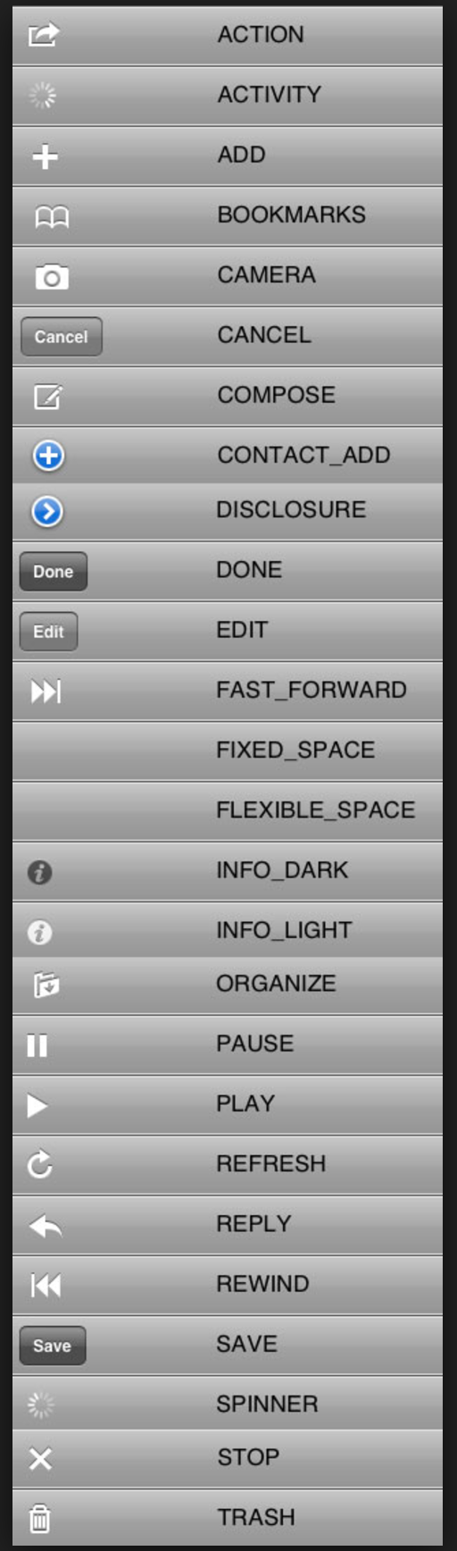
Properties 28
Use with Button.systemButton to specify an Action button.
The resulting button can only be used in navigation bars and toolbars.
Use with Button.systemButton to create an activity indicator that can be used in navigation bars and toolbars.
When visible, the activity indicator is already started.
Use with Button.systemButton to specify an Add button.
The resulting button can only be used in navigation bars and toolbars.
Inherited from Titanium.Proxy
The name of the API that this proxy corresponds to.
Use with Button.systemButton to specify a Bookmarks button.
The resulting button can only be used in navigation bars and toolbars.
Inherited from Titanium.Proxy
Indicates if the proxy will bubble an event to its parent.
Default: true
Use with Button.systemButton to specify a Camera button.
The resulting button can only be used in navigation bars and toolbars.
Use with Button.systemButton to specify a Cancel button.
This button is displayed as a bordered button with localized text.
The resulting button can only be used in navigation bars and toolbars.
Use with Button.systemButton to specify a Compose button.
The resulting button can only be used in navigation bars and toolbars.
Use with Button.style to specify a ContactAdd button.
The resulting button is not restricted to use in navigation bars and toolbars.
Use with Button.style to specify a Disclosure button.
The resulting button is not restricted to use in navigation bars and toolbars.
Use with Button.systemButton to specify a Done button.
This button is displayed as a bordered button with localized text.
The resulting button can only be used in navigation bars and toolbars.
Use with Button.systemButton to specify an Edit button.
This button is displayed as a bordered button with localized text.
The resulting button can only be used in navigation bars and toolbars.
Use with Button.systemButton to specify a Fast Forward button.
The resulting button can only be used in navigation bars and toolbars.
Use with Button.systemButton to create a fixed-width blank space for spacing items in toolbars.
Only the width property is used when this value is set.
Use with Button.systemButton to create a flexible blank space for spacing items in toolbars.
The space is distributed equally between the other items. Other item properties are ignored when this value is set.
Use with Button.style to specify a dark-colored Info button.
The resulting button is not restricted to use in navigation bars and toolbars.
Use with Button.style to specify a light-colored Info button.
The resulting button is not restricted to use in navigation bars and toolbars.
Use with Button.systemButton to specify an Organize button.
The resulting button can only be used in navigation bars and toolbars.
Use with Button.systemButton to specify a Pause button.
The resulting button can only be used in navigation bars and toolbars.
Use with Button.systemButton to specify a Play button.
The resulting button can only be used in navigation bars and toolbars.
Use with Button.systemButton to specify a Refresh button.
The resulting button can only be used in navigation bars and toolbars.
Use with Button.systemButton to specify a Reply button.
The resulting button can only be used in navigation bars and toolbars.
Use with Button.systemButton to specify a Rewind button.
The resulting button can only be used in navigation bars and toolbars.
Use with Button.systemButton to specify a Save button.
This button is displayed as a bordered button with localized text.
The resulting button can only be used in navigation bars and toolbars.
Identical to ACTIVITY.
Use with Button.systemButton to specify a Stop button.
The resulting button can only be used in navigation bars and toolbars.
Use with Button.systemButton to specify a Trash button.
The resulting button can only be used in navigation bars and toolbars.
Methods 4
Inherited from Titanium.Proxy
Adds the specified callback as an event listener for the named event.
| Parameters | Type | Description |
|---|---|---|
| name | String | Name of the event. |
| callback | Callback<Titanium.Event> | Callback function to invoke when the event is fired. 4 fields
|
applyProperties
since 3.0.0Inherited from Titanium.Proxy
Applies the properties to the proxy.
| Parameters | Type | Description |
|---|---|---|
| props | Dictionary | A dictionary of properties to apply. |
Inherited from Titanium.Proxy
Fires a synthesized event to any registered listeners.
| Parameters | Type | Description |
|---|---|---|
| name | String | Name of the event. |
| event? | Dictionary | A dictionary of keys and values to add to the Titanium.Event object sent to the listeners. |
Inherited from Titanium.Proxy
Removes the specified callback as an event listener for the named event.
| Parameters | Type | Description |
|---|---|---|
| name | String | Name of the event. |
| callback | Callback<Titanium.Event> | Callback function to remove. Must be the same function passed to 4 fields
|