Titanium.UI.Android.CollapseToolbar
Extends Titanium.UI.ViewTitanium.Proxy
A collapsing toolbar layout.
| Android |
|---|
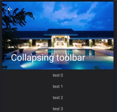 |
CollapseToolbar acts as a top-level container for window content that allows to set a parallax image and title
in the toolbar. The main content goes into centerView and will automatically be scrollable.
Examples
Simple setup
The following code shows a simple drawer-layout usage.
const win = Ti.UI.createWindow({
	theme: "Theme.Titanium.DayNight.NoTitleBar"
});

const centerView = Ti.UI.createView({
	layout: "vertical",
	height: Ti.UI.SIZE
});

for (let i = 0; i < 40; ++i) {
	let lbl = Ti.UI.createLabel({
		text: "test " + i,
		height: 40
	});
	centerView.add(lbl);
}

const collapsingToolbar = Ti.UI.Android.createCollapseToolbar({
	contentScrimColor: "#333",
	top: 0,
	image: "default.png",
	title: "Collapsing toolbar"
});


win.addEventListener('open', function() {
	collapsingToolbar.contentView = centerView;
	collapsingToolbar.onHomeIconItemSelected = function() {
		alert("click click");
	};
	collapsingToolbar.displayHomeAsUp = true;
});

win.add(collapsingToolbar);
win.open();
Alloy example
<Alloy>
	<Window>

		<CollapseToolbar platform="android">

			<ContentView>
				<View backgroundColor="red" height="Ti.UI.SIZE">
					<Label>test</Label>
				</View>
			</ContentView>
		</CollapseToolbar>

	</Window>
</Alloy>
Properties 18
Inherited from Titanium.UI.View
Boolean value to remove the long press notification for the device's accessibility service.
Default: true
Inherited from Titanium.Proxy
The name of the API that this proxy corresponds to.
barColor
StringBackground color of the extended toolbar when no image is shown.
color
StringColor of the title.
contentScrimColor
StringBackground color of the small toolbar when the content is scrolled up.
Main view below the toolbar.
Displays an "up" affordance on the "home" area of the action bar.
See also: setDisplayHomeAsUpEnabled in the Android Developer Reference.
flags
NumberScroll flags. Check Android documentation for more details.
height
Number | StringInherited from Titanium.UI.View
View height, in platform-specific units.
id
StringInherited from Titanium.UI.View
View's identifier.
image
StringBackground image for the full size toolbar. Has a parallax effect when scrolling upwards.
imageHeight
NumberHeight of the image. Use height for the height of the extended toolbar.
Default: 250
Inherited from Titanium.UI.View
A value indicating the render mode of the View
Default: false
navigationIconColor
StringColor of the back arrow.
Callback function called when the home icon is clicked.
title
StringTitle of the toolbar.
Inherited from Titanium.UI.View
The default text to display in the control's tooltip.
top
Number | StringInherited from Titanium.UI.View
The view's top position.
Methods 4
Inherited from Titanium.Proxy
Adds the specified callback as an event listener for the named event.
| Parameters | Type | Description |
|---|---|---|
| name | String | Name of the event. |
| callback | Callback<Titanium.Event> | Callback function to invoke when the event is fired. 4 fields
|
Inherited from Titanium.Proxy
Fires a synthesized event to any registered listeners.
| Parameters | Type | Description |
|---|---|---|
| name | String | Name of the event. |
| event? | Dictionary | A dictionary of keys and values to add to the Titanium.Event object sent to the listeners. |
Inherited from Titanium.Proxy
Removes the specified callback as an event listener for the named event.
| Parameters | Type | Description |
|---|---|---|
| name | String | Name of the event. |
| callback | Callback<Titanium.Event> | Callback function to remove. Must be the same function passed to 4 fields
|
stopAnimation
since 12.1.0Inherited from Titanium.UI.View
Stops a running animation.